The main purpose of the charts in Google Sheets is to understand the dataset at a glance. There are many types of charts in Google Sheets, such as Pie Charts, Bar Charts, Line Charts, and so on. Of all the charts, the organization chart is one of the most useful charts which helps to understand the hierarchy. An organization chart, as the name implies, can be used to explain common datasets such as employee reporting structures, family trees, and much more.
There are many complex charts, such as radial bar charts and grid charts, which need you to input the functions and formulas to create them on Google Sheets. Unlike them, organizational charts can be easily created for any given dataset just by using the built-in options. So why wait? Let us start exploring how to create organizational charts on spreadsheets with the help of Google Sheets Tips and Tricks. Scroll down to find out more.
| Table of Contents |
How To Create An Organization Chart Using Google Sheets?
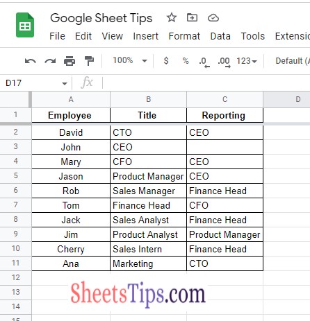
To create an org chart in Google Sheets, we need to devise a dataset. In this article, we will take the example of the employee reporting structure and create an organizational chart that shows the employee reporting format in the ABC organization.
To create a dataset in Google Sheets, follow the steps given below:
- Firstly, create 3 columns in the Google Sheets.
- The first column will have employee names.
- The second column will have an employee’s title or role in the organization.
- The third column will have employee reporting details.
So our dataset will look like the following image.
- Funnel Charts In Google Sheets – How To Make Funnel Templates In Google Spreadsheet?
- How to Create a Gantt Chart in Google Sheets? (Dynamic Gantt Chart Formula)
- Radial Bar Chart in Google Sheets Example – Learn How To Make Radial Chart in Spreadsheet
Steps to Creating an Organization Chart in Google Sheets
Now we have the dataset ready. The next step is to use the dataset to create an org chart in Google Sheets. The steps to get this done are as follows:
- 1st Step: Select the dataset. In this example, the cell range from A1 to C11 is selected.
- 2nd Step: Click on the “Insert” tab from the menubar and choose “Charts” from the drop-down menu.
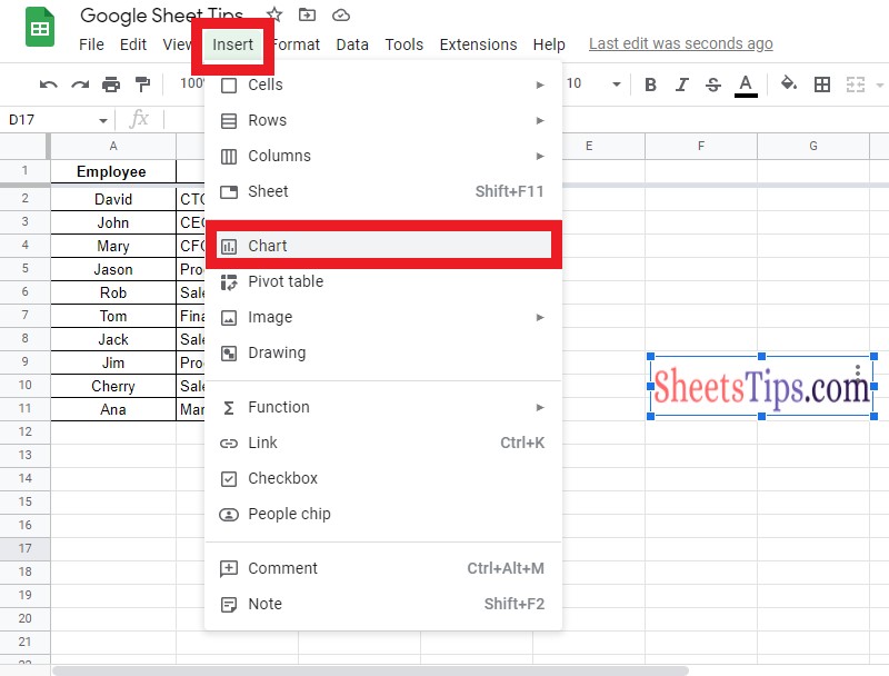
- 3rd Step: By default, Google Sheets will provide a chart. To convert the existing chart to an organization chart, move to the Chart Editor pane, which is on the right side of the screen.
- 4th Step: In the “Setup” pane, click on the “Chart Type” drop down box.
- 5th Step: Scroll down and choose the “Organizational” chart from the dropdown menu.
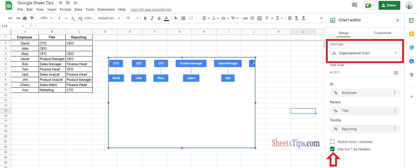
Based on the dataset chosen, the organizational chart has been designed. Although the organizational chart has been created on Google Sheets, we will have to customize the chart according to the dataset to polish the same. And that is where we have to customize our organizational chart.
Editing Organizational Charts In Google Sheets
Now the next step is to customize our organizational chart in Google Sheets. The steps to get this done in a Google spreadsheet are given below:
- 1st Step: Double click the organizational chart.
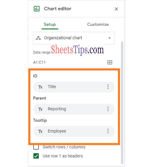
- 2nd Step: Now move to the Chart Editor Pane. In the setup pane, make sure the data range is “A1:C11“.
- 3rd Step: Tick the “Use row 1 as headers” check box.
- 4th Step: Now select the ID as an employee title or designation.
- 5th Step: In the Parent field, choose “Reporting Structure“.
- 6th Step: In the Tooltip filled in, choose “Employee Name“.
- 7th Step: Now move to the “Customize” section of the Chart Editor Pane.
- 8th Step: In the customize section, change the colors of the organization chart as per your choice.
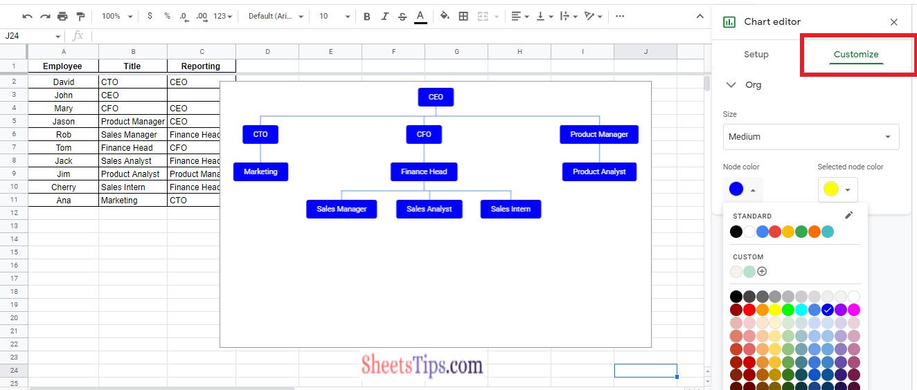
That’s it. Your organization chart is ready.
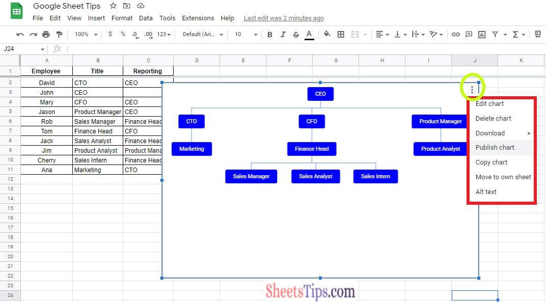
Apart from the other options, one also has various other options that can be done with the organization chart in Google Sheets. A few of them are outlined below.
- Publish the chart
- Copy the chart
- Transfer to other sheets
- Adding Alt text to the chart
One can perform the above actions by clicking the kebab menu in the organizational chart.