
Openpyxl is one of the most important Python libraries which helps users to automate excel operations such as reading, writing, mathematical operations, plotting graphs, and much more. In this article, let us discuss how to create charts in an Excel sheet using Openpyxl without launching the Excel sheet. To create a chart on an Excel sheet using Python, we must first create a chart object of a specified class before plotting charts on Excel. After creating a chart object, we must add data to it before including the chart object in the sheet object. The detailed steps on how to do this in Python are explained in the tutorial. Read further to find out more
In this article, we are going to plot the charts like
using openpyxl module in Python.
Openpyxl Module:
OpenPyXL is a Python package that allows you to communicate with Excel (.xlxs) files. But you can’t do it with Pandas. Yes, however Pandas does not support charts, formulas, or images. OpenPyXL allows data scientists and analysts to conduct a wide range of operations on Excel files, including:
- Reading and writing cells.
- Creating and renaming sheets.
- Drawing/Plotting charts.
- Add formulas.
- Creating pivot tables.
- Inserting images, and even doing formatting and styling.
Another noteworthy feature of OpenPyXL is that it does not require the installation of Microsoft Excel.
Plotting Charts in Excel Sheet using Openpyxl module in Python | Set 1
Chart #1: Plotting Bar Chart
Approach:
- Import the openpyxl module using the import keyword.
- Import the BarChart, Reference class from openpyxl.chart submodule using the import, from keywords.
- Create a workbook using the Workbook() function of the openpyxl module and store it in a variable.
- Set the above workbook to active by applying the active attribute to the workbook and store this sheet in a variable.
- Add some random data say numbers from 0 to 15 using the for loop.
- Append the iterator value to the worksheet using the append() function.
- Create some data for Plotting using the Reference() function by passing the worksheet, min, max columns, and rows as arguments and store these values in a variable.
- Create the BarChart() object using the BarChart() function and store this in a variable.
- Add the above data to the chart using the add_date() function by passing data values as an argument to it.
- Set the title of the Chart Object using the title attribute.
- Set the x axis title of the above chart using the x_axis, title attributes.
- Set the y axis title of the above chart using the x_axis, title attributes.
- Add the above chartObject to the sheet using the add_chart() function by passing the chartObject and anchored cell values as arguments to it.
- Save the workbook by passing the fileName of the plot as an argument to the save() function.
- The Exit of the Program.
Below is the Implementation:
# import the openpyxl module using the import keyword
import openpyxl

# import the BarChart,Reference class from openpyxl.chart sub module using the import,from keywords
from openpyxl.chart import BarChart,Reference

# Create a workbook using the Workbook() function of the openpyxl module and store it in a variable
workbook = openpyxl.Workbook()

# Set the above workbook to active by applying the active attribute to the workbook and store this sheet in a variable
worksheet = workbook.active

# Add some random data say numbers from 0 to 15 using the for loop
for itr in range(15):
  # Append the iterator value to the worksheet using the append() function
    worksheet.append([itr])

# Create some data for Plotting using the Reference() function by passing the worksheet,min,max columns and rows
# as arguments and store this values in a variable
datavalues = Reference(worksheet, min_col = 1, min_row = 1,max_col = 15, max_row = 15)

# Create the BarChart() object using the BarChart() function and store this in a variable
chartObj = BarChart()

# Add the above data to the chart using the add_date() function by pasing datavalues as argument to it
chartObj.add_data(datavalues)

# Set the title of the Chart Object using the title attribute
chartObj.title = " Plotting BAR CHART "

# Set the x axis title of the above chart using the x_axis,title attributes
chartObj.x_axis.title = " X-AXIS "

# Set the y axis title of the above chart using the x_axis,title attributes
chartObj.y_axis.title = " Y-AXIS "

# Add the above chartObject to the sheet using the add_chart() function
# by passing the chartObject and anchored cell values as arguments to it.
worksheet.add_chart(chartObj, "G2")

# Save the workbook by passing the fileName of the plot as an argument to the save() function.
workbook.save("chartBar.xlsx")
Output:
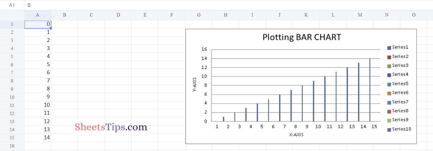
Chart #2: Plotting 3D PieChart
Use BarChart3D class from openpyxl.chart submodule to plot 3d Bar Chart.
Below is the Implementation:
# import the openpyxl module using the import keyword
import openpyxl

# import the BarChart3D,Reference class from openpyxl.chart sub module using the import,from keywords
from openpyxl.chart import BarChart3D,Reference

# Create a workbook using the Workbook() function of the openpyxl module and store it in a variable
workbook = openpyxl.Workbook()

# Set the above workbook to active by applying the active attribute to the workbook and store this sheet in a variable
worksheet = workbook.active

# Add some random data say numbers from 0 to 15 using the for loop
for itr in range(6):
  # Append the iterator value to the worksheet using the append() function
    worksheet.append([itr])

# Create some data for Plotting using the Reference() function by passing the worksheet,min,max columns and rows
# as arguments and store this values in a variable
datavalues = Reference(worksheet, min_col = 1, min_row = 1,max_col = 6, max_row = 6)

# Create the BarChart3D() object using the BarChart3D() function and store this in a variable
chartObj = BarChart3D()

# Add the above data to the chart using the add_date() function by pasing datavalues as argument to it
chartObj.add_data(datavalues)

# Set the title of the Chart Object using the title attribute
chartObj.title = " Plotting 3D BAR CHART "

# Set the x axis title of the above chart using the x_axis,title attributes
chartObj.x_axis.title = " X-AXIS "

# Set the y axis title of the above chart using the x_axis,title attributes
chartObj.y_axis.title = " Y-AXIS "

# Add the above chartObject to the sheet using the add_chart() function
# by passing the chartObject and anchored cell values as arguments to it.
worksheet.add_chart(chartObj, "E2")

# Save the workbook by passing the fileName of the plot as an argument to the save() function.
workbook.save("chartBar3D.xlsx")
Output:
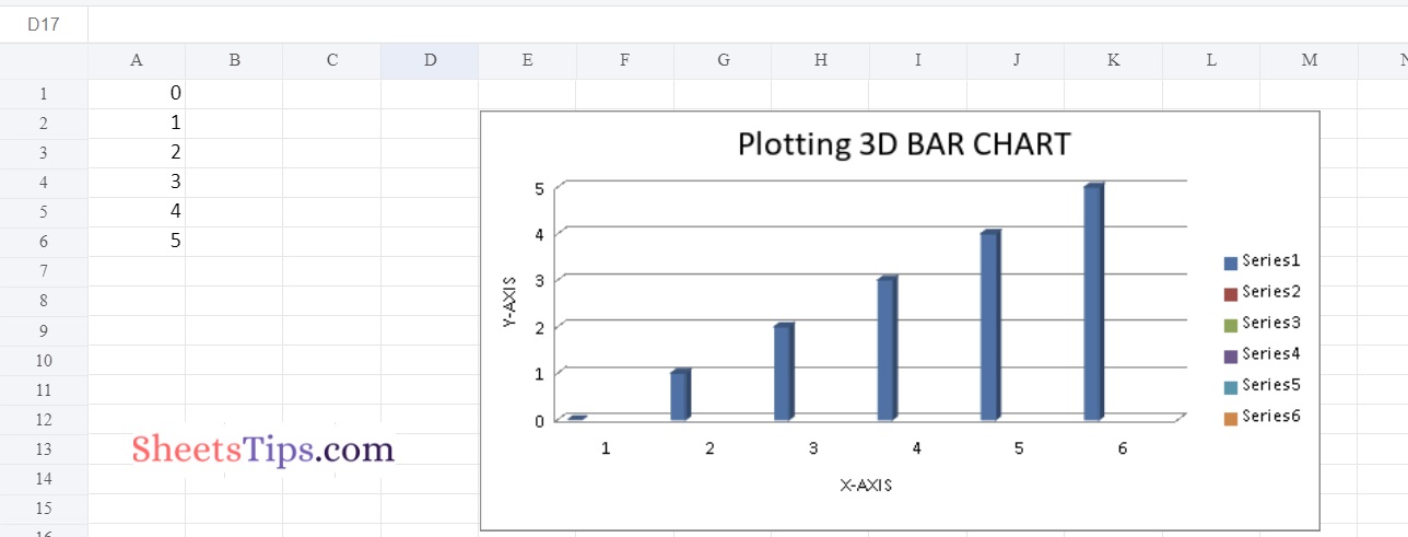
Chart #3: Plotting Area Chart
Use AreaChart class from openpyxl.chart submodule to plot AreaChart.
Below is the Implementation:
# import the openpyxl module using the import keyword
import openpyxl

# import the AreaChart,Reference class from openpyxl.chart sub module using the import,from keywords
from openpyxl.chart import AreaChart,Reference

# Create a workbook using the Workbook() function of the openpyxl module and store it in a variable
workbook = openpyxl.Workbook()

# Set the above workbook to active by applying the active attribute to the workbook and store this sheet in a variable
worksheet = workbook.active

# Add some random data say numbers from 0 to 15 using the for loop
for itr in range(6):
  # Append the iterator value to the worksheet using the append() function
    worksheet.append([itr])

# Create some data for Plotting using the Reference() function by passing the worksheet,min,max columns and rows
# as arguments and store this values in a variable
datavalues = Reference(worksheet, min_col = 1, min_row = 1,max_col = 6, max_row = 6)

# Create the AreaChart() object using the AreaChart() function and store this in a variable
chartObj = AreaChart()

# Add the above data to the chart using the add_date() function by pasing datavalues as argument to it
chartObj.add_data(datavalues)

# Set the title of the Chart Object using the title attribute
chartObj.title = " Plotting Area Chart  "

# Set the x axis title of the above chart using the x_axis,title attributes
chartObj.x_axis.title = " X-AXIS "

# Set the y axis title of the above chart using the x_axis,title attributes
chartObj.y_axis.title = " Y-AXIS "

# Add the above chartObject to the sheet using the add_chart() function
# by passing the chartObject and anchored cell values as arguments to it.
worksheet.add_chart(chartObj, "E2")

# Save the workbook by passing the fileName of the plot as an argument to the save() function.
workbook.save("chartArea.xlsx")
Output:
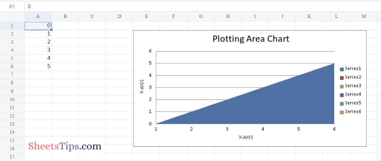
Chart #4: Plotting 3D Area Chart
Use AreaChart3D class from openpyxl.chart submodule to plot AreaChart3D.
Below is the Implementation:
# import the openpyxl module using the import keyword
import openpyxl

# import the AreaChart3D,Reference class from openpyxl.chart sub module using the import,from keywords
from openpyxl.chart import AreaChart3D,Reference

# Create a workbook using the Workbook() function of the openpyxl module and store it in a variable
workbook = openpyxl.Workbook()

# Set the above workbook to active by applying the active attribute to the workbook and store this sheet in a variable
worksheet = workbook.active

# Add some random data say numbers from 0 to 15 using the for loop
for itr in range(6):
  # Append the iterator value to the worksheet using the append() function
    worksheet.append([itr])

# Create some data for Plotting using the Reference() function by passing the worksheet,min,max columns and rows
# as arguments and store this values in a variable
datavalues = Reference(worksheet, min_col = 1, min_row = 1,max_col = 6, max_row = 6)

# Create the AreaChart3D() object using the AreaChart3D() function and store this in a variable
chartObj = AreaChart3D()

# Add the above data to the chart using the add_date() function by pasing datavalues as argument to it
chartObj.add_data(datavalues)

# Set the title of the Chart Object using the title attribute
chartObj.title = " Plotting 3D Area Chart  "

# Set the x axis title of the above chart using the x_axis,title attributes
chartObj.x_axis.title = " X-AXIS "

# Set the y axis title of the above chart using the x_axis,title attributes
chartObj.y_axis.title = " Y-AXIS "

# Add the above chartObject to the sheet using the add_chart() function
# by passing the chartObject and anchored cell values as arguments to it.
worksheet.add_chart(chartObj, "E2")

# Save the workbook by passing the fileName of the plot as an argument to the save() function.
workbook.save("chart3DArea.xlsx")
Output:
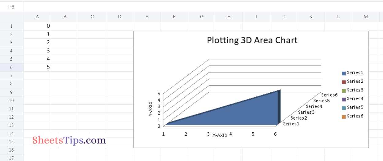
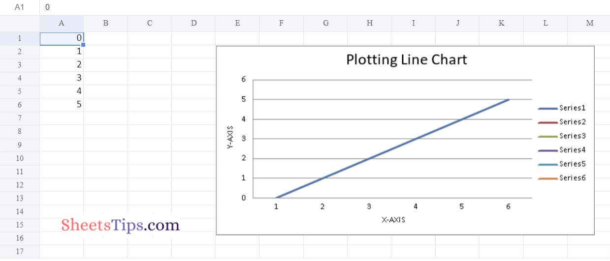
Chart #5: Plotting Line Chart
Use LineChartclass from openpyxl.chart submodule to plot LineChart.
Below is the Implementation:
# import the openpyxl module using the import keyword
import openpyxl

# import the LineChart,Reference class from openpyxl.chart sub module using the import,from keywords
from openpyxl.chart import LineChart,Reference

# Create a workbook using the Workbook() function of the openpyxl module and store it in a variable
workbook = openpyxl.Workbook()

# Set the above workbook to active by applying the active attribute to the workbook and store this sheet in a variable
worksheet = workbook.active

# Add some random data say numbers from 0 to 15 using the for loop
for itr in range(6):
  # Append the iterator value to the worksheet using the append() function
    worksheet.append([itr])

# Create some data for Plotting using the Reference() function by passing the worksheet,min,max columns and rows
# as arguments and store this values in a variable
datavalues = Reference(worksheet, min_col = 1, min_row = 1,max_col = 6, max_row = 6)

# Create the LineChart() object using the LineChart() function and store this in a variable
chartObj = LineChart()

# Add the above data to the chart using the add_date() function by pasing datavalues as argument to it
chartObj.add_data(datavalues)

# Set the title of the Chart Object using the title attribute
chartObj.title = " Plotting Line Chart  "

# Set the x axis title of the above chart using the x_axis,title attributes
chartObj.x_axis.title = " X-AXIS "

# Set the y axis title of the above chart using the x_axis,title attributes
chartObj.y_axis.title = " Y-AXIS "

# Add the above chartObject to the sheet using the add_chart() function
# by passing the chartObject and anchored cell values as arguments to it.
worksheet.add_chart(chartObj, "E2")

# Save the workbook by passing the fileName of the plot as an argument to the save() function.
workbook.save("chartline.xlsx")
Output:
Now that you have learnt how to create bar charts, 3D bar charts, area charts, 3D area charts, and line charts in Excel using Python, Now try it yourself and do let us know if the methods provided here helped you to create charts in Excel using Python.