
Users can automate a range of Excel functions, including reading, writing, performing computations, making graphs, and more, using one of the most important Python programs, Openpyxl. In this article, we will discuss how to create charts in an Excel sheet using Openpyxl without actually opening the Excel sheet. In order to construct a chart on an Excel sheet, we must first create a chart object in Python that belongs to a particular class. Before inserting the chart object into the sheet object, we must fill the chart object with data. The tutorial explains how to implement this in Python step-by-step. Keep reading to find out more.
In this article, we are going to plot the charts like
using openpyxl module in Python.
Openpyxl Module:
OpenPyXL is a Python package that allows you to communicate with Excel (.xlxs) files. But you can’t do it with Pandas. Yes, however Pandas does not support charts, formulas, or images. OpenPyXL allows data scientists and analysts to conduct a wide range of operations on Excel files, including:
- Reading and writing cells.
- Creating and renaming sheets.
- Drawing/Plotting charts.
- Add formulas.
- Creating pivot tables.
- Inserting images, and even doing formatting and styling.
Another noteworthy feature of OpenPyXL is that it does not require the installation of Microsoft Excel.
Program Plotting Charts in Excel Sheet using Openpyxl module in Python | Set 2
Chart #1: Plotting the Bubble Chart
Approach:
- Import the openpyxl module using the import keyword
- Import the BubbleChart, Reference, and Series class from openpyxl.chart submodule using the import, from keywords
- Create a workbook using the Workbook() function of the openpyxl module and store it in a variable
- Set the above workbook to active by applying the active attribute to the workbook and store this sheet in a variable
- Give the Data Values of the rows as a list and store them in a variable
- Fill out the first, second, and third columns of the active sheet with the content of each row.
- Create the BubbleChart() object using the BubbleChart() function and store this in a variable
- Creating Data to Plot
- Creating the 1st series of data using the series() function
- Append the series of data to the chart object using the append() function
- Set the title of the Chart Object using the title attribute.
- Set the x axis title of the above chart using the x_axis, title attributes.
- Set the y axis title of the above chart using the x_axis, title attributes. Add the above chartObject to the sheet using the add_chart() function by passing the chartObject and anchored cell values as arguments to it.
- Save the workbook by passing the fileName of the plot as an argument to the save() function.
- The Exit of the Program.
Below is the Implementation:
# import the openpyxl module using the import keyword
import openpyxl

# import the BubbleChart,Reference,Series class from openpyxl.chart sub module using the import,from keywords
from openpyxl.chart import BubbleChart, Reference, Series

# Create a workbook using the Workbook() function of the openpyxl module and store it in a variable
workbook = openpyxl.Workbook()

# Set the above workbook to active by applying the active attribute to the workbook and store this sheet in a variable
worksheet = workbook.active

#G ive the Data Values of the rows as a list and store it in a variable
rowsData = [
    ("Number of Mobiles", "Sales in Rs", "share Values"),
    (17, 12200, 18),
    (30, 60000,33),
    (28, 24400, 20),
    (32, 32000, 52)
]

# Fill out the first, second, and third columns of the active sheet with the content of each row.
for rowVal in rowsData:
    worksheet.append(rowVal)

# Create the BubbleChart() object using the BubbleChart() function and store this in a variable
chartObj = BubbleChart()

# Creating Data to Plot
x_values = Reference(worksheet, min_col = 1,
                    min_row = 2, max_row = 5)

y_values = Reference(worksheet, min_col = 2,
                    min_row = 2, max_row = 5)

size = Reference(worksheet, min_col = 3,
                min_row = 2, max_row = 5)

# creating the 1st series of data using the series() function
series = Series(values = y_values, xvalues = x_values,
                      zvalues = size, title ="2022")

# Append the series of data to the chart object using the append() function
chartObj.series.append(series)

# Set the title of the Chart Object using the title attribute
chartObj.title = " PlOTTING BUBBLE CHART "

# Set the x axis title of the above chart using the x_axis,title attributes
chartObj.x_axis.title = " X-AXIS "

# Set the y axis title of the above chart using the x_axis,title attributes
chartObj.y_axis.title = " Y-AXIS "

# Add the above chartObject to the sheet using the add_chart() function
# by passing the chartObject and anchored cell values as arguments to it.
worksheet.add_chart(chartObj, "E2")

# Save the workbook by passing the fileName of the plot as an argument to the save() function.
workbook.save("chartBubble.xlsx")
Output:
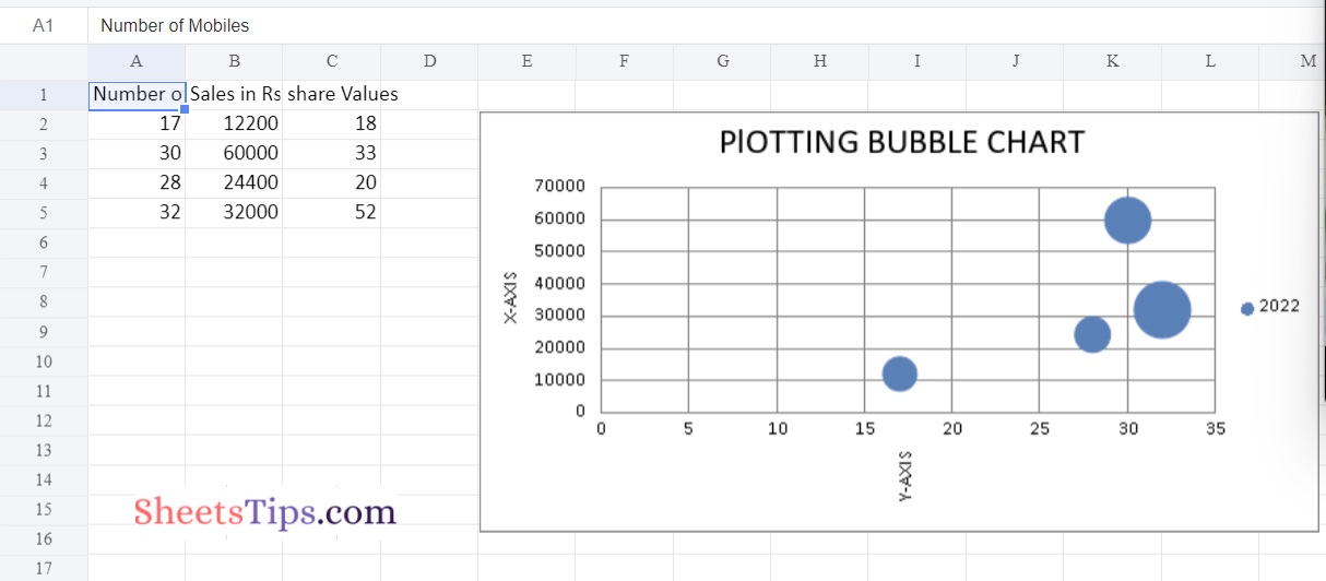
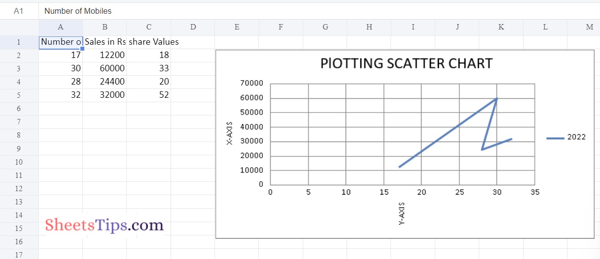
Chart #2: Plotting the Scatter Chart
Approach:
- Import the openpyxl module using the import keyword
- Import the ScatterChart, Reference, and Series class from openpyxl.chart submodule using the import, from keywords
- Create a workbook using the Workbook() function of the openpyxl module and store it in a variable
- Set the above workbook to active by applying the active attribute to the workbook and store this sheet in a variable
- Give the Data Values of the rows as a list and store them in a variable
- Fill out the first, second, and third columns of the active sheet with the content of each row.
- Create the ScatterChart() object using the ScatterChart() function and store this in a variable
- Creating Data to Plot
- Creating the 1st series of data using the series() function
- Append the series of data to the chart object using the append() function
- Set the title of the Chart Object using the title attribute.
- Set the x axis title of the above chart using the x_axis, title attributes.
- Set the y axis title of the above chart using the x_axis, title attributes. Add the above chartObject to the sheet using the add_chart() function by passing the chartObject and anchored cell values as arguments to it.
- Save the workbook by passing the fileName of the plot as an argument to the save() function.
- The Exit of the Program.
Below is the Implementation:
# import the openpyxl module using the import keyword
import openpyxl

# import the BubbleChart,Reference,Series class from openpyxl.chart sub module using the import,from keywords
from openpyxl.chart import ScatterChart, Reference, Series

# Create a workbook using the Workbook() function of the openpyxl module and store it in a variable
workbook = openpyxl.Workbook()

# Set the above workbook to active by applying the active attribute to the workbook and store this sheet in a variable
worksheet = workbook.active

#G ive the Data Values of the rows as a list and store it in a variable
rowsData = [
    ("Number of Mobiles", "Sales in Rs", "share Values"),
    (17, 12200, 18),
    (30, 60000,33),
    (28, 24400, 20),
    (32, 32000, 52)
]

# Fill out the first, second, and third columns of the active sheet with the content of each row.
for rowVal in rowsData:
    worksheet.append(rowVal)

# Create the ScatterChart() object using the ScatterChart() function and store this in a variable
chartObj = ScatterChart()

# Creating Data to Plot
x_values = Reference(worksheet, min_col = 1,
                    min_row = 2, max_row = 5)

y_values = Reference(worksheet, min_col = 2,
                    min_row = 2, max_row = 5)

size = Reference(worksheet, min_col = 3,
                min_row = 2, max_row = 5)

# creating the 1st series of data using the series() function
series = Series(values = y_values, xvalues = x_values,
                      zvalues = size, title ="2022")

# Append the series of data to the chart object using the append() function
chartObj.series.append(series)

# Set the title of the Chart Object using the title attribute
chartObj.title = " PlOTTING SCATTER CHART "

# Set the x axis title of the above chart using the x_axis,title attributes
chartObj.x_axis.title = " X-AXIS "

# Set the y axis title of the above chart using the x_axis,title attributes
chartObj.y_axis.title = " Y-AXIS "

# Add the above chartObject to the sheet using the add_chart() function
# by passing the chartObject and anchored cell values as arguments to it.
worksheet.add_chart(chartObj, "E2")

# Save the workbook by passing the fileName of the plot as an argument to the save() function.
workbook.save("chartScatter.xlsx")
Output:
You now have the knowledge necessary to create bubble charts and scatter charts in Excel using Python. Try it out for yourself and let us know if the tips we provided here were helpful.