In this article, we are going to plot the Scatter Charts in Excel Sheet using the xlsxWriter module in Python.
Charts are made up of a series of one or more data points. The series are made up of references to cell ranges. To plot the charts on an excel sheet, first create a chart object of the desired chart type ( i.e Stock chart, etc.). After generating chart objects, insert data into them before adding them to the sheet object.
Install the xlsxwriter using the below code
pip install xlsxwriter
Looking in indexes: https://pypi.org/simple, https://us-python.pkg.dev/colab-wheels/public/simple/
Collecting xlsxwriter
Downloading XlsxWriter-3.0.3-py3-none-any.whl (149 kB)
|████████████████████████████████| 149 kB 5.0 MB/s
Installing collected packages: xlsxwriter
Successfully installed xlsxwriter-3.0.3
Program to Plot Scatter Charts in Excel Sheet using XlsxWriter module in Python
- Plotting Simple Scatter Chart
- Plotting the Scatter Chart sub-type with straight lines and markers
- Plotting the Scatter Chart sub-type with straight lines and no markers
- Plotting the Scatter Chart sub-type with smooth and no markers
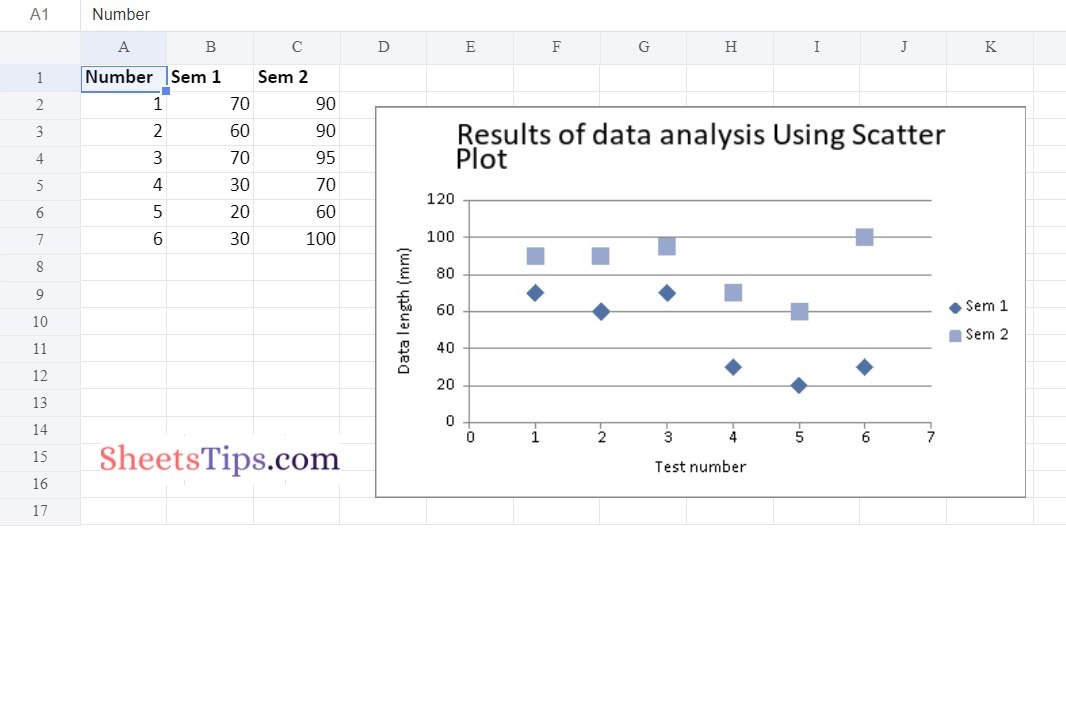
Example #1: Plotting Simple Scatter Chart
Approach:
- Import the xlsxwriter library using the import function.
- Pass the excel file path to the Workbook() function of xlsxwriter which is the file we want to create and store in a variable.
- Create the new Worksheet using the add_worsheet() function and apply it to the above workbook object and store it in a variable.
- Create a new Format object to format cells in spreadsheets using the add_format() method and apply it to the above workbook object.
- Here, we created a bold format object.
- Add the worksheet data that the charts will use.
- Write a row of heading data starting with ‘A1’ in the bold format using the write_row() function and apply on the above worksheet object by passing the argument rowNumber,headings list,and format.
- Write the column data that is starting from ‘A2′,’B2′,’C2’ using the write_coulmn() function and pass data as argument to it.
- Write a column of data starting from ‘A2’, ‘B2’, ‘C2’ respectively .
- Using the add_chart() method, create a chart object that can be added to a worksheet.
- Pass the type of chart as an argument to the add_chart() function and apply it to the above workbook object
- Using the add series() method, you can add a data series with a gradient pattern to a chart.
- The gap is used to highlight the patterns.
- Add the first series data using the add_series() function.
- Configuring the second series.
- Take note of the usage of different syntax to declare ranges [sheetname, first row, first col, last row, last col].
- Set the title to the chartObject using the set_title() function by passing the chart title name as value and key as “name” (Here the arguments are object).
- Label the x-axis using the set_x_axis() function by passing the Sem Number as value and key as “name” (Here the arguments are object).
- Label the y axis using the set_x_axis() function by passing the Data length as value and key as “name” (Here the arguments are object).
- Set the style of chart using the set_style() function.
- Add a chartObject to the worksheet with the provided offset values in the top-left corner of a chartObject that is anchored to cell D2.
- Close the workbook Object using the close() function.
Below is the Implementation:
# Import the xlsxwriter library using the import function
import xlsxwriter
# Pass the excel file path to the Workbook() function of xlsxwriter
# which is the file we want to create and store it in a variable
workbookObj = xlsxwriter.Workbook('chartScatter.xlsx')
# Create the new Worksheet using the add_worsheet() function and
# apply it to the above workbook object and store it in a variable
newWorksheet = workbookObj.add_worksheet()
# Create a new Format object to format cells in spreadsheets using the add_format() method and apply it to the above workbook object.
# Here, we created a bold format object. .
boldFormat = workbookObj.add_format({'bold': 1})
# Add the worksheet data that the charts will use.
headingsData = ['Number', 'Sem 1', 'Sem 2']
worksheetData = [
[1, 2, 3, 4, 5, 6],
[70, 60, 70, 30, 20, 30],
[90, 90, 95, 70, 60, 100]
]
# Write a row of heading data starting with 'A1' in bold format using the write_row() function
# and apply on the above worksheet object
# by passing the argument rowNumber,headings list,and format.
newWorksheet.write_row('A1', headingsData, boldFormat)
# Write the column data that is starting from 'A2','B2','C2'
# using the write_coulmn() function
# and pass data as argument to it
# Write a column of data starting from
# 'A2', 'B2', 'C2' respectively .
newWorksheet.write_column('A2', worksheetData[0])
newWorksheet.write_column('B2', worksheetData[1])
newWorksheet.write_column('C2', worksheetData[2])
# Using the add_chart() method, create a chart object that can be added to a worksheet.
# Pass the type of chart as an argument to the add_chart() function and apply it to the above workbook object
chartObject = workbookObj.add_chart({'type': 'scatter'})
# Using the add series() method, you can add a data series with a gradient pattern to a chart.
# The gap is used to highlight the patterns.
# Add the first series data using the add_series() function
chartObject.add_series({
'name': '= Sheet1 !$B$1',
'categories': '= Sheet1 !$A$2:$A$7',
'values': '= Sheet1 !$B$2:$B$7'
})
# Configuring the second series.
# Take note of the usage of different syntax to declare ranges.
#[sheetname, first row, first col, last row, last col]
chartObject.add_series({
'name': ['Sheet1', 0, 2],
'categories': ['Sheet1', 1, 0, 6, 0],
'values': ['Sheet1', 1, 2, 6, 2],
})
# Set the title to the chartObject using the set_title() function
# by passing the chart title name as value and key as "name" (Here the arguments are object)
chartObject.set_title ({'name': 'Results of data analysis Using Scatter Plot'})
# Label the x axis using the set_x_axis() function by passing the Sem Number as value and key as "name" (Here the arguments are object)
chartObject.set_x_axis({'name': 'Test number'})
# Label the y axis using the set_x_axis() function by passing the Data length as value and key as "name" (Here the arguments are object)
chartObject.set_y_axis({'name': 'Data length (mm)'})
# set the style of chart using the set_style() function
chartObject.set_style(11)
# Add a chartObject to the worksheet with the provided offset values in the top-left corner of a chartObject that is anchored to cell D2.
newWorksheet.insert_chart('D2', chartObject,
{'x_offset': 25, 'y_offset': 10})
# Close the workbook Object using the close() function.
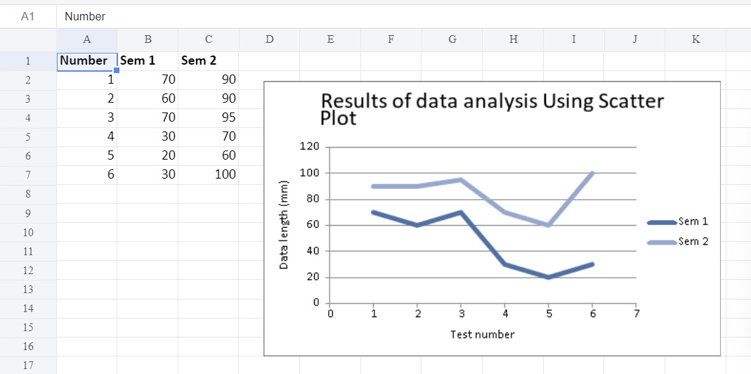
workbookObj.close()Output:
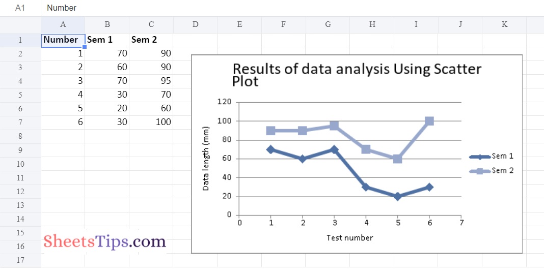
Example #2: Plotting the Scatter Chart sub-type with straight lines and markers
Use the add_chart() function of a workbook object with the type’scatter’ and subtype’straight with markers’ keyword parameter to plot this sort of chart on an excel sheet.
Below is the Implementation:
# Import the xlsxwriter library using the import function
import xlsxwriter

# Pass the excel file path to the Workbook() function of xlsxwriter
# which is the file we want to create and store it in a variable
workbookObj = xlsxwriter.Workbook('chartScatter2.xlsx')

# Create the new Worksheet using the add_worsheet() function and
# apply it to the above workbook object and store it in a variable
newWorksheet = workbookObj.add_worksheet()


# Create a new Format object to format cells in spreadsheets using the add_format() method and apply it to the above workbook object.
# Here, we created a bold format object. .
boldFormat = workbookObj.add_format({'bold': 1})


# Add the worksheet data that the charts will use.
headingsData = ['Number', 'Sem 1', 'Sem 2']
worksheetData = [
    [1, 2, 3, 4, 5, 6],
     [70, 60, 70, 30, 20, 30],
  [90, 90, 95, 70, 60, 100]
]


# Write a row of heading data starting with 'A1' in bold format using the write_row() function
# and apply on the above worksheet object
# by passing the argument rowNumber,headings list,and format.
newWorksheet.write_row('A1', headingsData, boldFormat)

# Write the column data that is starting from 'A2','B2','C2'
# using the write_coulmn() function
# and pass data as argument to it
# Write a column of data starting from
# 'A2', 'B2', 'C2' respectively .
newWorksheet.write_column('A2', worksheetData[0])
newWorksheet.write_column('B2', worksheetData[1])
newWorksheet.write_column('C2', worksheetData[2])

# Using the add_chart() method, create a chart object that can be added to a worksheet.
# Pass the type of chart as an argument to the add_chart() function and apply it to the above workbook object
chartObject = workbookObj.add_chart({'type': 'scatter', 'subtype': 'straight_with_markers'})

# Using the add series() method, you can add a data series with a gradient pattern to a chart.
# The gap is used to highlight the patterns.

# Add the first series data using the add_series() function
chartObject.add_series({
    'name':	 '= Sheet1 !$B$1',
    'categories': '= Sheet1 !$A$2:$A$7',
    'values':	 '= Sheet1 !$B$2:$B$7'
})

# Configuring the second series.
# Take note of the usage of different syntax to declare ranges.
#[sheetname, first row, first col, last row, last col]
chartObject.add_series({
    'name': ['Sheet1', 0, 2],
    'categories': ['Sheet1', 1, 0, 6, 0],
    'values': ['Sheet1', 1, 2, 6, 2],
})


# Set the title to the chartObject using the set_title() function
# by passing the chart title name as value and key as "name" (Here the arguments are object)

chartObject.set_title ({'name': 'Results of data analysis Using Scatter Plot'})

# Label the x axis using the set_x_axis() function by passing the Sem Number as value and key as "name" (Here the arguments are object)
chartObject.set_x_axis({'name': 'Test number'})

# Label the y axis using the set_x_axis() function by passing the Data length as value and key as "name" (Here the arguments are object)
chartObject.set_y_axis({'name': 'Data length (mm)'})

# set the style of chart using the set_style() function
chartObject.set_style(11)

# Add a chartObject to the worksheet with the provided offset values in the top-left corner of a chartObject that is anchored to cell D2.
newWorksheet.insert_chart('D2', chartObject,
{'x_offset': 25, 'y_offset': 10})


# Close the workbook Object using the close() function.
workbookObj.close()
Output:
Example #3: Plotting the Scatter Chart sub-type with straight lines and no markers
Use the add_chart() function of a workbook object with the type ‘scatter’ and subtype ‘straight’ keyword arguments to plot this sort of chart on an excel sheet.
Below is the Implementation:
# Import the xlsxwriter library using the import function
import xlsxwriter

# Pass the excel file path to the Workbook() function of xlsxwriter
# which is the file we want to create and store it in a variable
workbookObj = xlsxwriter.Workbook('chartScatter3.xlsx')

# Create the new Worksheet using the add_worsheet() function and
# apply it to the above workbook object and store it in a variable
newWorksheet = workbookObj.add_worksheet()


# Create a new Format object to format cells in spreadsheets using the add_format() method and apply it to the above workbook object.
# Here, we created a bold format object. .
boldFormat = workbookObj.add_format({'bold': 1})


# Add the worksheet data that the charts will use.
headingsData = ['Number', 'Sem 1', 'Sem 2']
worksheetData = [
    [1, 2, 3, 4, 5, 6],
     [70, 60, 70, 30, 20, 30],
  [90, 90, 95, 70, 60, 100]
]


# Write a row of heading data starting with 'A1' in bold format using the write_row() function
# and apply on the above worksheet object
# by passing the argument rowNumber,headings list,and format.
newWorksheet.write_row('A1', headingsData, boldFormat)

# Write the column data that is starting from 'A2','B2','C2'
# using the write_coulmn() function
# and pass data as argument to it
# Write a column of data starting from
# 'A2', 'B2', 'C2' respectively .
newWorksheet.write_column('A2', worksheetData[0])
newWorksheet.write_column('B2', worksheetData[1])
newWorksheet.write_column('C2', worksheetData[2])

# Using the add_chart() method, create a chart object that can be added to a worksheet.
# Pass the type of chart as an argument to the add_chart() function and apply it to the above workbook object
chartObject = workbookObj.add_chart({'type': 'scatter', 'subtype': 'straight'})

# Using the add series() method, you can add a data series with a gradient pattern to a chart.
# The gap is used to highlight the patterns.

# Add the first series data using the add_series() function
chartObject.add_series({
    'name':	 '= Sheet1 !$B$1',
    'categories': '= Sheet1 !$A$2:$A$7',
    'values':	 '= Sheet1 !$B$2:$B$7'
})

# Configuring the second series.
# Take note of the usage of different syntax to declare ranges.
#[sheetname, first row, first col, last row, last col]
chartObject.add_series({
    'name': ['Sheet1', 0, 2],
    'categories': ['Sheet1', 1, 0, 6, 0],
    'values': ['Sheet1', 1, 2, 6, 2],
})


# Set the title to the chartObject using the set_title() function
# by passing the chart title name as value and key as "name" (Here the arguments are object)

chartObject.set_title ({'name': 'Results of data analysis Using Scatter Plot'})

# Label the x axis using the set_x_axis() function by passing the Sem Number as value and key as "name" (Here the arguments are object)
chartObject.set_x_axis({'name': 'Test number'})

# Label the y axis using the set_x_axis() function by passing the Data length as value and key as "name" (Here the arguments are object)
chartObject.set_y_axis({'name': 'Data length (mm)'})

# set the style of chart using the set_style() function
chartObject.set_style(11)

# Add a chartObject to the worksheet with the provided offset values in the top-left corner of a chartObject that is anchored to cell D2.
newWorksheet.insert_chart('D2', chartObject,
{'x_offset': 25, 'y_offset': 10})


# Close the workbook Object using the close() function.
workbookObj.close()
Output:
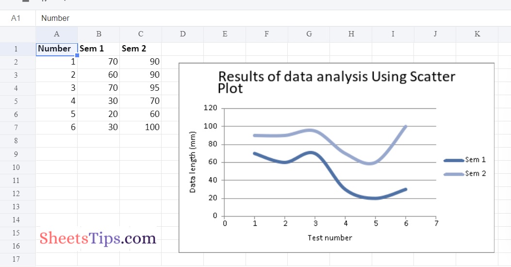
Example #4: Plotting the Scatter Chart sub-type with smooth and no markers
Below is the Implementation:
# Import the xlsxwriter library using the import function
import xlsxwriter

# Pass the excel file path to the Workbook() function of xlsxwriter
# which is the file we want to create and store it in a variable
workbookObj = xlsxwriter.Workbook('chartScatter4.xlsx')

# Create the new Worksheet using the add_worsheet() function and
# apply it to the above workbook object and store it in a variable
newWorksheet = workbookObj.add_worksheet()


# Create a new Format object to format cells in spreadsheets using the add_format() method and apply it to the above workbook object.
# Here, we created a bold format object. .
boldFormat = workbookObj.add_format({'bold': 1})


# Add the worksheet data that the charts will use.
headingsData = ['Number', 'Sem 1', 'Sem 2']
worksheetData = [
    [1, 2, 3, 4, 5, 6],
     [70, 60, 70, 30, 20, 30],
  [90, 90, 95, 70, 60, 100]
]


# Write a row of heading data starting with 'A1' in bold format using the write_row() function
# and apply on the above worksheet object
# by passing the argument rowNumber,headings list,and format.
newWorksheet.write_row('A1', headingsData, boldFormat)

# Write the column data that is starting from 'A2','B2','C2'
# using the write_coulmn() function
# and pass data as argument to it
# Write a column of data starting from
# 'A2', 'B2', 'C2' respectively .
newWorksheet.write_column('A2', worksheetData[0])
newWorksheet.write_column('B2', worksheetData[1])
newWorksheet.write_column('C2', worksheetData[2])

# Using the add_chart() method, create a chart object that can be added to a worksheet.
# Pass the type of chart as an argument to the add_chart() function and apply it to the above workbook object
chartObject = workbookObj.add_chart({'type': 'scatter', 'subtype': 'smooth'})

# Using the add series() method, you can add a data series with a gradient pattern to a chart.
# The gap is used to highlight the patterns.

# Add the first series data using the add_series() function
chartObject.add_series({
    'name':	 '= Sheet1 !$B$1',
    'categories': '= Sheet1 !$A$2:$A$7',
    'values':	 '= Sheet1 !$B$2:$B$7'
})

# Configuring the second series.
# Take note of the usage of different syntax to declare ranges.
#[sheetname, first row, first col, last row, last col]
chartObject.add_series({
    'name': ['Sheet1', 0, 2],
    'categories': ['Sheet1', 1, 0, 6, 0],
    'values': ['Sheet1', 1, 2, 6, 2],
})


# Set the title to the chartObject using the set_title() function
# by passing the chart title name as value and key as "name" (Here the arguments are object)

chartObject.set_title ({'name': 'Results of data analysis Using Scatter Plot'})

# Label the x axis using the set_x_axis() function by passing the Sem Number as value and key as "name" (Here the arguments are object)
chartObject.set_x_axis({'name': 'Test number'})

# Label the y axis using the set_x_axis() function by passing the Data length as value and key as "name" (Here the arguments are object)
chartObject.set_y_axis({'name': 'Data length (mm)'})

# set the style of chart using the set_style() function
chartObject.set_style(11)

# Add a chartObject to the worksheet with the provided offset values in the top-left corner of a chartObject that is anchored to cell D2.
newWorksheet.insert_chart('D2', chartObject,
{'x_offset': 25, 'y_offset': 10})


# Close the workbook Object using the close() function.
workbookObj.close()
Output: