

Pandas is a data analysis library written in Python. It can read, filter, and re-arrange small and large datasets in a variety of formats, including Excel.
Pandas use the XlsxWriter modules to write Excel files.
XlsxWriter Module in Python
XlsxWriter is a Python module that allows you to write files in the XLSX file format. It can be used to fill several spreadsheets with text, numbers, and formulas. It also allows formatting, images, charts, page setup, auto filters, conditional formatting, and many more features.
Installation:
Use the following command to install the XlsxWriter module.
pip install xlsxwriter
Looking in indexes: https://pypi.org/simple, https://us-python.pkg.dev/colab-wheels
/public/simple/
Collecting xlsxwriter
Downloading XlsxWriter-3.0.3-py3-none-any.whl (149 kB)
|████████████████████████████████| 149 kB 5.3 MB/s
Installing collected packages: xlsxwriter
Successfully installed xlsxwriter-3.0.3
DataFrame.to_excel() in Pandas:
Using the to_excel() function, we can export the DataFrame to an Excel file.
The target file name must be specified when writing a single object to an excel file. If we wish to write to many/multiple sheets, we must first create an ExcelWriter object with the target filename and then indicate the sheet in the file we want to write to.
The unique sheet_name can also be used to write multiple sheets. All modifications made to the data written to the file must be saved.
NOTE:
If we create an ExcelWriter object with a file name that already exists,
it will erase and overwrite the existing file's content.
Syntax:
DataFrame.to_excel(excel_writer, sheet_name='Sheet1', na_rep='', float_format=None,
columns=None, header=True, index=True, index_label=None, startrow=0, startcol=0,
engine=None, merge_cells=True, encoding=None, inf_rep='inf', verbose=True,
 freeze_panes=None)
Parameters
- excel_writer: It is a path of an Excel file or an existing ExcelWriter.
- sheet_name: It is the name of the sheet containing the DataFrame.
- na_rep: It is the Missing Data representation.
- float_format: This is optional. It formats the string for floating-point numbers. (ex: float_format= “%.2f”, formats 0.1316 to 0.13)
- columns: These are the columns to write.
- header: The header argument writes out the column names. Suppose, If a list of the string is given, it is assumed to be the aliases for the column names.
- index: This is Boolean. If it is set to True, it writes the index else NOT.
- index_label: It indicates the column label for the index column. If it is not given and both the header and the index are True, then the index names are used. If DataFrame uses MultiIndex, a sequence must be specified.
- startrow: The default value is 0. The upper left cell row to dump the DataFrame.
- startcol: The default value is 0. The upper left cell column to dump the DataFrame.
- engine: This is optional. It Writes the engine to use, ‘openpyxl’ or ‘xlsxwriter’. This can also be set using the options io.excel.xlsx.writer, io.excel.xls.writer, and io.excel.xlsm.writer.
- merge_cells: This is a Boolean value. The default value is True. It is used to write MultiIndex and Hierarchical rows as the merged cells.
- encoding: This is optional. It encodes the output excel file. It is just required for the xlwt.
- inf_rep: This is optional. The default value is
inf. In most cases, it represents infinity. - verbose: This is a Boolean value. The default value is True. It Displays more information in the error logs.
- freeze_panes: This is optional. It represents the one-based bottommost row and rightmost column that is to be frozen.
Working with Pandas and XlsxWriter in Python | Set – 3
- Using Pandas and XlsxWriter to Plot a Column chart
- Using Pandas and XlsxWriter to Plot a Line chart
- Using Pandas and XlsxWriter to Plot a Scatter chart
Method #1: Using Pandas and XlsxWriter to Plot a Column chart
Approach:
- Import pandas module using the import keyword
- Create a Pandas dataframe by passing some random data to the DataFrame() function of the pandas module and store it in a variable
- Pass the excel filepath, engine as xlsxwriter as arguments to the ExcelWriter() function of the pandas module to create an excel writer object.
- Apply to_excel() function on the above dataframe by passing the above writer object, sheet name as arguments to it to Write the above dataframe into the worksheet.
- Create a xlsxwriter workbook object using the book property and store it in a variable
- Create a xlsxwriter worksheet object using the sheets property and store it in another variable
- Apply set_column() function on the above worksheet to Set the width of the B and C columns
- Pass a type as a column as an argument to the add_chart() function and apply it in the above workbook object to create a column chart object.
- Using the add_series() method, you can add a data series with a pattern to a chart.
- The gap is used to highlight the patterns.
- Add the first series data using the add_series() function
- Configuring the second series.
- Take note of the usage of different syntax to declare ranges.
- [sheetname, first row, first col, last row, last col]
- Set the title to the chartObject using the set_title() function by passing the title name as value and key as “name” (Here the arguments are object)
- Label the x axis using the set_x_axis() function by passing the Computer Subjects as value and key as “name” (Here the arguments are object)
- Label the y axis using the set_x_axis() function by passing the Marks as value and key as “name” (Here the arguments are object)
- Add a chartObject to the worksheet with the provided offset values in the top-left corner of a chartObject that is anchored to cell D2.
- Save the above writer object using the save() function.
- The Exit of the Program.
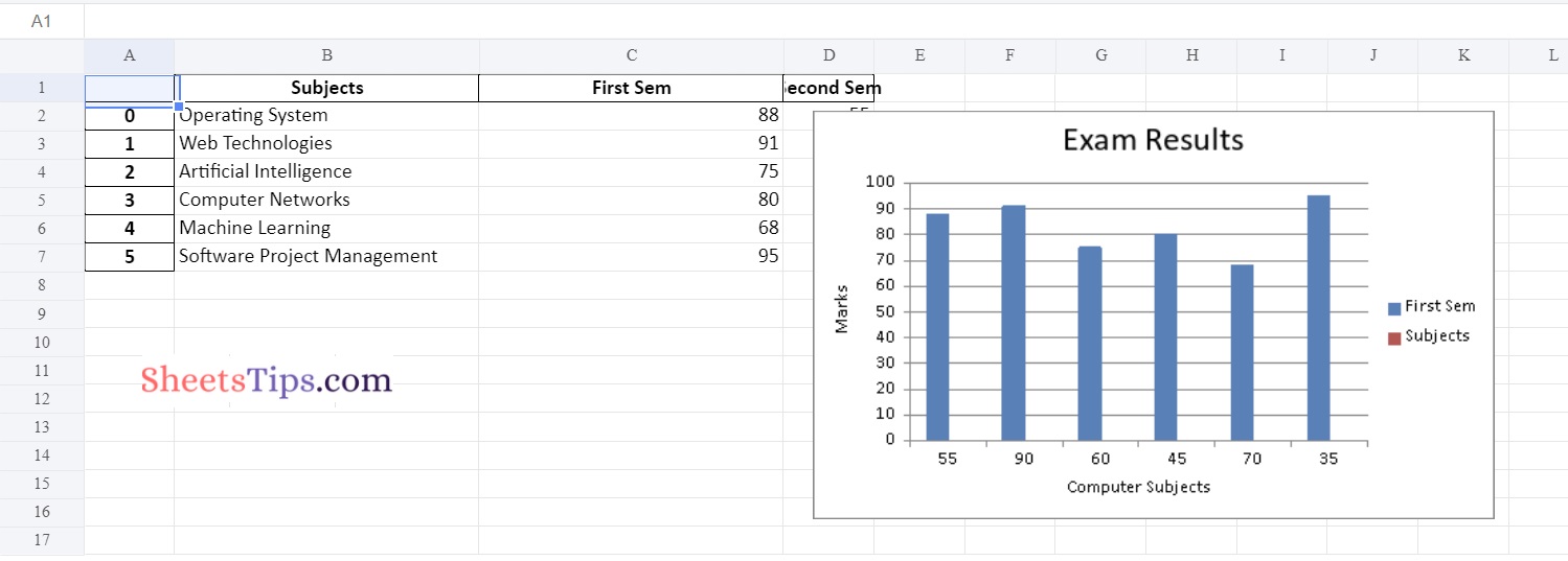
Below is the implementation:
# Import pandas module using the import keyword
import pandas as pd

# Create a Pandas dataframe by passing some random data to the
# DataFrame() function of the pandas module and store it in a variable
datafrme = pd.DataFrame({
                    'Subjects': ["Operating System", "Web Technologies", "Artificial Intelligence",
          "Computer Networks", "Machine Learning", "Software Project Management"],
                'First Sem' : [88, 91, 75, 80, 68, 95],
                'Second Sem' : [55, 90, 60, 45, 70, 35] })

# Pass the excel filepath, engine as xlsxwriter as arguments to the
# ExcelWriter() function of the pandas module to create an excel writer object.
writerObj= pd.ExcelWriter('Demo_ColumnChart.xlsx',
                                    engine ='xlsxwriter')

# Apply to_excel() function on the above dataframe by passing the above writer object,
# sheet name as arguments to it to Write the above dataframe into the worksheet.
datafrme.to_excel(writerObj, sheet_name ='Sheet1')

# Create a xlsxwriter workbook object using the book property and store it in a variable
workbookObj = writerObj.book

# Create a xlsxwriter worksheet object using the sheets property
# and store it in another variable
worksheet = writerObj.sheets['Sheet1']

# Apply set_column() function on the above worksheet to
# Set the width of the B and C columns
worksheet.set_column('B:C', 30)

# Pass a type as column as an argument to the add_chart() function and
# apply it in the above workbook object to create a column chart object .
chartObject = workbookObj.add_chart({'type': 'column'})

# Using the add_series() method, you can add a data series with a pattern to a chart.
# The gap is used to highlight the patterns.

# Add the first series data using the add_series() function
chartObject.add_series({
    'name':       ['Sheet1', 0, 2],
    'categories': ['Sheet1', 1, 3, 6, 3],
    'values':     ['Sheet1', 1, 2, 6, 2],
    })

# Configuring the second series.
# Take note of the usage of different syntax to declare ranges.
# [sheetname, first row, first col, last row, last col]
chartObject.add_series({
    'name':       ['Sheet1', 0, 1],
    'categories': ['Sheet1', 1, 3, 6, 3],
    'values':     ['Sheet1', 1, 1, 6, 1],
    })

# Set the title to the chartObject using the set_title() function by passing the title name as value and key as "name" (Here the arguments are object)
chartObject.set_title({'name': 'Exam Results'})

# Label the x axis using the set_x_axis() function by passing the Computer Subjects as value and key as "name" (Here the arguments are object)
chartObject.set_x_axis({'name': 'Computer Subjects'})

# Label the y axis using the set_x_axis() function by passing the Marks as value and key as "name" (Here the arguments are object)
chartObject.set_y_axis({'name': 'Marks'})

# Add a chartObject to the worksheet with the provided offset values in the top-left corner of a chartObject that is anchored to cell D2.
worksheet.insert_chart('D2', chartObject,
                {'x_offset': 20, 'y_offset': 5})

# Save the above writer object using the save() function
writerObj.save()
Output:
Method #2: Using Pandas and XlsxWriter to Plot a Line chart
Approach:
- Import pandas module using the import keyword
- Create a Pandas dataframe by passing some random data to the DataFrame() function of the pandas module and store it in a variable
- Pass the excel filepath, engine as xlsxwriter as arguments to the ExcelWriter() function of the pandas module to create an excel writer object.
- Apply to_excel() function on the above dataframe by passing the above writer object, sheet name as arguments to it to Write the above dataframe into the worksheet.
- Create a xlsxwriter workbook object using the book property and store it in a variable
- Create a xlsxwriter worksheet object using the sheets property and store it in another variable
- Apply set_column() function on the above worksheet to Set the width of the B and C columns
- Pass a type as a line as an argument to the add_chart() function and apply it in the above workbook object to create a line chart object.
- Using the add_series() method, you can add a data series with a pattern to a chart.
- The gap is used to highlight the patterns.
- Add the first series data using the add_series() function
- Configuring the second series.
- Take note of the usage of different syntax to declare ranges.
- [sheetname, first row, first col, last row, last col]
- Set the title to the chartObject using the set_title() function by passing the title name as value and key as “name” (Here the arguments are object)
- Label the x axis using the set_x_axis() function by passing the Computer Subjects as value and key as “name” (Here the arguments are object)
- Label the y axis using the set_x_axis() function by passing the Marks as value and key as “name” (Here the arguments are object)
- Add a chartObject to the worksheet with the provided offset values in the top-left corner of a chartObject that is anchored to cell D2.
- Save the above writer object using the save() function.
- The Exit of the Program.
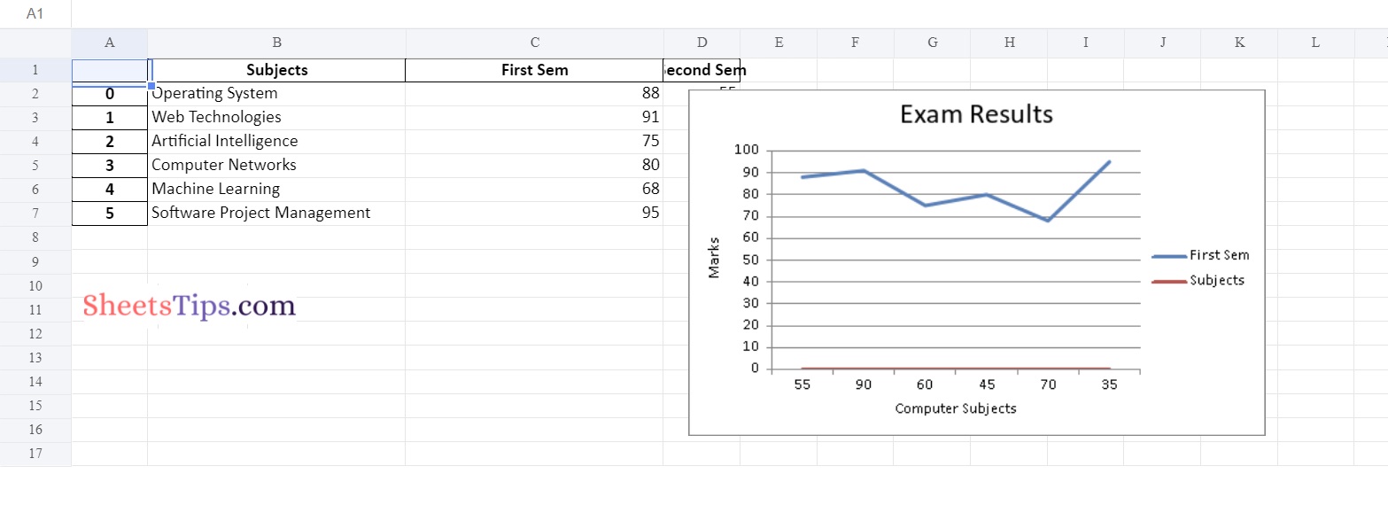
Below is the implementation:
# Import pandas module using the import keyword
import pandas as pd

# Create a Pandas dataframe by passing some random data to the
# DataFrame() function of the pandas module and store it in a variable
datafrme = pd.DataFrame({
                    'Subjects': ["Operating System", "Web Technologies", "Artificial Intelligence",
          "Computer Networks", "Machine Learning", "Software Project Management"],
                'First Sem' : [88, 91, 75, 80, 68, 95],
                'Second Sem' : [55, 90, 60, 45, 70, 35] })

# Pass the excel filepath, engine as xlsxwriter as arguments to the
# ExcelWriter() function of the pandas module to create an excel writer object.
writerObj= pd.ExcelWriter('Demo_LineChart.xlsx',
                                    engine ='xlsxwriter')

# Apply to_excel() function on the above dataframe by passing the above writer object,
# sheet name as arguments to it to Write the above dataframe into the worksheet.
datafrme.to_excel(writerObj, sheet_name ='Sheet1')

# Create a xlsxwriter workbook object using the book property and store it in a variable
workbookObj = writerObj.book

# Create a xlsxwriter worksheet object using the sheets property
# and store it in another variable
worksheet = writerObj.sheets['Sheet1']

# Apply set_column() function on the above worksheet to
# Set the width of the B and C columns
worksheet.set_column('B:C', 30)

# Pass a type as line as an argument to the add_chart() function and
# apply it in the above workbook object to create a line chart object .
chartObject = workbookObj.add_chart({'type': 'line'})


# Using the add_series() method, you can add a data series with a pattern to a chart.
# The gap is used to highlight the patterns.
# Add the first series data using the add_series() function
chartObject.add_series({
    'name':       ['Sheet1', 0, 2],
    'categories': ['Sheet1', 1, 3, 6, 3],
    'values':     ['Sheet1', 1, 2, 6, 2],
    })
# Configuring the second series.
# Take note of the usage of different syntax to declare ranges.
# [sheetname, first row, first col, last row, last col]
chartObject.add_series({
    'name':       ['Sheet1', 0, 1],
    'categories': ['Sheet1', 1, 3, 6, 3],
    'values':     ['Sheet1', 1, 1, 6, 1],
    })


# Set the title to the chartObject using the set_title() function by passing the title name as value and key as "name" (Here the arguments are object)
chartObject.set_title({'name': 'Exam Results'})

# Label the x axis using the set_x_axis() function by passing the Computer Subjects as value and key as "name" (Here the arguments are object)
chartObject.set_x_axis({'name': 'Computer Subjects'})

# Label the y axis using the set_x_axis() function by passing the Marks as value and key as "name" (Here the arguments are object)
chartObject.set_y_axis({'name': 'Marks'})

# Add a chartObject to the worksheet with the provided offset values in the top-left corner of a chartObject that is anchored to cell D2.
worksheet.insert_chart('D2', chartObject,
                {'x_offset': 20, 'y_offset': 5})

# Save the above writer object using the save() function
writerObj.save()
Output:
Method #3: Using Pandas and XlsxWriter to Plot a Scatter chart
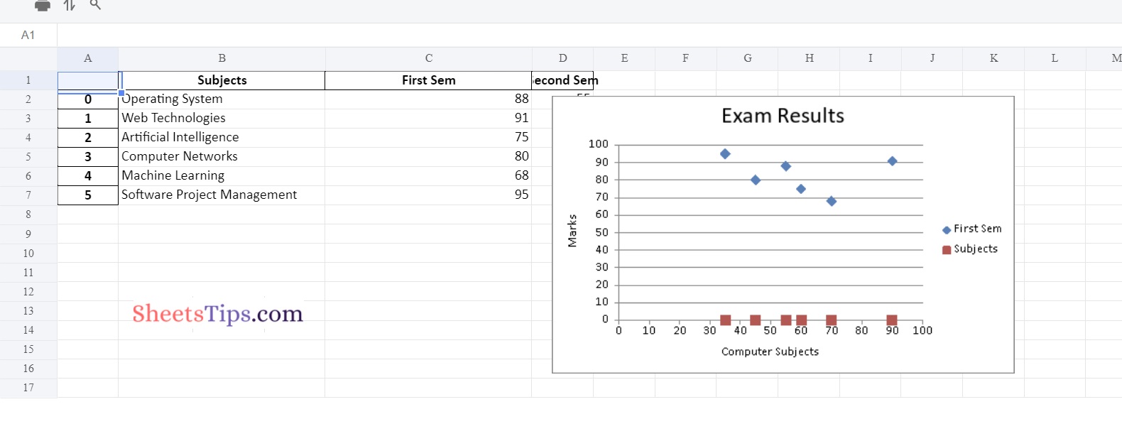
Below is the Implementation:
# Import pandas module using the import keyword
import pandas as pd

# Create a Pandas dataframe by passing some random data to the
# DataFrame() function of the pandas module and store it in a variable
datafrme = pd.DataFrame({
                    'Subjects': ["Operating System", "Web Technologies", "Artificial Intelligence",
          "Computer Networks", "Machine Learning", "Software Project Management"],
                'First Sem' : [88, 91, 75, 80, 68, 95],
                'Second Sem' : [55, 90, 60, 45, 70, 35] })

# Pass the excel filepath, engine as xlsxwriter as arguments to the
# ExcelWriter() function of the pandas module to create an excel writer object.
writerObj= pd.ExcelWriter('Demo_ScatterChart.xlsx',
                                    engine ='xlsxwriter')

# Apply to_excel() function on the above dataframe by passing the above writer object,
# sheet name as arguments to it to Write the above dataframe into the worksheet.
datafrme.to_excel(writerObj, sheet_name ='Sheet1')

# Create a xlsxwriter workbook object using the book property and store it in a variable
workbookObj = writerObj.book

# Create a xlsxwriter worksheet object using the sheets property
# and store it in another variable
worksheet = writerObj.sheets['Sheet1']

# Apply set_column() function on the above worksheet to
# Set the width of the B and C columns
worksheet.set_column('B:C', 30)

# Pass a type as scatter as an argument to the add_chart() function and
# apply it in the above workbook object to create a scatter chart object .
chartObject = workbookObj.add_chart({'type': 'scatter'})

# Using the add_series() method, you can add a data series with a pattern to a chart.
# The gap is used to highlight the patterns.

# Add the first series data using the add_series() function
chartObject.add_series({
    'name':       ['Sheet1', 0, 2],
    'categories': ['Sheet1', 1, 3, 6, 3],
    'values':     ['Sheet1', 1, 2, 6, 2],
    })

# Configuring the second series.
# Take note of the usage of different syntax to declare ranges.
# [sheetname, first row, first col, last row, last col]
chartObject.add_series({
    'name':       ['Sheet1', 0, 1],
    'categories': ['Sheet1', 1, 3, 6, 3],
    'values':     ['Sheet1', 1, 1, 6, 1],
    })

# Set the title to the chartObject using the set_title() function by passing the title name as value and key as "name" (Here the arguments are object)
chartObject.set_title({'name': 'Exam Results'})

# Label the x axis using the set_x_axis() function by passing the Computer Subjects as value and key as "name" (Here the arguments are object)
chartObject.set_x_axis({'name': 'Computer Subjects'})

# Label the y axis using the set_x_axis() function by passing the Marks as value and key as "name" (Here the arguments are object)
chartObject.set_y_axis({'name': 'Marks'})

# Add a chartObject to the worksheet with the provided offset values in the top-left corner of a chartObject that is anchored to cell D2.
worksheet.insert_chart('D2', chartObject,
                {'x_offset': 20, 'y_offset': 5})

# Save the above writer object using the save() function
writerObj.save()
Output:
Also Read: Python Program to Take in the Marks of 5 Subjects and Display the Grade