
The Xlsx module in Python is one of the most important libraries in Python that helps us plot graphs in the Excel worksheet. The Xlsx library in Python does various things, such as importing, writing, performing mathematical operations, plotting charts into Excel, and much more.
To create a chart in Excel using Python, it is extremely important for users to create a chart object for the required chart type before inserting the chart sheet in Excel. Once the chart objects are defined in Python, simply enter the data and insert the same into the sheet objects to create a chart in Excel in Python. This page explains the details on how to add a chart to an Excel workbook using the Python Xlsx libraries, with examples. Scroll down to find out more.
How to Add a Chart Sheet to an Excel Sheet using Python Libraries?
Charts are made up of a series of one or more data points. The series is made up of references to cell ranges. To plot the charts on an excel sheet, first create a chart object of the desired chart type ( i.e Stock chart, etc.). After generating chart objects, insert data into them before adding them to the sheet object.
ChartSheet:
A ChartSheet depicts a chart sheet or a worksheet that only contains a chart. Create a Chart instead if you wish to embed a chart in a worksheet that also contains other things, such as cells or other controls.
A ChartSheet in the Excel object model provides all of the chart-related features of a native Microsoft.Office.Interop.Excel.Chart object. A ChartSheet, on the other hand, exposes events. ChartSheet objects can only be created at design time in a document-level project.
Install the xlsxwriter using the below code
pip install xlsxwriter
Looking in indexes: https://pypi.org/simple, https://us-python.pkg.dev/colab-wheels/public/simple/
Collecting xlsxwriter
Downloading XlsxWriter-3.0.3-py3-none-any.whl (149 kB)
|████████████████████████████████| 149 kB 5.0 MB/s
Installing collected packages: xlsxwriter
Successfully installed xlsxwriter-3.0.3
Program to Add a Chartsheet to an Excel sheet using XlsxWriter module in Python
Below is the Full Implementation to add a ChartSheet to an Excel Sheet using the XlsxWriter Module in Python
Approach:
- Import the xlsxwriter library using the import function.
- Pass the excel file path to the Workbook() function of xlsxwriter which is the file we want to create and store in a variable.
- Create the new Worksheet using the add_worsheet() function, apply it to the above workbook object, and store it in a variable.
- Create a new chartSheet using the add_chartsheet() function and store this in a variable
- Create a new Format object to format cells in spreadsheets using the add_format() method and apply it to the above workbook object.
- Here, we created a bold format object.
- Add the worksheet data that the charts will use.
- Write a row of heading data starting with ‘A1’ in the bold format using the write_row() function and apply on the above worksheet object by passing the argument rowNumber,headings list,and format.
- Write the column data that is starting from ‘A2′,’B2′,’C2’ using the write_coulmn() function and pass data as argument to it.
- Write a column of data starting from ‘A2’, ‘B2’, ‘C2’ respectively .
- Using the add_chart() method, create a chart object that can be added to a worksheet.
- Pass the type of chart as an argument to the add_chart() function and apply it to the above workbook object
- Using the add series() method, you can add a data series with a gradient pattern to a chart.
- The gap is used to highlight the patterns.
- Add the first series data using the add_series() function.
- Configuring the second series.
- Take note of the usage of different syntax to declare ranges [sheetname, first row, first col, last row, last col].
- Set the title to the chartObject using the set_title() function by passing the chart title name as value and key as “name” (Here the arguments are object).
- Label the x-axis using the set_x_axis() function by passing the Sem Number as value and key as “name” (Here the arguments are object).
- Label the y axis using the set_x_axis() function by passing the Data length as value and key as “name” (Here the arguments are object).
- Set the style of chart using the set_style() function.
- Set the Above ChartObject to the chartSheet using the set_chart() function
- When the workbook is opened, make the chartsheet the active sheet using the activate() function.
- Close the workbook Object using the close() function.
Below is the Implementation:
# Import the xlsxwriter library using the import function
import xlsxwriter
# Pass the excel file path to the Workbook() function of xlsxwriter
# which is the file we want to create and store it in a variable
workbookObj = xlsxwriter.Workbook('chartSheet.xlsx')
# Create the new Worksheet using the add_worsheet() function and
# apply it to the above workbook object and store it in a variable
newWorksheet = workbookObj.add_worksheet()
# Create a new chartSheet using the add_chartsheet() function
# and store this in a variable
chartSheet = workbookObj.add_chartsheet()
# Create a new Format object to format cells in spreadsheets using the add_format() method and apply it to the above workbook object.
# Here, we created a bold format object. .
boldFormat = workbookObj.add_format({'bold': 1})
# Add the worksheet data that the charts will use.
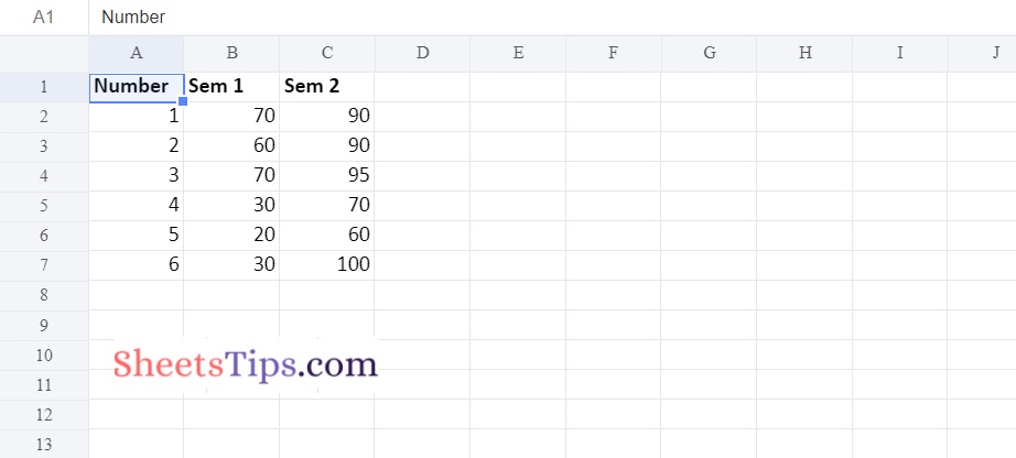
headingsData = ['Number', 'Sem 1', 'Sem 2']
worksheetData = [
[1, 2, 3, 4, 5, 6],
[70, 60, 70, 30, 20, 30],
[90, 90, 95, 70, 60, 100]
]
# Write a row of heading data starting with 'A1' in bold format using the write_row() function
# and apply on the above worksheet object
# by passing the argument rowNumber,headings list,and format.
newWorksheet.write_row('A1', headingsData, boldFormat)
# Write the column data that is starting from 'A2','B2','C2'
# using the write_coulmn() function
# and pass data as argument to it
# Write a column of data starting from
# 'A2', 'B2', 'C2' respectively .
newWorksheet.write_column('A2', worksheetData[0])
newWorksheet.write_column('B2', worksheetData[1])
newWorksheet.write_column('C2', worksheetData[2])
# Using the add_chart() method, create a chart object that can be added to a worksheet.
# Pass the type of chart as an argument to the add_chart() function and apply it to the above workbook object
chartObject = workbookObj.add_chart({'type': 'line'})
# Using the add series() method, you can add a data series with a gradient pattern to a chart.
# The gap is used to highlight the patterns.
# Add the first series data using the add_series() function
chartObject.add_series({
'name': '= Sheet1 !$B$1',
'categories': '= Sheet1 !$A$2:$A$7',
'values': '= Sheet1 !$B$2:$B$7'
})
# Configuring the second series.
# Take note of the usage of different syntax to declare ranges.
#[sheetname, first row, first col, last row, last col]
chartObject.add_series({
'name': ['Sheet1', 0, 2],
'categories': ['Sheet1', 1, 0, 6, 0],
'values': ['Sheet1', 1, 2, 6, 2],
})
# Set the title to the chartObject using the set_title() function
# by passing the chart title name as value and key as "name" (Here the arguments are object)
chartObject.set_title ({'name': 'Results of data analysis using ChartSheet'})
# Label the x axis using the set_x_axis() function by passing the Sem Number as value and key as "name" (Here the arguments are object)
chartObject.set_x_axis({'name': 'Test number'})
# Label the y axis using the set_x_axis() function by passing the Data length as value and key as "name" (Here the arguments are object)
chartObject.set_y_axis({'name': 'Data length (mm)'})
# set the style of chart using the set_style() function
chartObject.set_style(11)
# Set the Above ChartObject to the chartSheet using the set_chart() function
chartSheet.set_chart(chartObject)
# When the workbook is opened, make the chartsheet the active sheet using the activate() function
chartSheet.activate();
# Close the workbook Object using the close() function.
workbookObj.close()
Output:
Now that you are provided with all the necessary information on how to add the chart sheet to the Excel workbook using Python, Xlsx is one of the most widely used libraries in Python that lets users perform various types of functions, right from reading data to performing mathematics operations. Among those functions, inserting charts into Excel is one of the most useful functions performed by Xlsx module.