
If you are looking for information on plotting combined graphs in Excel using Python, you have landed on the right page. Python has a library named XlsxWriter which is used to perform various operations on the Excel file, such as creating, writing, arithmetic calculations, plotting graphs, and much more. Using the XlsxWriter in Python, we can also create various types of charts, such as stacked bar charts, combined charts, combo charts, etc.
On this page, we will discuss everything about how to plot a graph in Excel using Python with live examples. Scroll down to learn more.
How To Generate Combined Graphs in Excel in Google Sheets?
Charts are made up of a series of one or more data points. The series is made up of references to cell ranges. To plot the charts on an excel sheet, first create a chart object of the desired chart type ( i.e Stock chart, etc.). After generating chart objects, insert data into them before adding them to the sheet object.
Install the xlsxwriter using the below code
pip install xlsxwriter
Looking in indexes: https://pypi.org/simple, https://us-python.pkg.dev/colab-wheels/public/simple/
Collecting xlsxwriter
Downloading XlsxWriter-3.0.3-py3-none-any.whl (149 kB)
|████████████████████████████████| 149 kB 5.0 MB/s
Installing collected packages: xlsxwriter
Successfully installed xlsxwriter-3.0.3
Program to Plot Combined Charts in Excel Sheet using XlsxWriter module in Python
Approach:
- Import the xlsxwriter library using the import function.
- Pass the excel file path to the Workbook() function of xlsxwriter which is the file we want to create and store in a variable.
- Create the new Worksheet using the add_worsheet() function and apply it to the above workbook object and store it in a variable.
- Create a new Format object to format cells in spreadsheets using the add_format() method and apply it to the above workbook object.
- Here, we created a bold format object.
- Add the worksheet data that the charts will use.
- Write a row of heading data starting with ‘A1’ in the bold format using the write_row() function and apply it to the above worksheet object by passing the argument row number, headings list, and format.
- Write the column data that is starting from ‘A2’, ‘B2’, ‘C2’ using the write_coulmn() function and pass data as an argument to it.
- Write a column of data starting from ‘A2’, ‘B2’, ‘C2’ respectively .
- Using the add_chart() method, create a chart object that can be added to a worksheet.
- Pass the type of chart as an argument to the add_chart() function and apply it to the above workbook object.
- Using the add series() method, you can add a data series with a gradient pattern to a chart.
- The gap is used to highlight the patterns.
- Add the first series data using the add_series() function.
- Create a new line chart using the add_chart() function which will be the secondary chart.
- Add the data series to the line chart using the add_series() function and apply it to the above lineChart object.
- Merge/Combine both line and column chart using the combine() function.
- Combine both column and line charts together.
- Set the title to the chartObject using the set_title() function by passing the title name as value and key as “name” (Here the arguments are object).
- Label the x axis using the set_x_axis() function by passing the Sem Number as value and key as “name” (Here the arguments are object).
- Label the y axis using the set_x_axis() function by passing the Data length as value and key as “name” (Here the arguments are object).
- Add a chartObject to the worksheet with the provided offset values in the top-left corner of a chartObject that is anchored to cell D2.
- Close the workbook Object using the close() function.
- The Exit of the Program.
Below is the Implementation:
# Import the xlsxwriter library using the import function
import xlsxwriter
# Pass the excel file path to the Workbook() function of xlsxwriter
# which is the file we want to create and store it in a variable
workbookObj = xlsxwriter.Workbook('chartCombined.xlsx')
# Create the new Worksheet using the add_worsheet() function and
# apply it to the above workbook object and store it in a variable
newWorksheet = workbookObj.add_worksheet()
# Create a new Format object to format cells in spreadsheets using the add_format() method and apply it to the above workbook object.
# Here, we created a bold format object. .
boldFormat = workbookObj.add_format({'bold': 1})
# Add the worksheet data that the charts will use.
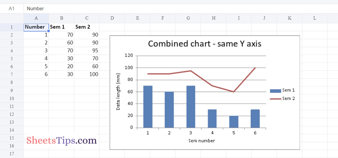
headingsData = ['Number', 'Sem 1', 'Sem 2']
worksheetData = [
[1, 2, 3, 4, 5, 6],
[70, 60, 70, 30, 20, 30],
[90, 90, 95, 70, 60, 100]
]
# Write a row of heading data starting with 'A1' in bold format using the write_row() function
# and apply on the above worksheet object
# by passing the argument rowNumber,headings list,and format.
newWorksheet.write_row('A1', headingsData, boldFormat)
# Write the column data that is starting from 'A2','B2','C2'
# using the write_coulmn() function
# and pass data as argument to it
# Write a column of data starting from
# 'A2', 'B2', 'C2' respectively .
newWorksheet.write_column('A2', worksheetData[0])
newWorksheet.write_column('B2', worksheetData[1])
newWorksheet.write_column('C2', worksheetData[2])
# Using the add_chart() method, create a chart object that can be added to a worksheet.
# Pass the type of chart as an argument to the add_chart() function and apply it to the above workbook object
columnchartObject = workbookObj.add_chart({'type': 'column'})
# Using the add series() method, you can add a data series with a gradient pattern to a chart.
# The gap is used to highlight the patterns.
# Add the first series data using the add_series() function
columnchartObject.add_series({
'name': '= Sheet1 !$B$1',
'categories': '= Sheet1 !$A$2:$A$7',
'values': '= Sheet1 !$B$2:$B$7'
})
# Create a new line chart using the add_chart() function which will be the secondary chart
lineChart = workbookObj.add_chart({'type': 'line'})
# Add the data series to the line chart using the add_series() function and apply on the above lineChart object
lineChart.add_series({
'name': '= Sheet1 !$C$1',
'categories': '= Sheet1 !$A$2:$A$7',
'values': '= Sheet1 !$C$2:$C$7',
})
# Merge/Combine both line and column chart using the combine() function
# Combine both column and line charts together.
columnchartObject.combine(lineChart)
# Set the title to the chartObject using the set_title() function by passing the title name as value and key as "name" (Here the arguments are object)
columnchartObject.set_title({ 'name': 'Combined chart - same Y axis'})
# Label the x axis using the set_x_axis() function by passing the Sem Number as value and key as "name" (Here the arguments are object)
columnchartObject.set_x_axis({'name': 'Sem number'})
# Label the y axis using the set_x_axis() function by passing the Data length as value and key as "name" (Here the arguments are object)
columnchartObject.set_y_axis({'name': 'Data length (mm)'})
# Add a chartObject to the worksheet with the provided offset values in the top-left corner of a chartObject that is anchored to cell D2.
newWorksheet.insert_chart('D2', columnchartObject, {'x_offset': 25, 'y_offset': 10})
# Close the workbook Object using the close() function.
workbookObj.close()
Output:
Here is the combined Y-axis of the Column Chart and Line Chart
XlsxWriter is one of the most useful functions which is not only limited to plotting graphs in Excel. The XlsxWriter function in the Python library also allows users to read, write, perform arithmetical operations, and many others. Stay tuned to Sheetstips.com for more information related to the XlsxWriter function in Python.