

One of the most important Python libraries for helping us plot pie charts in the Excel worksheet is the Xlsx module. The Python Xlsx package can import data, write data, execute mathematical operations, display charts in Excel, and much more.
To create a pie chart in Excel using Python, it is extremely important for users to create a chart object for the required chart type before inserting the chart sheet in Excel. Once the pie chart objects are defined in Python, simply enter the data and insert the same into the sheet objects to create a pie chart in Excel in Python. This page explains the details on how to add a chart to an Excel workbook using the Python Xlsx libraries, with examples. Scroll down to find out more.
Python Program to Plot Pie Charts in Excel Sheet using XlsxWriter module
Charts are made up of a series of one or more data points. The series are made up of references to cell ranges. To plot the charts on an excel sheet, first create a chart object of the desired chart type ( i.e Stock chart, etc.). After generating chart objects, insert data into them before adding them to the sheet object.
Install the xlsxwriter using the below code
pip install xlsxwriter
Looking in indexes: https://pypi.org/simple, https://us-python.pkg.dev/colab-wheels/public/simple/
Collecting xlsxwriter
Downloading XlsxWriter-3.0.3-py3-none-any.whl (149 kB)
|████████████████████████████████| 149 kB 5.0 MB/s
Installing collected packages: xlsxwriter
Successfully installed xlsxwriter-3.0.3
Program to Plot Pie Charts in Excel Sheet using XlsxWriter module in Python
Below are the examples of how to plot different types of pie charts in an Excel Sheet using the XlsxWriter module in Python:
- Plotting Simple Pie Chart
- Plotting Pie Chart with user defined colors
- Plotting a Pie chart with rotation of the segments
Example #1: Plotting Simple Pie Chart
Approach:
- Import the xlsxwriter library using the import function.
- Pass the excel file path to the Workbook() function of xlsxwriter which is the file we want to create and store in a variable.
- Create the new Worksheet using the add_worsheet() function and apply it to the above workbook object and store it in a variable.
- Create a new Format object to format cells in spreadsheets using the add_format() method and apply it to the above workbook object.
- Here, we created a bold format object.
- Add the worksheet data that the charts will use.
- Write a row of heading data starting with ‘A1’ in the bold format using the write_row() function and apply it to the above worksheet object by passing the argument row number, headings list, and format.
- Write the column data that is starting from ‘A2’, ‘B2’ using the write_coulmn() function and pass data as an argument to it.
- Write a column of data starting from ‘A2’, and ‘B2’ respectively.
- Using the add_chart() method, create a chart object that can be added to a worksheet.
- Pass the type of chart as an argument to the add_chart() function and apply it to the above workbook object.
- Using the add series() method, you can add a data series with a pattern to a chart.
- The gap is used to highlight the patterns.
- Add the first series(Bricks) data using the add_series() function.
- Configuring the First series.
- Below is the Syntax to define ranges [sheetname, first_row, first_col, last_row, last_col].
- Set the title to the chartObject using the set_title() function by passing the name as value and key as “name” (Here the arguments are object).
- Set the style of the chart using the set_style() function.
- Add a chartObject to the worksheet with the provided offset values in the top-left corner of a chartObject that is anchored to cell C2.
- Close the workbook Object using the close() function.
- The Exit of the Program.
Below is the Implementation:
# Import the xlsxwriter library using the import function
import xlsxwriter

# Pass the excel file path to the Workbook() function of xlsxwriter
# which is the file we want to create and store it in a variable
workbookObj = xlsxwriter.Workbook('chartDoughnut1.xlsx')

# Create the new Worksheet using the add_worsheet() function and
# apply it to the above workbook object and store it in a variable
newWorksheet = workbookObj.add_worksheet()


# Create a new Format object to format cells in spreadsheets using the add_format() method and apply it to the above workbook object.
# Here, we created a bold format object. .
boldFormat = workbookObj.add_format({'bold': 1})

# Add the worksheet data that the charts will use.
headingsData = ['Category', 'Values']
worksheetData = [
    ['Blue', 'Red', 'Pink'],
    [70, 55, 25],
]

# Write a row of heading data starting with 'A1' in bold format using the write_row() function
# and apply on the above worksheet object
# by passing the argument rowNumber,headings list,and format.
newWorksheet.write_row('A1', headingsData, boldFormat)

# Write the column data that is starting from 'A2','B2' using the write_coulmn() function
# and pass data as argument to it
# Write a column of data starting from
# 'A2', 'B2' respectively .
newWorksheet.write_column('A2', worksheetData[0])
newWorksheet.write_column('B2', worksheetData[1])

# Using the add_chart() method, create a chart object that can be added to a worksheet.
# Pass the type of chart as an argument to the add_chart() function
# and apply it to the above workbook object
chartObj = workbookObj.add_chart({'type': 'doughnut'})

# Using the add series() method, you can add a data series with a pattern to a chart.
# The gap is used to highlight the patterns.
# Add the first series(Bricks) data using the add_series() function

# Configuring First series.
# Below is the Syntax to define ranges
# [sheetname, first_row, first_col, last_row, last_col].
chartObj.add_series({
    'name':     'Doughnut Colour sales data',
    'categories': ['Sheet1', 1, 0, 3, 0],
    'values':     ['Sheet1', 1, 1, 3, 1],
})

# Set the title to the chartObject using the set_title() function
# by passing the name as value and key as "name" (Here the arguments are object)
chartObj.set_title ({'name': 'Doughnut Types'})

# Set the style of the chart using the set_style() function
chartObj.set_style(12)

# Add a chartObject to the worksheet with the provided offset values in the top-left corner of a chartObject that is anchored to cell C2.
newWorksheet.insert_chart('C2', chartObj, {'x_offset': 25, 'y_offset': 10})

# Close the workbook Object using the close() function.
workbookObj.close()
Output:
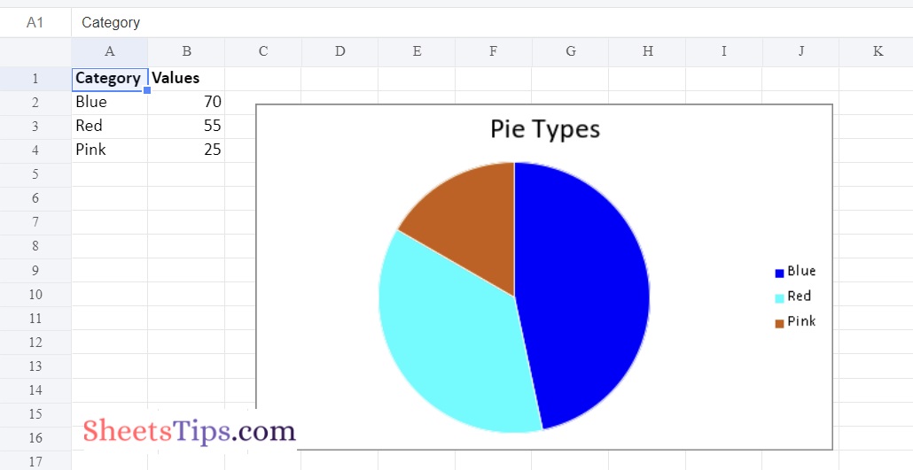
Example #2: Plotting Pie Chart with user defined colors
Use the add_series() function of a chart object with the points keyword argument to plot a pie chart with user defined segment colors on an excel sheet.
Below is the Implementation:
# Import the xlsxwriter library using the import function
import xlsxwriter
# Pass the excel file path to the Workbook() function of xlsxwriter
# which is the file we want to create and store it in a variable
workbookObj = xlsxwriter.Workbook('chartPie1.xlsx')
# Create the new Worksheet using the add_worsheet() function and
# apply it to the above workbook object and store it in a variable
newWorksheet = workbookObj.add_worksheet()
# Create a new Format object to format cells in spreadsheets using the add_format() method and apply it to the above workbook object.
# Here, we created a bold format object. .
boldFormat = workbookObj.add_format({'bold': 1})
# Add the worksheet data that the charts will use.
headingsData = ['Category', 'Values']
worksheetData = [
['Blue', 'Red', 'Pink'],
[70, 55, 25],
]
# Write a row of heading data starting with 'A1' in bold format using the write_row() function
# and apply on the above worksheet object
# by passing the argument rowNumber,headings list,and format.
newWorksheet.write_row('A1', headingsData, boldFormat)
# Write the column data that is starting from 'A2','B2' using the write_coulmn() function
# and pass data as argument to it
# Write a column of data starting from
# 'A2', 'B2' respectively .
newWorksheet.write_column('A2', worksheetData[0])
newWorksheet.write_column('B2', worksheetData[1])
# Using the add_chart() method, create a chart object that can be added to a worksheet.
# Pass the type of chart as an argument to the add_chart() function
# and apply it to the above workbook object
chartObj = workbookObj.add_chart({'type': 'pie'})
# Configuring First series.
# Below is the Syntax to define ranges
# [sheetname, first_row, first_col, last_row, last_col].
chartObj.add_series({
'name': 'Pie Colour sales data',
'categories': ['Sheet1', 1, 0, 3, 0],
'values': ['Sheet1', 1, 1, 3, 1],
'points': [
{'fill': {'color': '# 0000FF'}},
{'fill': {'color': '# 00FFFF'}},
{'fill': {'color': '# CA5C05'}},
],
})
# Set the title to the chartObject using the set_title() function
# by passing the name as value and key as "name" (Here the arguments are object)
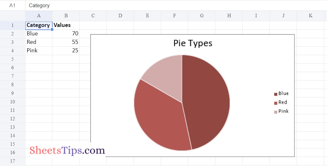
chartObj.set_title ({'name': 'Pie Types'})
# Set the style of the chart using the set_style() function
chartObj.set_style(12)
# Add a chartObject to the worksheet with the provided offset values in the top-left corner of a chartObject that is anchored to cell C2.
newWorksheet.insert_chart('C2', chartObj, {'x_offset': 25, 'y_offset': 10})
# Close the workbook Object using the close() function.
workbookObj.close()
Output:
Method #3: Plotting a Pie chart with rotation of the segments
Set the chart object’s set_rotation() method with a definite angle input to plot a pie chart with segment rotation on an excel sheet.
Below is the Implementation:
# Import the xlsxwriter library using the import function
import xlsxwriter

# Pass the excel file path to the Workbook() function of xlsxwriter
# which is the file we want to create and store it in a variable
workbookObj = xlsxwriter.Workbook('chartPie2.xlsx')

# Create the new Worksheet using the add_worsheet() function and
# apply it to the above workbook object and store it in a variable
newWorksheet = workbookObj.add_worksheet()


# Create a new Format object to format cells in spreadsheets using the add_format() method and apply it to the above workbook object.
# Here, we created a bold format object. .
boldFormat = workbookObj.add_format({'bold': 1})

# Add the worksheet data that the charts will use.
headingsData = ['Category', 'Values']
worksheetData = [
    ['Blue', 'Red', 'Pink'],
    [70, 55, 25],
]

# Write a row of heading data starting with 'A1' in bold format using the write_row() function
# and apply on the above worksheet object
# by passing the argument rowNumber,headings list,and format.
newWorksheet.write_row('A1', headingsData, boldFormat)

# Write the column data that is starting from 'A2','B2' using the write_coulmn() function
# and pass data as argument to it
# Write a column of data starting from
# 'A2', 'B2' respectively .
newWorksheet.write_column('A2', worksheetData[0])
newWorksheet.write_column('B2', worksheetData[1])

# Using the add_chart() method, create a chart object that can be added to a worksheet.
# Pass the type of chart as an argument to the add_chart() function
# and apply it to the above workbook object
chartObj = workbookObj.add_chart({'type': 'pie'})

# Configuring First series.
# Below is the Syntax to define ranges
# [sheetname, first_row, first_col, last_row, last_col].
chartObj.add_series({
    'name':     'Pie Colour sales data',
    'categories': ['Sheet1', 1, 0, 3, 0],
    'values':     ['Sheet1', 1, 1, 3, 1],
    'points': [
        {'fill': {'color': '# 0000FF'}},
        {'fill': {'color': '# 00FFFF'}},
        {'fill': {'color': '# CA5C05'}},
    ],
})

# Set the title to the chartObject using the set_title() function
# by passing the name as value and key as "name" (Here the arguments are object)
chartObj.set_title ({'name': 'Pie Types'})

# Set the style of the chart using the set_style() function
chartObj.set_style(12)
# Change the rotation(angle) of the first segment using ther set_rotation() function
chartObj.set_rotation(90)
# Add a chartObject to the worksheet with the provided offset values in the top-left corner of a chartObject that is anchored to cell C2.
newWorksheet.insert_chart('C2', chartObj, {'x_offset': 25, 'y_offset': 10})

# Close the workbook Object using the close() function.
workbookObj.close()
Output:
Xlsx is one of the most popular Python libraries that allows users to conduct a variety of functions, from reading data to completing mathematical operations. Now that you have all the information on how to insert the pie chart into the Excel file using Python, you can move on. One of the most useful tasks carried out by the xlsx module is the insertion of pie chart charts into Excel.