
The Xlsx module of the Python programming language is one of the most important libraries for helping us plot column charts in an Excel worksheet. The Python Xlsx library can do mathematical operations, display charts in Excel, import data, write data, and much more.
It is important for users to establish a chart object for the necessary chart type before inserting the chart sheet in Excel in order to make a column chart in Excel using Python. Once the Python objects for the column charts have been defined, all that is needed to construct a column chart in Excel in Python is to enter the data and insert the same into the sheet objects. This page provides instructions and examples for adding a column chart to an Excel worksheet using the Python Xlsx library.
Insert Column Charts in Excel Sheet With Data Tables
Charts are made up of a series of one or more data points. The series are made up of references to cell ranges. To plot the charts on an excel sheet, first create a chart object of the desired chart type ( i.e Stock chart, etc.). After generating chart objects, insert data into them before adding them to the sheet object.
Install the xlsxwriter using the below code
pip install xlsxwriter
Looking in indexes: https://pypi.org/simple, https://us-python.pkg.dev/colab-wheels/public/simple/
Collecting xlsxwriter
Downloading XlsxWriter-3.0.3-py3-none-any.whl (149 kB)
|████████████████████████████████| 149 kB 5.0 MB/s
Installing collected packages: xlsxwriter
Successfully installed xlsxwriter-3.0.3
Program to Plot Column Charts in Excel Sheet with Data tables using XlsxWriter module in Python
Below is the full approach to Plot the Column Charts in Excel Sheet with Data Tables using the XlsxWriter Module in Python.
Approach:
- Import the xlsxwriter library using the import function.
- Pass the excel file path to the Workbook() function of xlsxwriter which is the file we want to create and store it in a variable.
- Create the new Worksheet using the add_worsheet() function and apply it to the above workbook object and store it in a variable.
- Create a new Format object to format cells in spreadsheets using the add_format() method and apply it to the above workbook object.
- Here, we created a bold format object.
- Add the worksheet data that the charts will use.
- Write a row of heading data starting with ‘A1’ in the bold format using the write_row() function and apply it to the above worksheet object by passing the argument row number, headings list, and format.
- Write the column data that is starting from ‘A2’, ‘B2’, and ‘C2’ using the write_coulmn() function and pass data as an argument to it.
- Write a column of data starting from ‘A2’, ‘B2’, ‘C2’ respectively .
- Change the width of the column using the set_column() function.
- Using the add_chart() method, create a chart object that can be added to a worksheet.
- Pass the type of chart as an argument to the add_chart() function and apply it to the above workbook object.
- Using the add series() method, you can add a data series with a pattern to a chart.
- The gap is used to highlight the patterns.
- Add the first series data using the add_series() function.
- Configuring the second series.
- Take note of the usage of different syntax to declare ranges. [sheetname, first row, first col, last row, last col]
- Set the title to the chartObject using the set_title() function by passing the title name as value and key as “name” (Here the arguments are object).
- Label the x axis using the set_x_axis() function by passing the Computer Subjects as value and key as “name” (Here the arguments are object).
- Label the y axis using the set_x_axis() function by passing the Marks as value and key as “name” (Here the arguments are object).
- Set the style of the chart using the set_style() function.
- Set the Layout of the plot Area of the chart using the set_plotarea() function.
- Set the data table on the X-axis with legend keys visible using the set_table() function.
- Add a chartObject to the worksheet with the provided offset values in the top-left corner of a chartObject that is anchored to cell D2.
- Close the workbook Object using the close() function.
- The Exit of the Program.
Below is the Implementation:
# Import the xlsxwriter library using the import function
import xlsxwriter
# Pass the excel file path to the Workbook() function of xlsxwriter
# which is the file we want to create and store it in a variable
workbookObj = xlsxwriter.Workbook('chartColumn.xlsx')
# Create the new Worksheet using the add_worsheet() function and
# apply it to the above workbook object and store it in a variable
newWorksheet = workbookObj.add_worksheet()
# Create a new Format object to format cells in spreadsheets using the add_format() method and apply it to the above workbook object.
# Here, we created a bold format object. .
boldFormat = workbookObj.add_format({'bold': 1})
# Add the worksheet data that the charts will use.
headingsData = ['Subject', 'First Sem', 'Second Sem']
Data2 = [["Operating System", "Web Technologies", "Artificial Intelligence",
"Computer Networks", "Machine Learning", "Software Project Management"],
[92, 75, 84, 82, 66, 63],
[90, 67, 72, 75, 63, 61]]
# Write a row of heading data starting with 'A1' in bold format using the write_row() function
# and apply on the above worksheet object
# by passing the argument rowNumber,headings list,and format.
newWorksheet.write_row('A1', headingsData, boldFormat)
# Write the column data that is starting from 'A2','B2','C2'
# using the write_coulmn() function
# and pass data as argument to it
# Write a column of data starting from
# 'A2', 'B2', 'C2' respectively .
newWorksheet.write_column('A2', worksheetData[0])
newWorksheet.write_column('B2', worksheetData[1])
newWorksheet.write_column('C2', worksheetData[2])
# Change the width of the column using the set_column() function
newWorksheet.set_column('B:C', 25)
# Using the add_chart() method, create a chart object that can be added to a worksheet.
# Pass the type of chart as an argument to the add_chart() function and apply it to the above workbook object
chartObject = workbookObj.add_chart({'type': 'column'})
# Using the add series() method, you can add a data series with a pattern to a chart.
# The gap is used to highlight the patterns.
# Add the first series data using the add_series() function
chartObject.add_series({
'name': '= Sheet1 !$B$1',
'categories': '= Sheet1 !$A$2:$A$7',
'values': '= Sheet1 !$B$2:$B$7',
})
# Configuring the second series.
# Take note of the usage of different syntax to declare ranges.
#[sheetname, first row, first col, last row, last col]
chartObject.add_series({
'name': ['Sheet1', 0, 2],
'categories': ['Sheet1', 1, 0, 6, 0],
'values': ['Sheet1', 1, 2, 6, 2],
})
# Set the title to the chartObject using the set_title() function by passing the title name as value and key as "name" (Here the arguments are object)
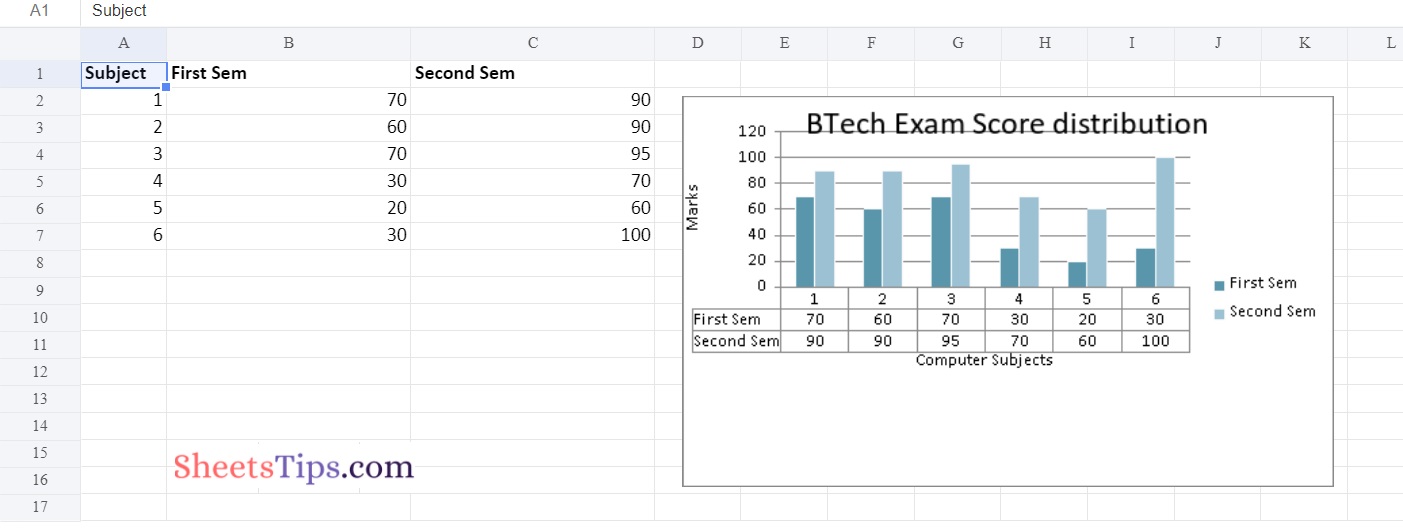
chartObject.set_title({'name': 'BTech Exam Score distribution'})
# Label the x axis using the set_x_axis() function by passing the Computer Subjects as value and key as "name" (Here the arguments are object)
chartObject.set_x_axis({'name': 'Computer Subjects'})
# Label the y axis using the set_x_axis() function by passing the Marks as value and key as "name" (Here the arguments are object)
chartObject.set_y_axis({'name': 'Marks'})
# Set the style of the chart using the set_style() function
chartObject.set_style(15)
#Set the Layout of the plot Area of the chart using the set_plotarea() function
chartObject.set_plotarea({
'layout': {
'x': 0.15,
'y': 0.09,
'width': 0.63,
'height': 0.40, } })
# Set the data table on the X-axis with legend keys visible using the set_table function.
chartObject.set_table()
# Add a chartObject to the worksheet with the provided offset values in the top-left corner of a chartObject that is anchored to cell D2.
newWorksheet.insert_chart('D2', chartObject,
{'x_offset': 20, 'y_offset': 5})
# Close the workbook Object using the close() function.
workbookObj.close()
Output:
One of the robust programming languages that enables us to automate Excel is Python. It features a number of modules that allow us to easily build a variety of things without opening any Excel files. Keep checking SheetsTips.Com for more information on automating Excel using Python.