In this article, we will plot an excel chart with pattern fills in columns using the xlsxWriter module in Python.
XlsxWriter:
XlsxWriter is a Python package that allows you to execute various actions on Excel files such as creating, writing, arithmetic calculations, and graph charting. Let’s look at how to create a chart with pattern fills using real-time data.
Charts are made up of a series of one or more data points. The series are made up of references to cell ranges. To plot the charts on an excel sheet, first create a chart object of the desired chart type ( i.e Stock chart, etc.). After generating chart objects, insert data into them before adding them to the sheet object.
Install the xlsxwriter using the below code
pip install xlsxwriter
Looking in indexes: https://pypi.org/simple, https://us-python.pkg.dev/colab-wheels/public/simple/
Collecting xlsxwriter
Downloading XlsxWriter-3.0.3-py3-none-any.whl (149 kB)
|████████████████████████████████| 149 kB 5.0 MB/s
Installing collected packages: xlsxwriter
Successfully installed xlsxwriter-3.0.3
Plotting an Excel Chart with Pattern Fills in Column using XlsxWriter module in Python
Approach:
- Import the datetime function from the datetime library.
- Pass the excel file path to the Workbook() function of xlsxwriter which is the file we want to create and store it in a variable.
- Create the new Worksheet using the add_worsheet() function and apply it to the above workbook object and store it in a variable.
- Create a new Format object to format cells in spreadsheets using the add_format() method and apply it to the above workbook object.
- Here, we created a bold format object.
- Add the worksheet data that the charts will use.
- Write a row of heading data starting with ‘A1’ in the bold format using the write_row() function and apply to the above worksheet object by passing the argument row number, headings list, and format.
- Write the column data that is starting from ‘A2’, ‘B2’ using the write_coulmn() function and pass data as an argument to it.
- Write a column of data starting from ‘A2’, and ‘B2’ respectively.
- Using the add_chart() method, create a chart object that can be added to a worksheet.
- Pass the type of chart as an argument to the add_chart() function and apply it to the above workbook object.
- Using the add series() method, you can add a data series with a pattern to a chart.
- The gap is used to highlight the patterns.
- Add the first series(Bricks) data using the add_series() function.
- Here fg_color represents the foreground color.
- Here bg_color represents the foreground color.
- Add the second series(Mud) data using the add_series() function.
- Set the title to the chartObject using the set_title() function by passing the Cladding types as value and key as “name” (Here the arguments are object).
- Label the x-axis using the set_x_axis() function by passing the Area as value and key as “name” (Here the arguments are object).
- Label the y axis using the set_x_axis() function by passing the Number of houses/flats as value and the key as “name” (Here the arguments are object).
- Add a chartObj to the worksheet using the given offset values in the top-left corner of a chartObj that is anchored to cell D2.
- Close the workbook Object using the close() function.
- The Exit of the Program.
Below is the Implementation:
# Import the datetime function from the datetime library
import xlsxwriter
# Pass the excel file path to the Workbook() function of xlsxwriter
# which is the file we want to create and store it in a variable
workbookObj = xlsxwriter.Workbook('chartPattern.xlsx')
# Create the new Worksheet using the add_worsheet() function and
# apply it to the above workbook object and store it in a variable
newWorksheet = workbookObj.add_worksheet()
# Create a new Format object to format cells in spreadsheets using the add_format() method and apply it to the above workbook object.
# Here, we created a bold format object. .
boldFormat = workbookObj.add_format({'bold': 1})
# Add the worksheet data that the charts will use.
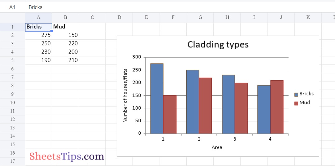
headingsData = ['Bricks', 'Mud']
worksheetData = [
[275, 250, 230, 190 ],
[150, 220, 200, 210],
]
# Write a row of heading data starting with 'A1' in bold format using the write_row() function
# and apply on the above worksheet object
# by passing the argument rowNumber,headings list,and format.
newWorksheet.write_row('A1', headingsData, boldFormat)
# Write the column data that is starting from 'A2','B2' using the write_coulmn() function
# and pass data as argument to it
# Write a column of data starting from
# 'A2', 'B2' respectively .
newWorksheet.write_column('A2', worksheetData[0])
newWorksheet.write_column('B2', worksheetData[1])
# Using the add_chart() method, create a chart object that can be added to a worksheet.
# Pass the type of chart as an argument to the add_chart() function
# and apply it to the above workbook object
chartObj = workbookObj.add_chart({'type': 'column'})
# Using the add series() method, you can add a data series with a pattern to a chart.
# The gap is used to highlight the patterns.
# Add the first series(Bricks) data using the add_series() function
chartObj.add_series({
'name': '= Sheet1 !$A$1',
'values': '= Sheet1 !$A$2:$A$5',
'pattern': {
'pattern': 'Bricks',
# Here fg_color represents foreground color
'fg_color': '# 804000',
# Here bg_color represents foreground color
'bg_color': '# c68c53'
},
'border': {'color': '# 804200'},
'gap': 80,
})
# Add the second series(Mud) data using the add_series() function
chartObj.add_series({
'name': '= Sheet1 !$B$1',
'values': '= Sheet1 !$B$2:$B$5',
'pattern': {
'pattern': 'Mud',
# Here fg_color represents foreground color
'fg_color': '# ff6666',
# Here bg_color represents foreground color
'bg_color': '# b30000'
},
'border': {'color': '# b30000'},
})
# Set the title to the chartObject using the set_title() function
# by passing the Cladding types as value and key as "name" (Here the arguments are object)
chartObj.set_title ({'name': 'Cladding types'})
# Label the x axis using the set_x_axis() function by passing the Area as value and key as "name" (Here the arguments are object)
chartObj.set_x_axis({'name': 'Area'})
# Label the y axis using the set_x_axis() function by passing the Number of houses/flats as value and key as "name" (Here the arguments are object)
chartObj.set_y_axis({'name': 'Number of houses/flats'})
# Add a chartObj to the worksheet using the given offset values in the
# top-left corner of a chartObj that is anchored to cell D2.
newWorksheet.insert_chart('D2', chartObj, {'x_offset': 25, 'y_offset': 10})
# Close the workbook Object using the close() function.
workbookObj.close()
Output: