

An area chart shows how one or more quantities have changed over time. It is created by plotting a set of data points over time, joining them with line segments, and then coloring or shading the region between the line and the x-axis. Surprisingly, one can easily plot an area chart in Excel using Python. Python uses the module XLSX Writer to plot area charts on Excel files from Python. With the help of the Python module XlsxWriter, one may create, write, execute arithmetic operations, and plot graphs on excel files. Let us learn to create area charts with real-time data in Excel using Python from this page. In this article, we have provided all the necessary information on how to create an area chart in an Excel file using Python with examples. Read on to find out more.
How To Plot Area Charts in Excel Using XlsxWriter?
Charts are made up of a series of one or more data points. The series are made up of references to cell ranges. To plot the charts on an excel sheet, first create a chart object of the desired chart type ( i.e Stock chart, etc.). After generating chart objects, insert data into them before adding them to the sheet object.
Install the xlsxwriter using the below code
pip install xlsxwriter
Looking in indexes: https://pypi.org/simple, https://us-python.pkg.dev/colab-wheels/public/simple/
Collecting xlsxwriter
Downloading XlsxWriter-3.0.3-py3-none-any.whl (149 kB)
|████████████████████████████████| 149 kB 5.0 MB/s
Installing collected packages: xlsxwriter
Successfully installed xlsxwriter-3.0.3
Program to Plot Area Charts in Excel Sheet using XlsxWriter module in Python
Below are the examples of the Area chart:
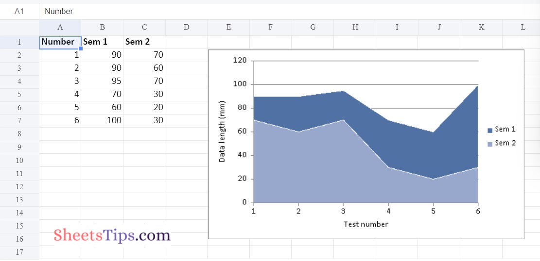
Example #1: Plotting Simple Area Chart
Approach:
- Import the xlsxwriter library using the import function.
- Pass the excel file path to the Workbook() function of xlsxwriter which is the file we want to create and store in a variable.
- Create the new Worksheet using the add_worsheet() function and apply it to the above workbook object and store it in a variable.
- Create a new Format object to format cells in spreadsheets using the add_format() method and apply it to the above workbook object.
- Here, we created a bold format object.
- Add the worksheet data that the charts will use.
- Write a row of heading data starting with ‘A1’ in the bold format using the write_row() function and apply on the above worksheet object by passing the argument rowNumber,headings list,and format.
- Write the column data that is starting from ‘A2′,’B2′,’C2’ using the write_coulmn() function and pass data as argument to it.
- Write a column of data starting from ‘A2’, ‘B2’, ‘C2’ respectively .
- Using the add_chart() method, create a chart object that can be added to a worksheet.
- Pass the type of chart as an argument to the add_chart() function and apply it to the above workbook object
- Using the add series() method, you can add a data series with a gradient pattern to a chart.
- The gap is used to highlight the patterns.
- Add the first series data using the add_series() function.
- Configuring the second series.
- Take note of the usage of different syntax to declare ranges [sheetname, first row, first col, last row, last col].
- Set the title to the chartObject using the set_title() function by passing the chart title name as value and key as “name” (Here the arguments are object).
- Label the x-axis using the set_x_axis() function by passing the Sem Number as value and key as “name” (Here the arguments are object).
- Label the y axis using the set_x_axis() function by passing the Data length as value and key as “name” (Here the arguments are object).
- Set the style of chart using the set_style() function.
- Add a chartObject to the worksheet with the provided offset values in the top-left corner of a chartObject that is anchored to cell D2.
- Close the workbook Object using the close() function.
- The exit of the Program.
Below is the Implementation:
# Import the xlsxwriter library using the import function
import xlsxwriter

# Pass the excel file path to the Workbook() function of xlsxwriter
# which is the file we want to create and store it in a variable
workbookObj = xlsxwriter.Workbook('chartArea.xlsx')

# Create the new Worksheet using the add_worsheet() function and
# apply it to the above workbook object and store it in a variable
newWorksheet = workbookObj.add_worksheet()


# Create a new Format object to format cells in spreadsheets using the add_format() method and apply it to the above workbook object.
# Here, we created a bold format object. .
boldFormat = workbookObj.add_format({'bold': 1})

# Add the worksheet data that the charts will use.
headingsData = ['Number', 'Sem 1', 'Sem 2']
worksheetData = [
    [1, 2, 3, 4, 5, 6],
    [90, 90, 95, 70, 60, 100],
     [70, 60, 70, 30, 20, 30],

]


# Write a row of heading data starting with 'A1' in bold format using the write_row() function
# and apply on the above worksheet object
# by passing the argument rowNumber,headings list,and format.
newWorksheet.write_row('A1', headingsData, boldFormat)

# Write the column data that is starting from 'A2','B2','C2'
# using the write_coulmn() function
# and pass data as argument to it
# Write a column of data starting from
# 'A2', 'B2', 'C2' respectively .
newWorksheet.write_column('A2', worksheetData[0])
newWorksheet.write_column('B2', worksheetData[1])
newWorksheet.write_column('C2', worksheetData[2])

# Using the add_chart() method, create a chart object that can be added to a worksheet.
# Pass the type of chart as an argument to the add_chart() function and apply it to the above workbook object
chartObject = workbookObj.add_chart({'type': 'area'})

# Add a data series to a chart
# using add_series method.

# Configure the first series.
# = Sheet1 !$A$1 is equivalent to ['Sheet1', 0, 0].
chartObject.add_series({
    'name':	 '= Sheet1 !$B$1',
    'categories': '= Sheet1 !$A$2:$A$7',
    'values':	 '= Sheet1 !$B$2:$B$7',
})

# Configuring the second series.
# Take note of the usage of different syntax to declare ranges.
#[sheetname, first row, first col, last row, last col]
chartObject.add_series({
    'name': ['Sheet1', 0, 2],
    'categories': ['Sheet1', 1, 0, 6, 0],
    'values': ['Sheet1', 1, 2, 6, 2],
})


# Set the title to the chartObject using the set_title() function
# by passing the chart title name as value and key as "name" (Here the arguments are object)

# Label the x axis using the set_x_axis() function by passing the Sem Number as value and key as "name" (Here the arguments are object)
chartObject.set_x_axis({'name': 'Test number'})

# Label the y axis using the set_x_axis() function by passing the Data length as value and key as "name" (Here the arguments are object)
chartObject.set_y_axis({'name': 'Data length (mm)'})

# set the style of chart using the set_style() function
chartObject.set_style(11)

# Add a chartObject to the worksheet with the provided offset values in the top-left corner of a chartObject that is anchored to cell E2.
newWorksheet.insert_chart('E2', chartObject)

# Close the workbook Object using the close() function.
workbookObj.close()
Output:
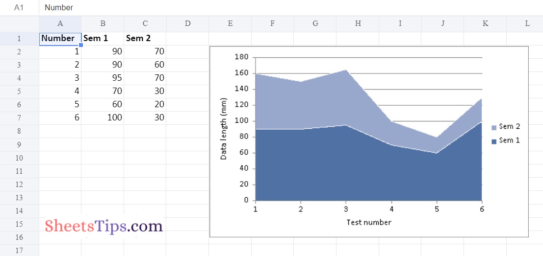
Example #2: Plotting the Stacked Area Plot
Use the add_chart() function of a workbook object with the type ‘area’ and subtype ‘stacked’ keyword arguments to plot the Stacked Area chart on an excel sheet.
Below is the Implementation:
# Import the xlsxwriter library using the import function
import xlsxwriter

# Pass the excel file path to the Workbook() function of xlsxwriter
# which is the file we want to create and store it in a variable
workbookObj = xlsxwriter.Workbook('chartArea1.xlsx')

# Create the new Worksheet using the add_worsheet() function and
# apply it to the above workbook object and store it in a variable
newWorksheet = workbookObj.add_worksheet()


# Create a new Format object to format cells in spreadsheets using the add_format() method and apply it to the above workbook object.
# Here, we created a bold format object. .
boldFormat = workbookObj.add_format({'bold': 1})

# Add the worksheet data that the charts will use.
headingsData = ['Number', 'Sem 1', 'Sem 2']
worksheetData = [
    [1, 2, 3, 4, 5, 6],
    [90, 90, 95, 70, 60, 100],
     [70, 60, 70, 30, 20, 30],

]


# Write a row of heading data starting with 'A1' in bold format using the write_row() function
# and apply on the above worksheet object
# by passing the argument rowNumber,headings list,and format.
newWorksheet.write_row('A1', headingsData, boldFormat)

# Write the column data that is starting from 'A2','B2','C2'
# using the write_coulmn() function
# and pass data as argument to it
# Write a column of data starting from
# 'A2', 'B2', 'C2' respectively .
newWorksheet.write_column('A2', worksheetData[0])
newWorksheet.write_column('B2', worksheetData[1])
newWorksheet.write_column('C2', worksheetData[2])

# Using the add_chart() method, create a chart object that can be added to a worksheet.
# Pass the type of chart as an argument to the add_chart() function and apply it to the above workbook object
chartObject = workbookObj.add_chart({'type': 'area','subtype': 'stacked'})

# Add a data series to a chart
# using add_series method.

# Configure the first series.
# = Sheet1 !$A$1 is equivalent to ['Sheet1', 0, 0].
chartObject.add_series({
    'name':	 '= Sheet1 !$B$1',
    'categories': '= Sheet1 !$A$2:$A$7',
    'values':	 '= Sheet1 !$B$2:$B$7',
})

# Configuring the second series.
# Take note of the usage of different syntax to declare ranges.
#[sheetname, first row, first col, last row, last col]
chartObject.add_series({
    'name': ['Sheet1', 0, 2],
    'categories': ['Sheet1', 1, 0, 6, 0],
    'values': ['Sheet1', 1, 2, 6, 2],
})


# Set the title to the chartObject using the set_title() function
# by passing the chart title name as value and key as "name" (Here the arguments are object)

# Label the x axis using the set_x_axis() function by passing the Sem Number as value and key as "name" (Here the arguments are object)
chartObject.set_x_axis({'name': 'Test number'})

# Label the y axis using the set_x_axis() function by passing the Data length as value and key as "name" (Here the arguments are object)
chartObject.set_y_axis({'name': 'Data length (mm)'})

# set the style of chart using the set_style() function
chartObject.set_style(11)

# Add a chartObject to the worksheet with the provided offset values in the top-left corner of a chartObject that is anchored to cell E2.
newWorksheet.insert_chart('E2', chartObject)

# Close the workbook Object using the close() function.
workbookObj.close()
Output:
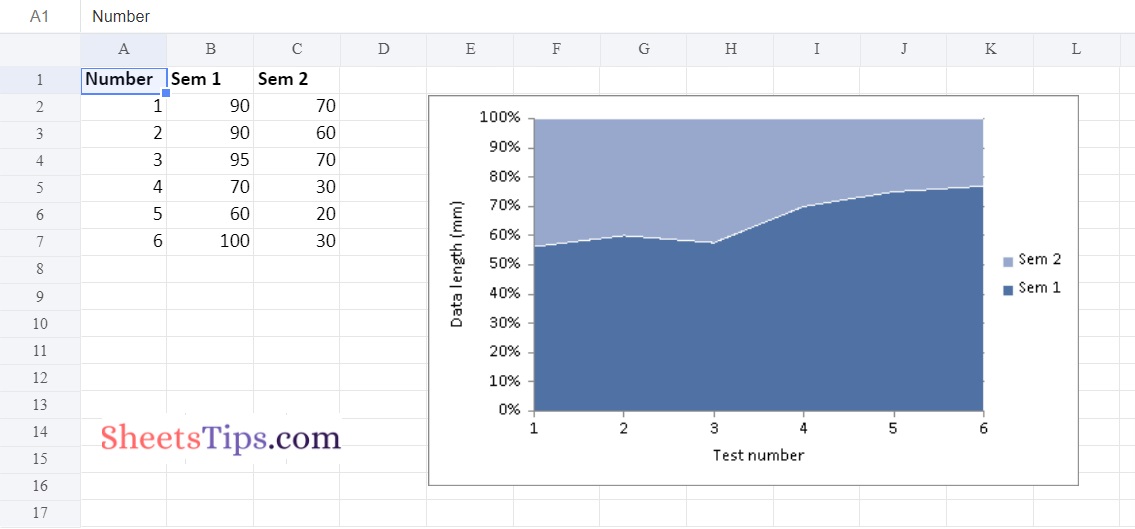
Example #3: Plotting the Percent Stacked Area Plot
Use the add chart() function of a workbook object with the type ‘area’ and subtype ‘percent stacked’ keyword parameter to plot the Percent Stacked Area chart on an excel sheet.
Below is the Implementation:
# Import the xlsxwriter library using the import function
import xlsxwriter

# Pass the excel file path to the Workbook() function of xlsxwriter
# which is the file we want to create and store it in a variable
workbookObj = xlsxwriter.Workbook('chartArea2.xlsx')

# Create the new Worksheet using the add_worsheet() function and
# apply it to the above workbook object and store it in a variable
newWorksheet = workbookObj.add_worksheet()


# Create a new Format object to format cells in spreadsheets using the add_format() method and apply it to the above workbook object.
# Here, we created a bold format object. .
boldFormat = workbookObj.add_format({'bold': 1})

# Add the worksheet data that the charts will use.
headingsData = ['Number', 'Sem 1', 'Sem 2']
worksheetData = [
    [1, 2, 3, 4, 5, 6],
    [90, 90, 95, 70, 60, 100],
     [70, 60, 70, 30, 20, 30],

]


# Write a row of heading data starting with 'A1' in bold format using the write_row() function
# and apply on the above worksheet object
# by passing the argument rowNumber,headings list,and format.
newWorksheet.write_row('A1', headingsData, boldFormat)

# Write the column data that is starting from 'A2','B2','C2'
# using the write_coulmn() function
# and pass data as argument to it
# Write a column of data starting from
# 'A2', 'B2', 'C2' respectively .
newWorksheet.write_column('A2', worksheetData[0])
newWorksheet.write_column('B2', worksheetData[1])
newWorksheet.write_column('C2', worksheetData[2])

# Using the add_chart() method, create a chart object that can be added to a worksheet.
# Pass the type of chart as an argument to the add_chart() function and apply it to the above workbook object
chartObject = workbookObj.add_chart({'type': 'area','subtype': 'percent_stacked'})

# Add a data series to a chart
# using add_series method.

# Configure the first series.
# = Sheet1 !$A$1 is equivalent to ['Sheet1', 0, 0].
chartObject.add_series({
    'name':	 '= Sheet1 !$B$1',
    'categories': '= Sheet1 !$A$2:$A$7',
    'values':	 '= Sheet1 !$B$2:$B$7',
})

# Configuring the second series.
# Take note of the usage of different syntax to declare ranges.
#[sheetname, first row, first col, last row, last col]
chartObject.add_series({
    'name': ['Sheet1', 0, 2],
    'categories': ['Sheet1', 1, 0, 6, 0],
    'values': ['Sheet1', 1, 2, 6, 2],
})


# Set the title to the chartObject using the set_title() function
# by passing the chart title name as value and key as "name" (Here the arguments are object)

# Label the x axis using the set_x_axis() function by passing the Sem Number as value and key as "name" (Here the arguments are object)
chartObject.set_x_axis({'name': 'Test number'})

# Label the y axis using the set_x_axis() function by passing the Data length as value and key as "name" (Here the arguments are object)
chartObject.set_y_axis({'name': 'Data length (mm)'})

# set the style of chart using the set_style() function
chartObject.set_style(11)

# Add a chartObject to the worksheet with the provided offset values in the top-left corner of a chartObject that is anchored to cell E2.
newWorksheet.insert_chart('E2', chartObject)

# Close the workbook Object using the close() function.
workbookObj.close()
Output:
Python is one of the powerful programming languages that helps us automate excel. It has various modules with the help of which we can easily create many things without launching the Excel files. Stay tuned to SheetsTips.Com to learn more about how to automate Excel with Python.
Recommended Reading On: Java Program to Print the Series 6 11 21 36 56 …N