
Automate Excel Stock Charts with Python: lsxwriter is a Python module that allows users to perform multiple operations, such as creating, writing, executing, arithmetic operations, and plotting graphs on excel files using Python. Like other operations, the lsxwriter in Python can also create a stock chart in Excel. A stock chart is basically a price chart that displays the price of a stock plotted over time, which includes the stock symbol, exchange price, chart period, price charge, last charge, volume, etc.,
Including all these parameters in a stock chart are quite tricky from a Python standpoint. Thus, to help you with it, here is a detailed tutorial that explains how to plot a stock chart in Excel using Python. This page contains detailed instructions and examples for creating a stock chart in an excel file using Python libraries. Scroll down to learn more.
Plot Stock Chart in Excel using Python
Charts are made up of a series of one or more data points. The series are made up of references to cell ranges. To plot the charts on an excel sheet, first create a chart object of the desired chart type ( i.e Stock chart, etc.). After generating chart objects, insert data into them before adding them to the sheet object.
Install the xlsxwriter using the below code
pip install xlsxwriter
Looking in indexes: https://pypi.org/simple, https://us-python.pkg.dev/colab-wheels/public/simple/
Collecting xlsxwriter
Downloading XlsxWriter-3.0.3-py3-none-any.whl (149 kB)
|████████████████████████████████| 149 kB 5.0 MB/s
Installing collected packages: xlsxwriter
Successfully installed xlsxwriter-3.0.3
Plotting Stock charts in excel sheet using XlsxWriter module in Python
Approach:
- Import the datetime function from the datetime library.
- Import the xlsxwriter library using the import function.
- Pass the excel file path to the Workbook() function of xlsxwriter which is the file we want to create and store in a variable.
- Create the new Worksheet using the add_worsheet() function and apply it to the above workbook object and store it in a variable.
- Create a new Format object to format cells in spreadsheets using the add_format() method and apply it to the above workbook object.
- Here, we created a bold format object.
- Using the add_chart() method, create a chart object that can be added to a worksheet.
- Pass the type of chart as an argument to the add_chart() function and apply it to the above workbook object
- Add the worksheet data that the charts will use.
- Write a row of heading data starting with ‘A1’ in the bold format using the write_row() function and apply to the above worksheet object by passing the argument row number, headings list, and format.
- Writing the above data in the worksheet.
- Iterate till the number of rows of the data(Here it is 5).
- Convert a string type date to a date in the correct format using the strptime() function.
- Apply the dateformat object on the first Cell and write it to the worksheet using the write() function and apply it to the above created Worksheet
- Write the worksheetData on the cells by passing the data with the corresponding rownumber and write() function.
- Write worksheetData in the respective cells.
- Set the width of columns(Here we have 4 columns) A to D column set to some random value say 12.
- Add the data from A2 to A6 and B2 to B6 using the add_series function and apply to the chartObject data take from A2 to A6 and B2 to B6 respectively.
- Add the data from A2 to A6 and C2 to C6 using the add_series function and apply to the chartObject.
- Add the data from A2 to A6 and D2 to D6 using the add_series function and apply to the chartObject.
- Set the title to the chartObject using the set_title() function by passing the name as value and key as “name (Here the arguments are object).
- Label the x axis using the set_x_axis() function by passing the Date as value and key as “name” (Here the arguments are object)
- Label the y axis using the set_x_axis() function by passing the Share price as value and key as “name” (Here the arguments are object)
- Add a chartObject to the worksheet with the provided offset values in the top-left corner of a chartObject that is anchored to cell E9.
- Close the workbook Object using the close() function.
- The Exit of the Program.
Below is the Implementation:
# Import the datetime function from the datetime library
from datetime import datetime
# Import the xlsxwriter library using the import function
import xlsxwriter
# Pass the excel file path to the Workbook() function of xlsxwriter
# which is the file we want to create and store it in a variable
workbookObj = xlsxwriter.Workbook('chartStock.xlsx')
# Create the new Worksheet using the add_worsheet() function and
# apply it to the above workbook object and store it in a variable
newWorksheet = workbookObj.add_worksheet()
# Create a new Format object to format cells in spreadsheets using the add_format() method and apply it to the above workbook object.
# Here, we created a bold format object. .
boldFormat = workbookObj.add_format({'bold': 1})
# Using the add_chart() method, create a chart object that can be added to a worksheet.
# Pass the type of chart as an argument to the add_chart() function and apply it to the above workbook objec
chartObject = workbookObj.add_chart({'type': 'stock'})
# Add the worksheet data that the charts will use.
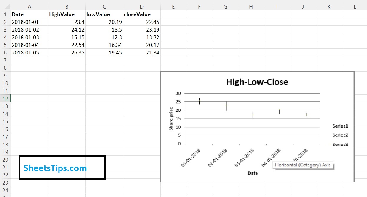
headingsData = ['Date', 'HighValue', 'lowValue', 'closeValue']
worksheetData = [
['2018-01-01', '2018-01-02', '2018-01-03', '2018-01-04', '2018-01-05'],
[23.4, 24.12, 15.15, 22.54, 26.35],
[20.19, 18.5, 12.3, 16.34, 19.45],
[22.45, 23.19, 13.32, 20.17, 21.34],
]
# Write a row of heading data starting with 'A1' in bold format using the write_row() function
# and apply on the above worksheet object
# by passing the argument rowNumber,headings list,and format.
newWorksheet.write_row('A1', headingsData, boldFormat)
# Writing the above data in the worksheet
#Iterate till the number of rows of the data(Here it is 5)
for rowNumb in range(5):
#Convert a string type date to a date in the correct format using the strptime() function
date = datetime.strptime(worksheetData[0][rowNumb], "%Y-%m-%d")
# Apply the dateformat object on the first Cell and write it to the
# worksheet using the write() function and apply on the above created Worksheet
newWorksheet.write(rowNumb + 1, 0, worksheetData[0][rowNumb])
# Write the worksheetData on the cells by passing the data with the corresponding rownumber and write() function
# write worksheetData in the respective cells
newWorksheet.write(rowNumb + 1, 1, worksheetData[1][rowNumb])
newWorksheet.write(rowNumb + 1, 2, worksheetData[2][rowNumb])
newWorksheet.write(rowNumb + 1, 3, worksheetData[3][rowNumb])
# Set the width of columns(Here we have 4 columns) A to D column set to some random value say 12.
newWorksheet.set_column('A:D', 12)
# Add the data from A2 to A6 and B2 to B6 using the add_series function and apply on the chartObject
chartObject.add_series({
'categories': '= Sheet1 !$A$2:$A$6',
'values': '= Sheet1 !$B$2:$B$6',
})
# Add the data from A2 to A6 and C2 to C6 using the add_series function and apply on the chartObject
chartObject.add_series({
'categories': '= Sheet1 !$A$2:$A$6',
'values': '= Sheet1 !$C$2:$C$6',
})
#Add the data from A2 to A6 and D2 to D6 using the add_series function and apply on the chartObject
chartObject.add_series({
'categories': '= Sheet1 !$A$2:$A$6',
'values': '= Sheet1 !$D$2:$D$6',
})
# Set the title to the chartObject using the set_title() function by passing the name as value and key as "name" (Here the arguments are object)
chartObject.set_title ({'name': 'High-Low-Close'})
# Label the x axis using the set_x_axis() function by passing the Date as value and key as "name" (Here the arguments are object)
chartObject.set_x_axis({'name': 'Date'})
# Label the y axis using the set_x_axis() function by passing the Share price as value and key as "name" (Here the arguments are object)
chartObject.set_y_axis({'name': 'Share price'})
# Add a chartObject to the worksheet with the provided offset values in the top-left corner of a chartObject that is anchored to cell E9.
newWorksheet.insert_chart('E9', chartObject)
# Close the workbook Object using the close() function.
workbookObj.close()
Output:
Now that you are provided with all the necessary information on how to plot a stock chart in Excel using Python, when you are creating chart objects, make sure you insert data into them and add the chart to the sheet object. Missing this step might result in a major error. Just ensure your code is error free to create the charts hassle free.