There are various types of charts that can be created on Google Sheets to make our data in a more easy and understanding manner. A waterfall chart could show the number of leads, traffic sources, or blog visits over a period of time. For example, a waterfall chart might be used to indicate how your blog traffic has climbed or dropped over the last year, with values given month by month. Waterfall charts are more or less like a line or graph chart but present the data in a more advanced manner.
So if you are looking at how to create a Waterfall Chart in Google Spreadsheet, then this page will tell you everything about it. With the help of Google Sheets Tips provided on this page, you will understand the simple steps to create a stacked waterfall chart. Read further to find more.
Table of Contents |
How To Format Data in Google Sheets to Create Waterfall Chart?
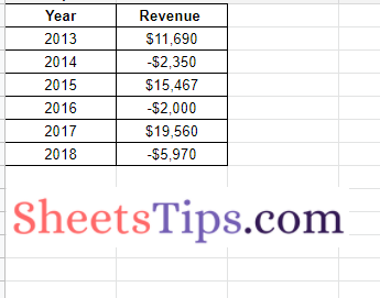
In order to create a waterfall chart, first, we need to devise the data in the Google Sheets. The steps to format the data in Google Spreadsheet are as follows:
- Fill up the first column with a label for each row. The horizontal axis displays the labels from the first column.
- Other columns: Fill up the blanks with numbers. A category name can also be added here.
- Rows: Each row on the chart represents a separate bar.
If you enter numeric data in two or more columns, you can choose whether to view the data sequentially or stacked.
- How to Create Candlestick Chart in Google Sheets (With Examples)
- How to Create a Gantt Chart in Google Sheets? (Dynamic Gantt Chart Formula)
- How to Make a Line Chart in Google Sheets: Setup/Edit/Customize Line Graph
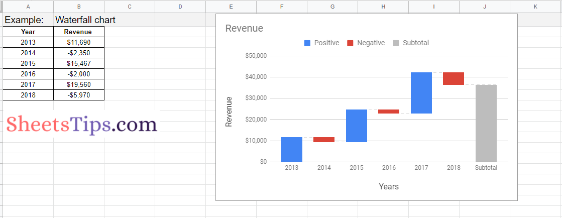
So in this example, we have formatted our data as shown below:
Steps to Create Waterfall Charts in Google Sheets
The steps to create waterfall charts in Google Sheets are given below:
- 1st Step: Open the Google Spreadsheet on your device.
- 2nd Step: Now on the homepage, select the dataset for which you want to create waterfall charts.
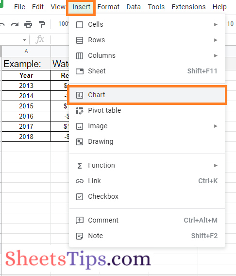
- 3rd Step: Click on the “Insert” tab and choose “Chart” from the drop down menu.
- 4th Step: By default, the Google Sheets will insert a chart here based on your dataset. If it hasn’t inserted the waterfall chart, then move to the chart editor pane which is towards the right side of the screen.
- 5th Step: Now in the Chart Editor window, move to the “Setup” section.
- 6th Step: In the Setup section, click on the “Chart Type“.
- 7th Step: Now various types of Chart options will open on the screen. Scroll down and move to the “Other” section.
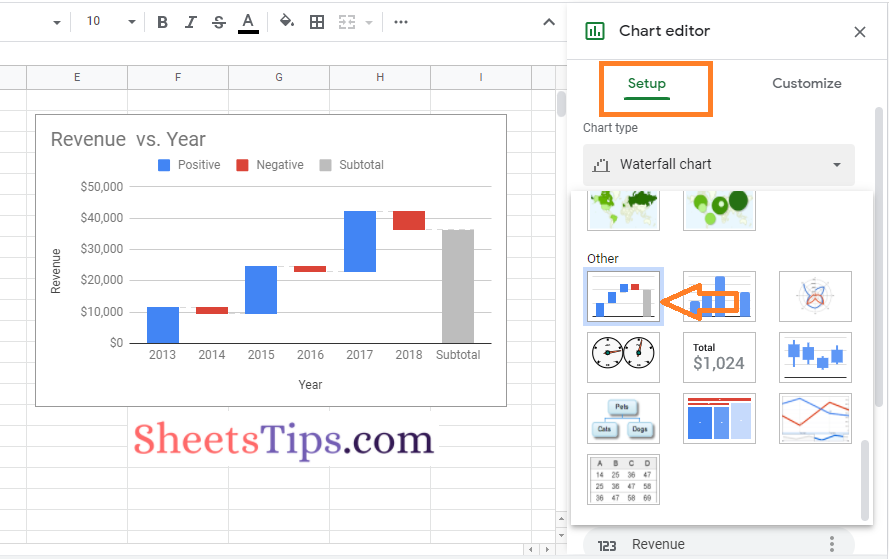
- 8th Step: Here choose the first option named Waterfall and that’s it. The waterfall chart has been inserted into your sheets.
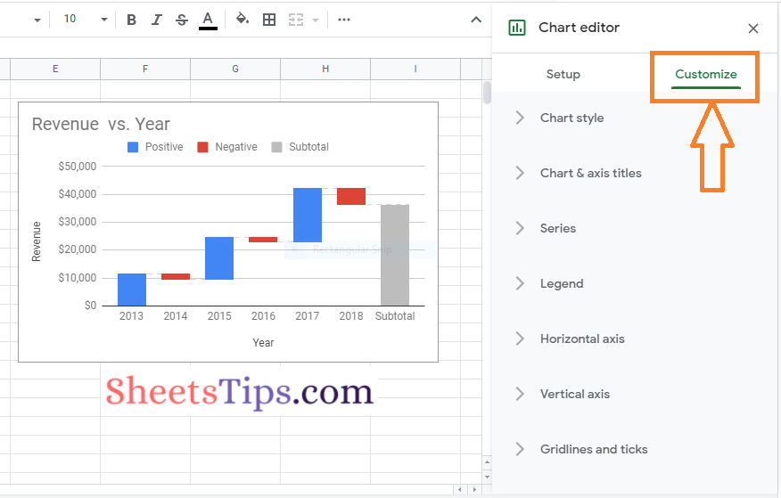
Customizing Waterfall Charts In Google Sheets
Now the Google Sheets has picked up the default colors and created a Waterfall chart on its own. We can also customize the waterfall chart in Google Spreadsheet by moving to the “Customize” section under the “Chart editor” pane. The steps to customize the waterfall charts in Google Sheets are explained below:
- 1st Step: Open the Google Spreadsheet where you would like to customize your waterfall chart.
- 2nd Step: Now on the homepage, click on the waterfall chart which needs to be customized.
- 3rd Step: Move to the “Customize” section.
- 4th Step: Here you will find various options with the help of which you can customize your waterfall chart.
- Chart style: Change the appearance of the chart, or add and edit connector lines.
- Chart & axis titles: Edit or format the title text for the chart and axis.
- Series: Change column colors, add and edit subtotals, and data labels in this series.
- Legend: Change the position and content of the legend.
- Horizontal axis: Reverse axis order or edit or format axis text.
- Vertical axis: Edit or format the axis text, specify the min and max value, or use the log scale on the vertical axis.
- Gridlines: You can add and edit gridlines in this section.