A chart can depict a set of data values more clearly than a table with rows of numbers. Thus Google Sheets offers various types of charts that we can incorporate with our dataset. One of the most useful charts in Google Sheets is Candlestick Chart. A candlestick chart is a type of visualization tool that may be used to track changes in a variable’s value over time. In this article, let’s understand how to create a candlestick chart with the help of Google Sheet tips provided on this page. Read on to find more.
Table of Contents |
What is Candlestick Chart?
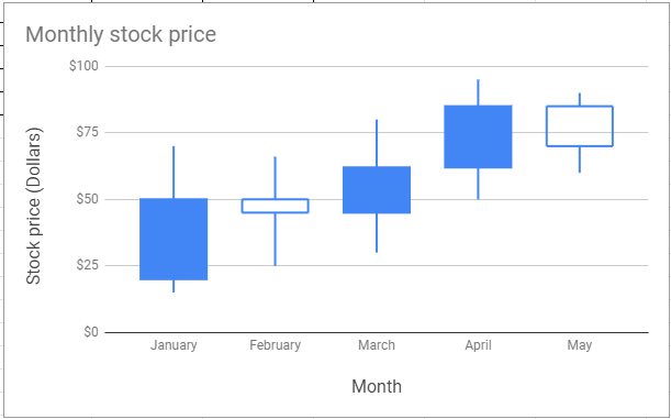
A candlestick chart can be used to display the low, high, opening, and closing values of a security over a given time period. With the help of a candlestick chart, we can also get the daily variation in stock prices.
A candlestick chart can also be used to track scientific data, such as rainfall or temperature.
- How to Make a Line Chart in Google Sheets: Setup/Edit/Customize Line Graph
- How to Make a Histogram in Google Sheets: Create/Delete/Customize Histogram Graph
- How to Make a Scatter Plot in Google Sheets (Step-by-Step)
How to Create Candlestick Chart in Google Sheets?
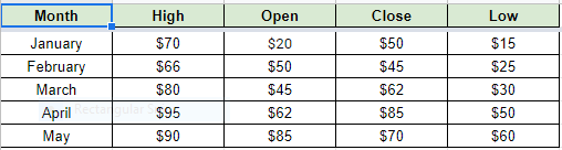
Consider the following dataset which talks about the monthly stock price.
Now follow the steps as listed below to create a Candlestick chart in Google Sheets:
- Step 1: Select the dataset columns to create the candlestick chart. In our example, I have selected Month, High, Open, Close, Low.
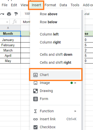
- Step 2: Click on the “Insert” tab from the menubar.
- Step 3: Now select the “Chart” icon from the drop-down menu.
- Step 4: The Chart editor will open towards the right side of the screen. Google usually tries to understand the data you have chosen and displays the chart it believes is the best representation of it. It should ideally show a Candlestick chart. If you see a different type of chart, proceed to step 5.
- Step 5: To make a candlestick chart, click on the “Setup” tab and select “Candlestick chart” from the Chart type drop down menu.
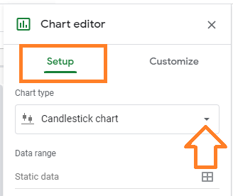
- Step 6: Choose the “Candlestick chart” from the chart options that appear. It should be visible in either the “Suggested” or “Other” categories.
On your Google worksheet, you should now see a Candlestick Chart.
Parameters to Create Candlestick Chart
The list of parameters that generates the candlestick chart in Google Sheets are explained below:
- First Column: Enter a label for the X-axis in the first column.
- Second Column: Enter a number to represent the highest or most extreme value. This value corresponds to the top of the candle’s center line.
- Third Column: In the third column, enter a number as the opening or initial value. This value is one of the candle’s vertical borders.
- Fourth Column: In the fourth column, enter a number to represent the closing or final value. This value is the candle’s second vertical border.
- Fifth Column: Enter a number for the minimum value in the fifth column. This is the value at the bottom of the candle’s center line.
- Rows: A single candlestick marker is represented by each row.
The candlestick chart will be filled if the value of the third column is less than the value of the fourth column. It will be empty otherwise.
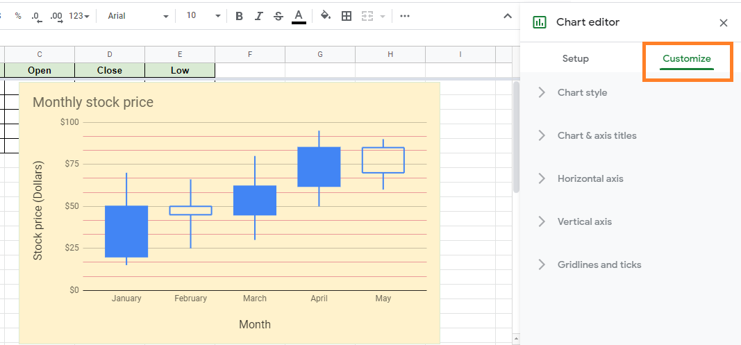
How to Customize Candlestick Chart in Google Sheets?
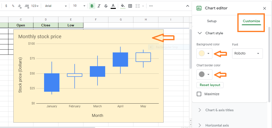
Although you cannot change the color of the candlesticks, you can make other changes to your chart in Google Sheets. Here’s how to do it:
Generally, the Chart editor has a ‘Customize’ tab where you can enter all of your specifications. Follow the steps listed below to customize your candlestick chart in Google Sheets:
- Step 1: Open a Google Sheets spreadsheet on your device to customize your candlestick chart.
- Step 2: Now double-click on the candlestick chart that needs to be modified.
- Step 3: Here chart editor pane opens towards the right side of the screen. Choose Customize on the right bar.
- Step 4: Here you will be provided with the following set of options. Select one of the following options:
- Chart Style: To change the font and background color.
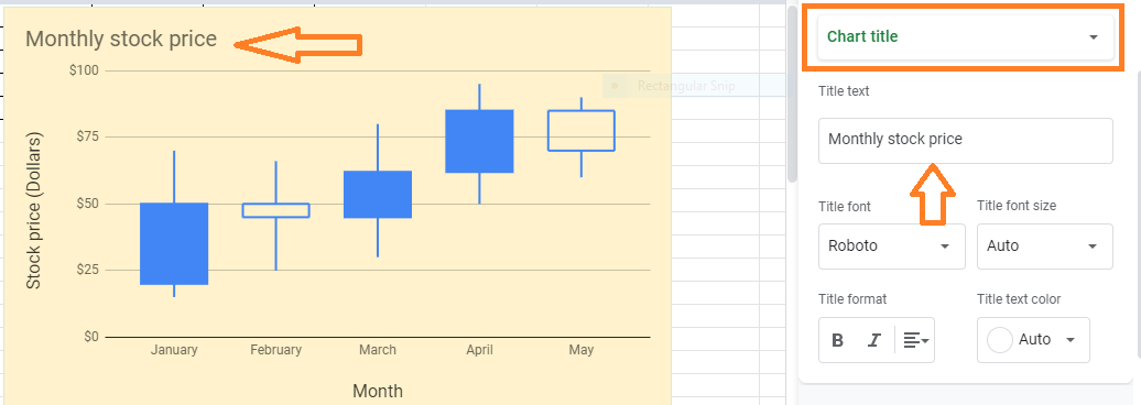
- Chart & Axis Title: To edit or format the title text on a candlestick chart.
- Horizontal Axis: Reverse axis order or edit or format axis text.
- Vertical Axis: Edit or format the axis text, set the minimum and maximum value, or log scale.
- Gridlines: To create and modify gridlines.
- Chart Style: To change the font and background color.