
Scatter plots are very helpful, as they are a tool for showing relationships and trends in data when other graphs are not capable of doing the same. Google Sheets Tips are highly convenient for making scatter plots since they have a built-in tool for creating scatter plot graphs.
Scatter plots are helpful when the data is all over the place but still embodies a trend. It also helps convey datapoint clusters, which is a weak point for both bar and line charts.
Trendlines and error bars can also be used in scatter plots to establish relationships between points and data and represent which data points are outliers and to what extent they are outliers.
Here, a hypothetical list of 30 commercial properties for sale against the requested price is mentioned. A part of the data is shown below;
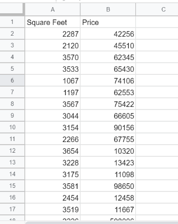
The columns taken into account here are “Square Feet” and “Price,” representing the building’s square footage of the property and the requested price, respectively.
- How to build a Scatter Plot In Google Sheets
- How to add a Trendline to a Scatter Plot In Google Sheets
- How to use Error Bars in a Scatter Plot
- Interpreting data with the help of a Scatter Plot
How to build a Scatter Plot In Google Sheets
In Google Sheets, scatter plots are a built-in preset graph applied to any and every data set. Creating a scatter plot requires little in the way of configuration.
While creating a line or bar chart, if one feels that the data is all over the place, that indicates that they should use a scatter plot for the job.
The steps to build a scatter plot in Google Sheets are mentioned below:
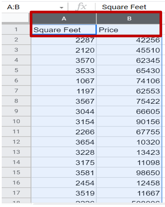
The columns that one wants to compare can be highlighted by holding shift and then left-clicking on the column names.
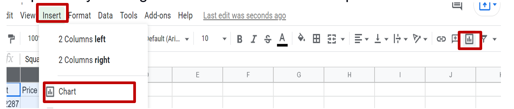
Click on the Insert option and select chart to open the Chart editor. It can also be opened by clicking on the Chart icon from the top submenu.
From the Chart editor options menu, click on Chart type and then select the Scatter chart option to create the scatter chart.
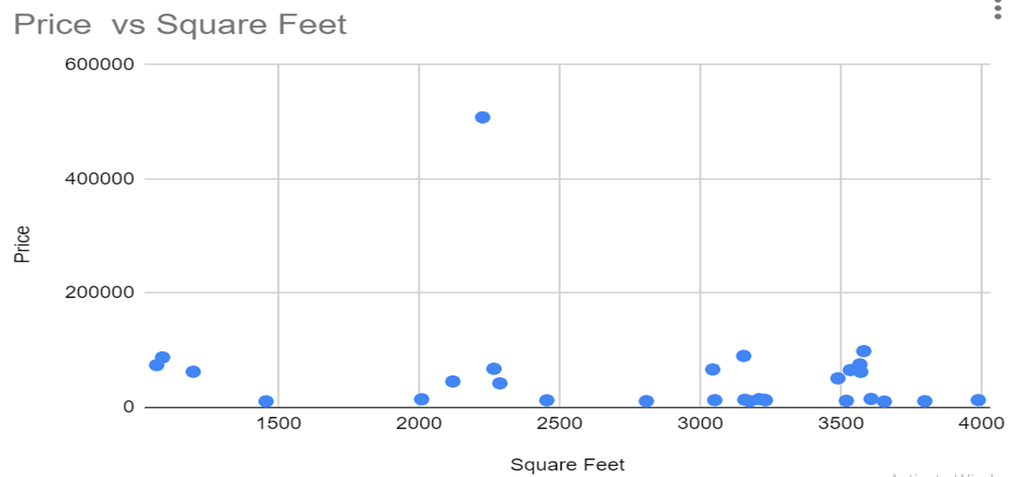
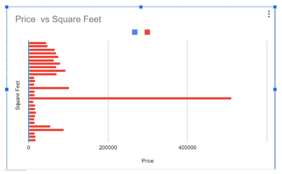
The scatter plot chart for data has been created.
How to add a Trendline to a Scatter Plot In Google Sheets
A trendline can be added to a Google Sheets scatter plot for a more straightforward demonstration of trends in the data. Fortunately, Sheets makes it easy to add this feature to your chart.
- How to Make Dot Plot in Google Sheets? Customizing Scatter Chart to Dot Plot
- How To Insert Indents in Google Sheets? – Know How to Tab Down in Google Sheets
- Jump To Cell Range in Google Sheets – How To Jump To Specific Cell Range in Google Sheets?
The following steps demonstrate how to add a trendline to a scatter plot in Google Sheets:
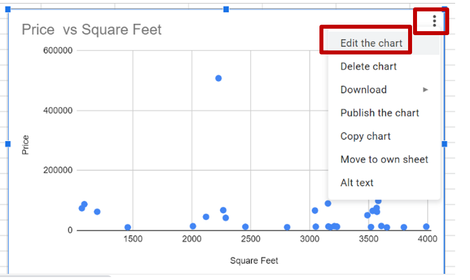
From the top right of the graph, click on the three dots icon. A pop-up menu will appear. From there, select the Edit chart option to open the chart editor for the scatter plot.
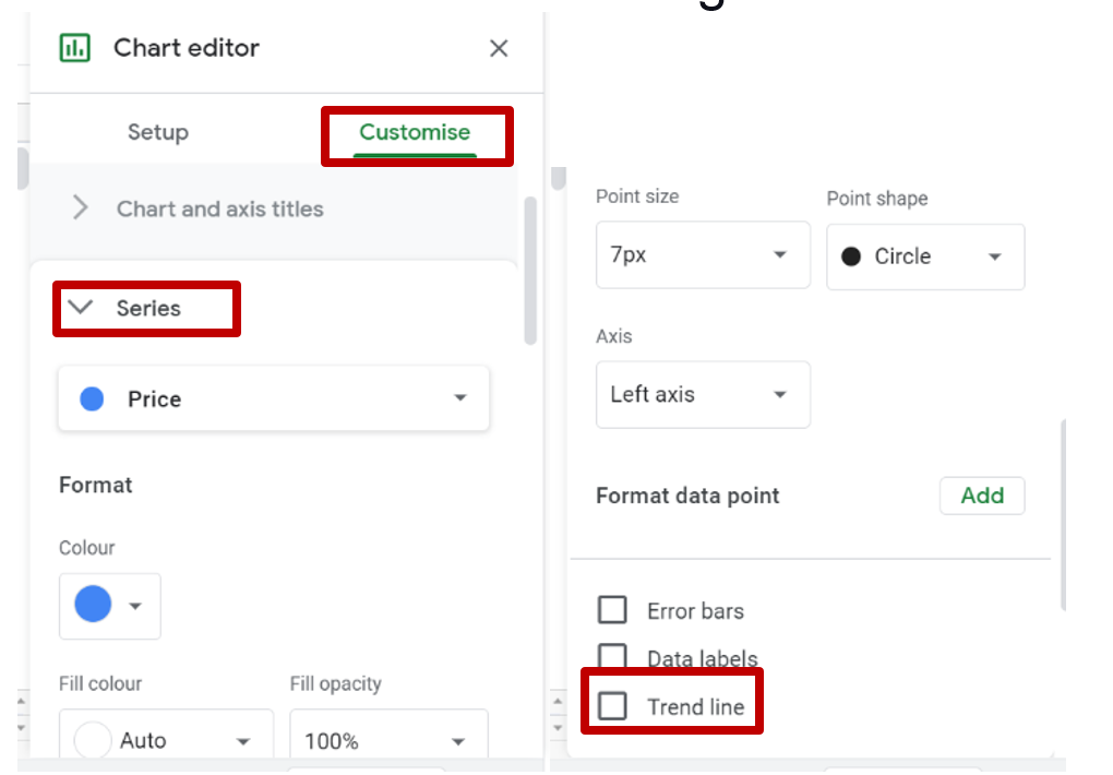
Now, click on the Customize tab, and then expand the Series section and check the box next to the trendline for adding features to the chart.
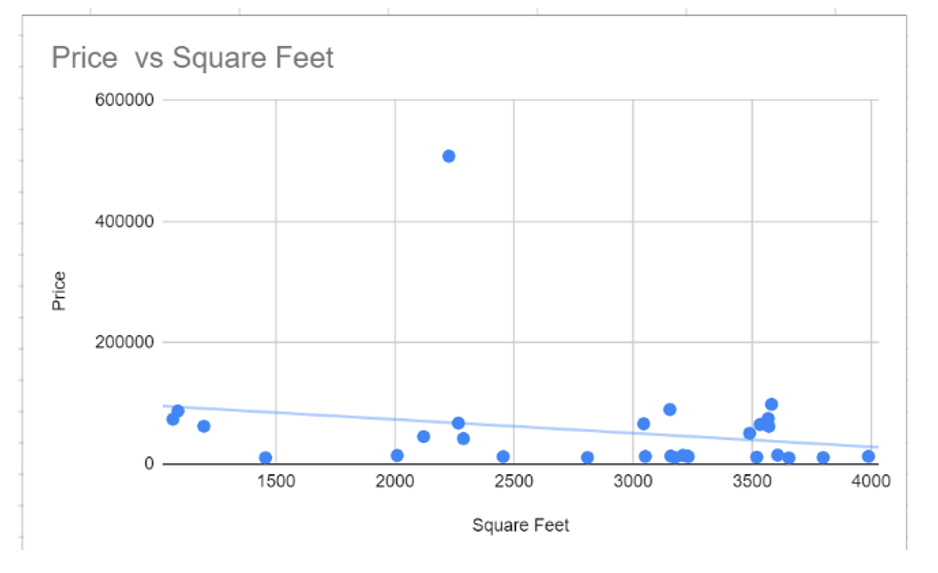
The scatter plot graph will now feature a trendline representing the overall relationship between the coordinate values of X and Y.
How to use Error Bars in a Scatter Plot
To demonstrate the reliability of a given data point or to demonstrate how on-trend a given data point is, error bars are the most helpful tool on a scatter plot. In commercial properties, scatter plots can help a potential buyer successfully avoid overpriced properties.
To add error bars to your scatter plot, follow these steps:
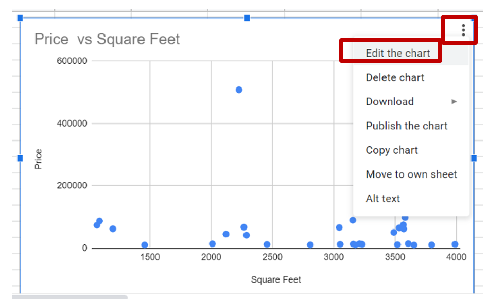
- From the top right of the graph, click on the three dots. A pop-up menu will appear. From there, select the Edit chart option to open the chart editor for the scatter plot.
Now, click on the Customize tab, then expand the Series section and check the box which is next to Error bars for adding features to the chart.
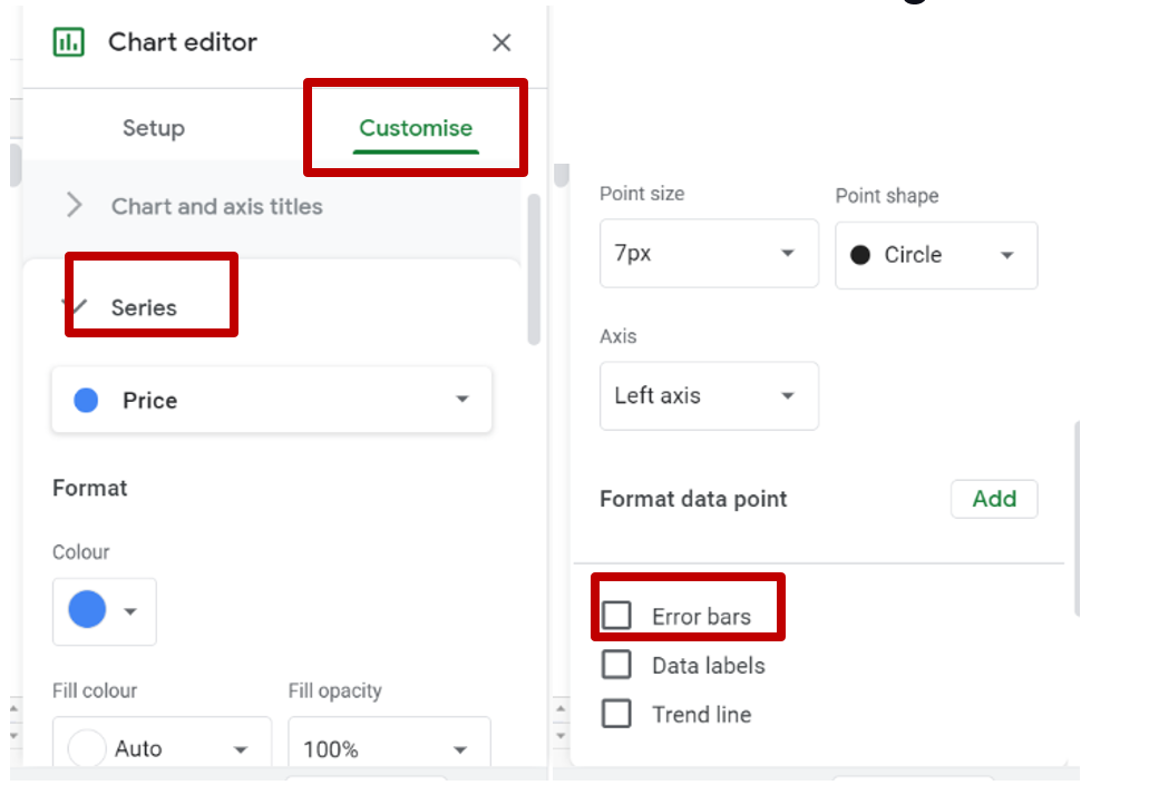
The scatter plot graph for each data point will now feature error bars representing how adjacent they are to the trendline.
Interpreting Data with a Scatter Plot
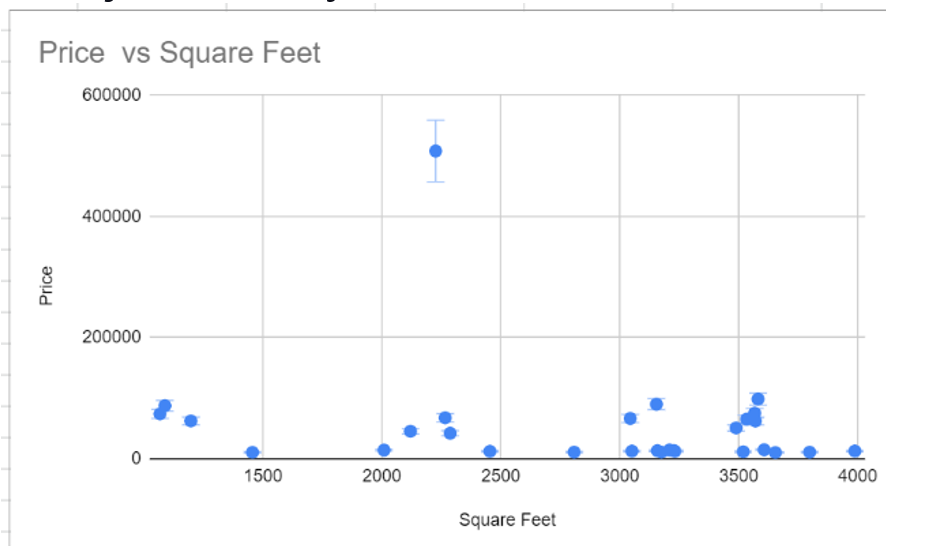
As the scatter plot with trendlines and error bars is ready, let’s focus on certain things that the chart states.
Two clusters are the most notable in the dataset.
- Around 3,000 sq. ft. for an amount ranging from 12,500 to 14,400
- Approximately 3,500 sq. ft. for an amount ranging from 14,900 to 55,000
This data gives us the information that the cost of moving from 3,000 sq. ft. to 3,500 sq. ft. is extremely high, and the properties in the clusters are priced competitively.
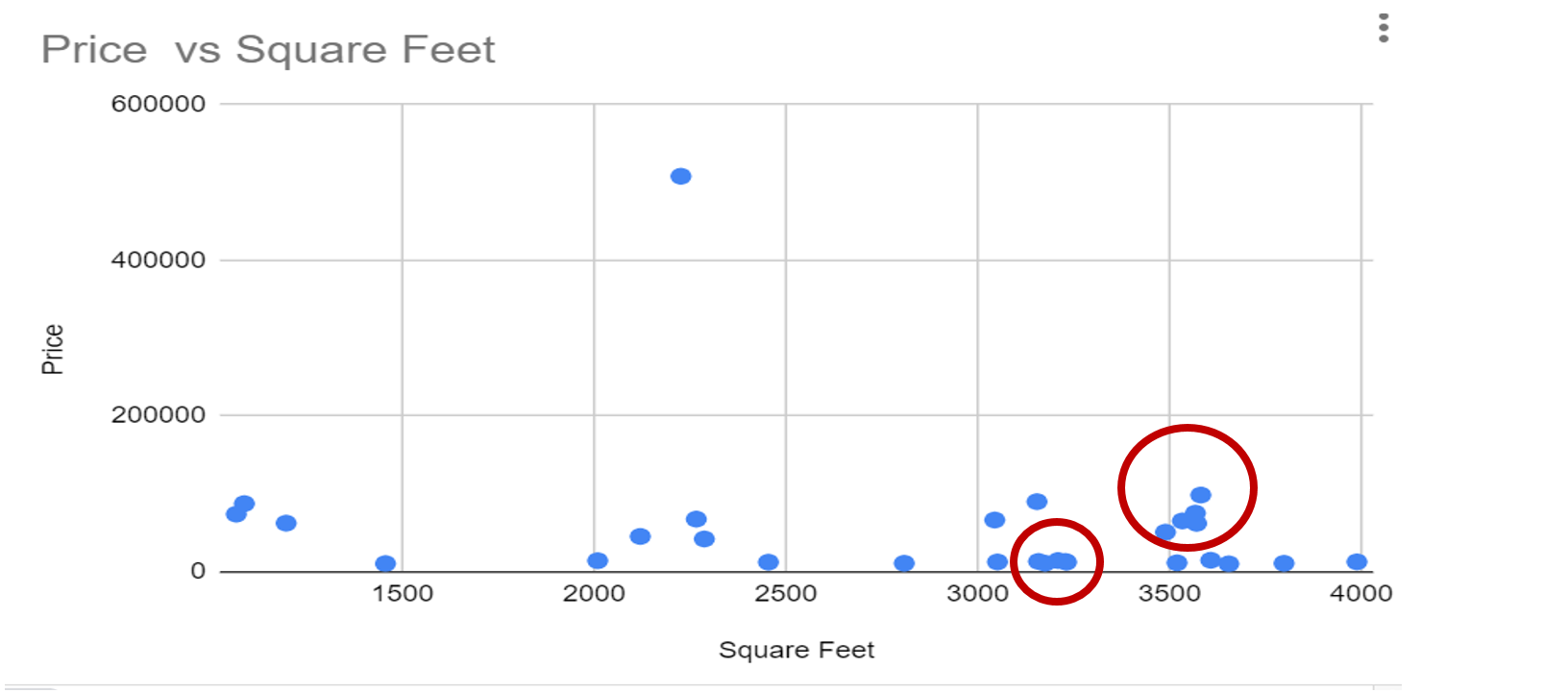
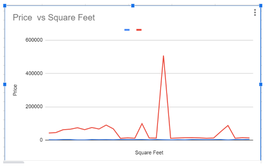
In comparison to scatter plot charts, bar and line charts do not establish these clusters as efficiently.
In addition, for showing off-trend data clusters, scatter plots do a fantastic job. In the example provided above, the chart clearly indicates that numerous more significant properties are overpriced through large error bars and are far above the trend line.
Following the steps that are mentioned above, anyone will be able to create and enhance scatter plot graphs in Google Sheets quickly.
However, it should also be noted that scatter plots are not suitable for all kinds of datasets. Flat trendlines or massive error bars show that the data does not follow a trend.
Hoping that this tutorial on google sheets charting was useful.