
Google Sheets has various numbers of built-in charts such as Pie charts, Line charts, Bar charts. However, when it comes to Dot Plot, Google Sheets doesn’t have a built-in function for the same. And this is the reason we will have to build the Dot Plot chart in Google Sheets manually.
In this article, let us understand how to make a Dot Plot Chart with the help of a scatter chart along with the Google Sheet tips provided on this page. Read on to find more.
Table of Contents |
What is Dot Plot in Google Sheets?
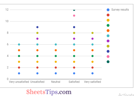
Dot plots are a fun and easy method to communicate very simple information. Instead of a solid bar, a dot plot would show distinct dots for each click. This is how a dot plot appears.
How to Create a Dot Plot in Google Sheets using Scatter Plot?
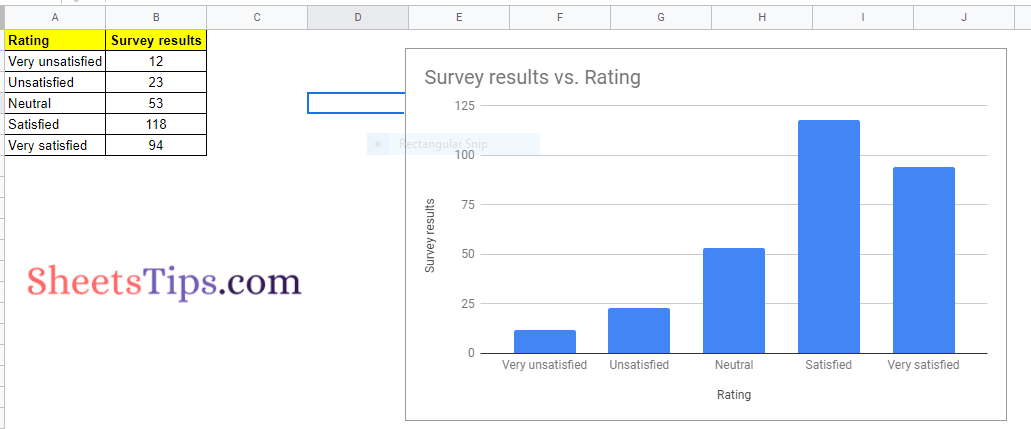
Consider the dataset which has surveying results as an example. When we insert a chart in Google Sheets, by default spreadsheet chooses a chart based on the dataset and displays the same as shown below.
But for creating a dot plot chart in Google Sheets, we need to create a scatter plot. This means that first, we need to create a Scatter Plot chart in Google Sheets and then convert it into Dot Plot.
- How to Make a Scatter Plot in Google Sheets (Step-by-Step)
- How to Create Candlestick Chart in Google Sheets (With Examples)
- How to Make a Line Chart in Google Sheets: Setup/Edit/Customize Line Graph
Now follow the steps as given below to create a scatter plot in Google Sheets:
- Step 1: Select the dataset and copy it using Cntrl + C. Alternatively you can also right-click after selecting the dataset and select Copy from the sub-menu appearing on the screen.
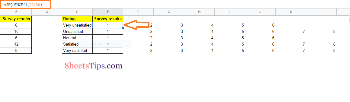
- Step 2: Now move to the adjacent cell and paste the selected data using Cntrl+V. Here we are copying data from Cell A & B and pasting it in Cell D & E respectively.
- Step 3: Then modify the data entered in Cell E2 with the help of the formula “=Sequence(1, B2:B6)“.
- Step 4: Now press the “Enter” button and you will see the results as shown in the image below.
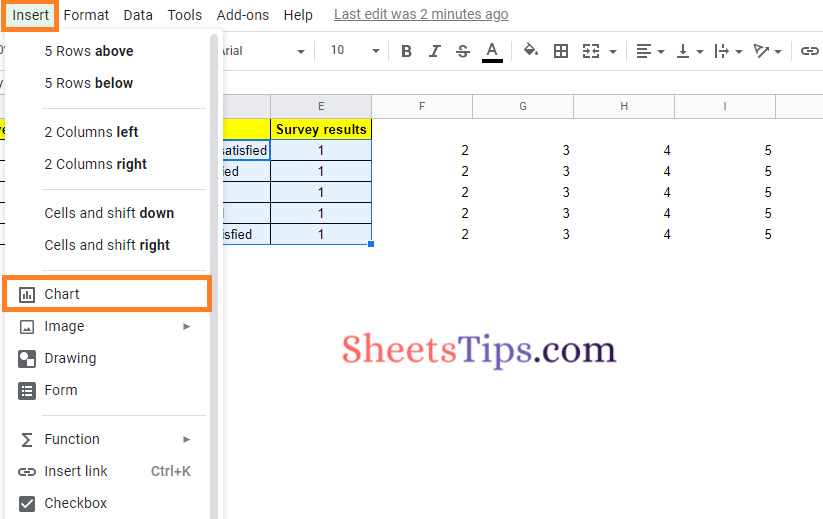
- Step 5: Now select the dataset in Columns D and E.
- Step 6: Click on the “Insert” tab from the menubar and select “Chart” from the drop-down menu.
- Step 7: By default Google Sheets will create a chart depending on your data. Now move to the Chart Editor Pane.
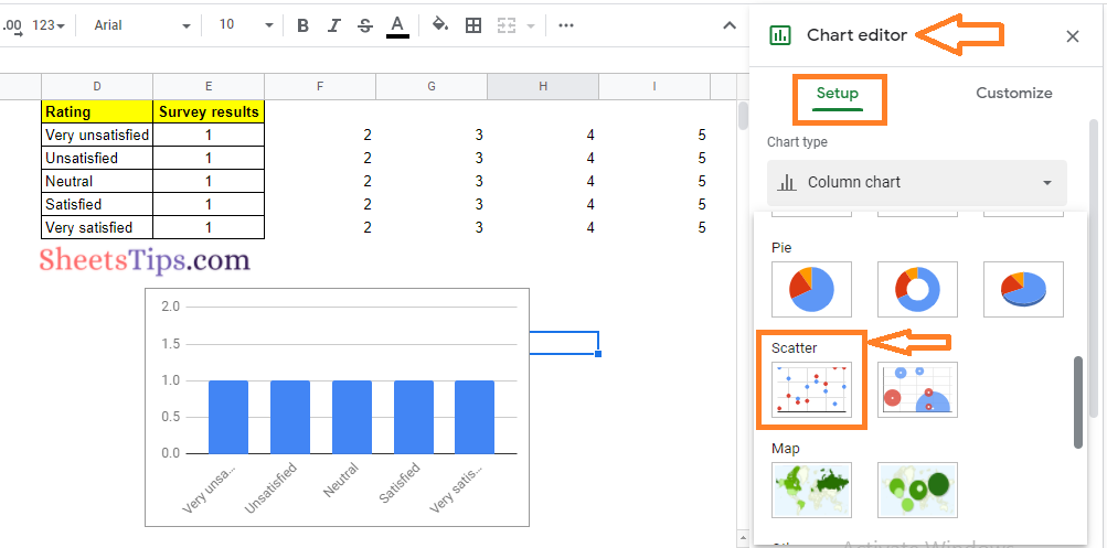
- Step 8: Move to the Setup pane under the chart editor window.
- Step 9: Click on “Chart Type” and select “Scatter” from types of charts in Google Sheets.
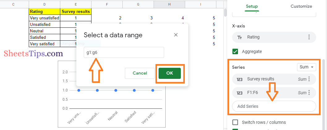
- Step 10: By default, you will see dots being created on the Google Sheets. Now under the setup pane, move to the series.
- Step 11: Click on the “Add Series” button.
- Step 12: Now a window will open on the screen. Here enter the data range. Since we need to create a dot plot, we need to enter until the sequence has been created. So our first data range would be f1:f6.
- Step 13: Click on the “Ok” button. Now you will see a slight variance in Chart.
- Step 14: Now continue Step 12 and Step 13, until the sequences are completed in your sheet by adding “Series” and “Data Range“.
Step 15: Soon after adding all the data range in the series you will see the dot plot chart being created on the Google Sheets as shown in the image below. 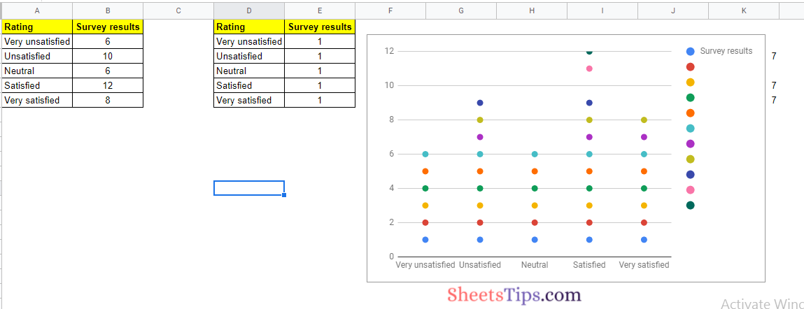
Advantages of Dot Plot in Google Sheets
The advantages of Dot Plot in Google Sheets are explained below:
- Your information is short and best comprehended visually.
- The disparities between columns are more difficult to understand when using a graph.
- You are seeking discrete information rather than patterns.
- Bar charts and trend lines are some of the alternatives to dot plots that are incorporated into Google Sheets.
- Dot plots, on the other hand, can be effective for displaying small amounts of discrete data.