Google Sheets Histogram: When we want to display the distribution of a data set across different buckets or ranges, we can use a histogram chart in Google Sheets. The number of values in each range is represented by the height of each bar. The histogram is an inbuilt graphing tool that can be accessed easily within few clicks.
Also Read: Graph Theory Questions and Answers
One of the main advantages of the Histogram chart in Google Sheets is that it provides relative results instead of showing specific results. For example, If we have a scoreboard of students, we use the histogram chart to know how many students score falls under 90 to 100, 80 to 90 and so on. In this article, let’s understand how to create a histogram chart with Google Sheet tips. Read on to find out more.
Table of Contents |
How to Make a Histogram on Google Sheets?
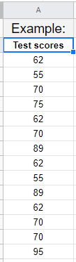
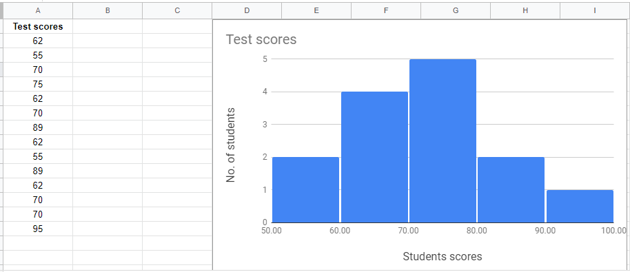
Let’s consider we have students’ scoreboards as shown below.
Follow the steps as listed below to create a histogram graph on Google Sheets:
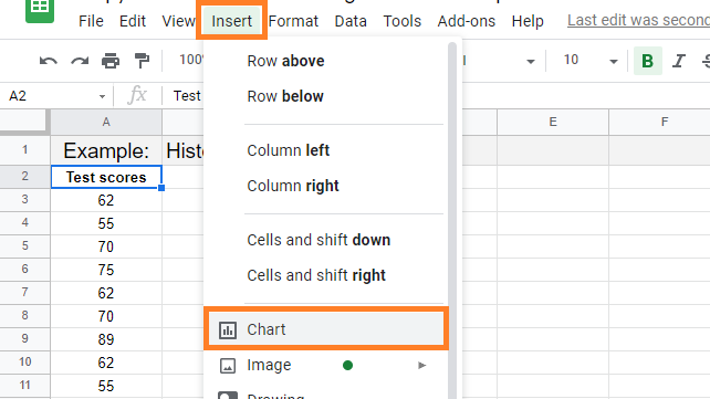
- Step 1: Select the dataset where you would like to insert the histogram graph.
- Step 2: Now move to the toolbar and hit the “Insert” tab.
- Step 3: Choose “Chart” from the drop-down menu.
Step 4: Now the Chart Pane opens towards the right side of the screen. Select the drop menu under “chart type” on the chart “Setup” tab.
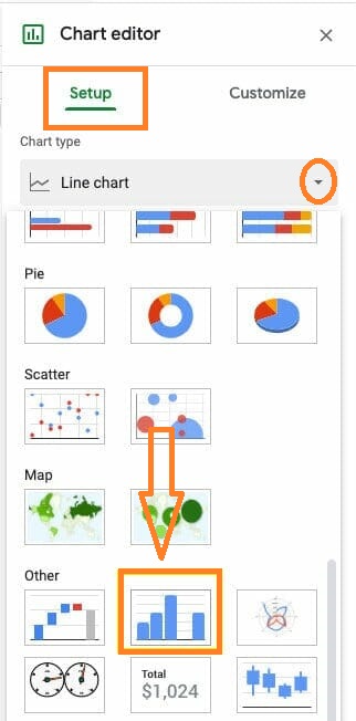
- Step 5: Under the “Other” section, select the Histogram graph option type from the drop-down menu.
- Step 6: The histogram graph will be created on the sheets as shown below:
- How to Make a Line Chart in Google Sheets: Setup/Edit/Customize Line Graph
- How to Create a Drop Down List in Google Sheets: Add/Remove/Customize Drop Down Menu
- How to Make a Scatter Plot in Google Sheets (Step-by-Step)
How to Format Data in Google Sheets?
We can format the data in Google Sheets with the help of the following options.
- First row: Type a category name in the first row of the column. In the legend, the first row entries appear as labels.
- Enter numeric values in the first column. A category name can also be added.
- Enter numeric data in the other columns. You can also name the category.
How to Customize Histogram Graph in Google Sheets?
Follow the steps as listed below to customize the Histogram Graph in Google Sheets:
- Step 1: Open a Google Sheets spreadsheet on your device where you want to customize your chart.
- Step 2: To customize the chart, double-click on the chart.
- Step 3: Right-click and select customize option from the drop-down menu.
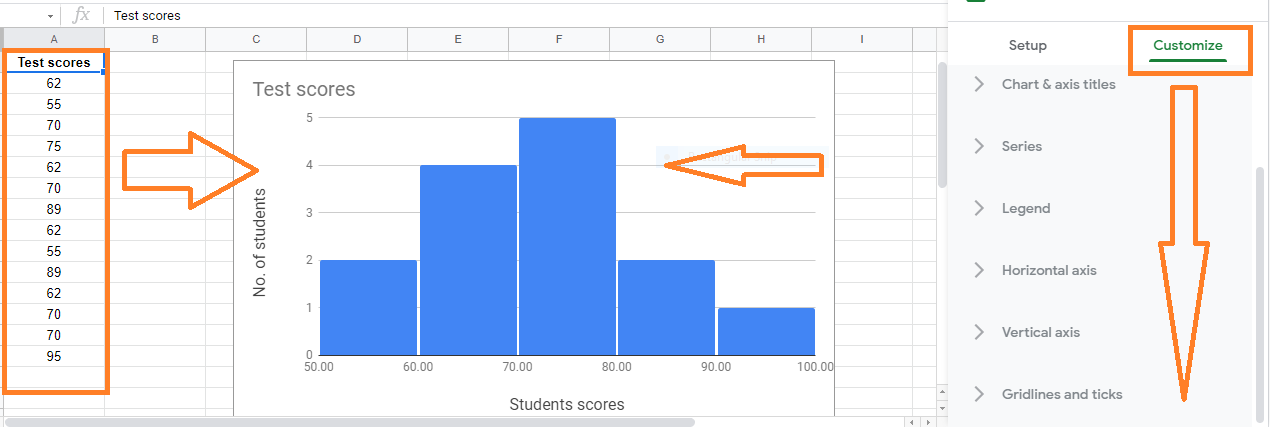
<h3id=”List-of-Options-Available-under-Customize-Option”>List of Options Available under Customize Option
The list of options that are available under the Google Sheets Histogram Customize option are explained below:
- Chart Style: Change the appearance of the chart.
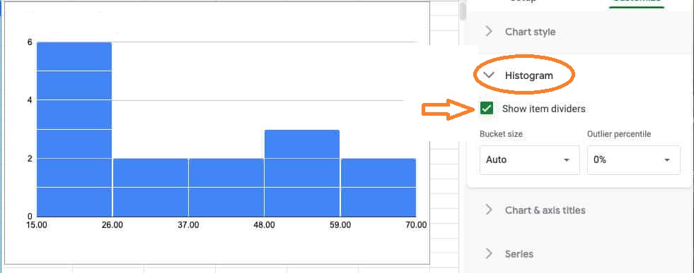
- Histogram: Show item dividers in the histogram, or adjust the bucket size or outlier percentile.
- Chart and Axis Title: Edit or format the title text for the chart and axis.
- Series: Change the colour of the bars in the series.
- Legend: Change the position and content of the legend.
- Horizontal Axis: Axis text can be edited or formatted, and min and max values can be defined on the horizontal axis.
- Vertical Axis: Edit or format the axis text, specify the min and max value, or use the log scale on the vertical axis.
- Gridlines: You can add and edit gridlines in this section.
Customize Option under Histogram Tab
The Histogram choices area in Google Sheets is the most effective tool for data formatting, despite having only three options.
- Show Item dividers(checkbox): To put a line between each item in the chart, check this box. This may help better portray the distribution depending on the data.
- Bucket Size: You can select the value range for each bucket here. Automatic sorting is available in Google Sheets. Buckets can be specified in increments of 1, 2, 5, 10, 25, and 50.
- Percentile of outliers: This option can be used to group data outliers with the bucket that is closest to them.