
The Google Sheets Radial Bar Charts look great when you want to grab the attention of users. However, the radial bar charts in Google Sheets should be designed carefully since they are hard to read than a regular chart. This is because it is difficult to measure the lengths in Google Sheets. And that is why here is an article, which tells you everything about how to design a radial bar chart in Google Sheets with simple G-Sheet tricks. Read further to find more.
| Table of Contents
|
How To Create Radial Bar Charts in Google Sheets?
In order to create a Radial Chart in Spreadsheet, we need to have a dataset.
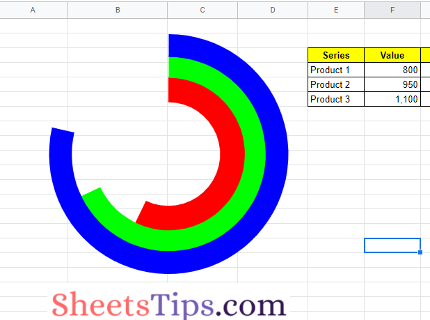
For these three series, such as items with a number of units sold, we’ll require a column of values.
Following that, we’ll need an upper limit (maximum value) for our bars. This helps us to appropriately scale the bars.
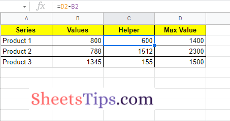
Finally, we require a helper column that computes the difference between the maximum and actual value. So our dataset for creating a radial bar chart is shown below:
- How to Make an Organization Chart in Google Sheets? – Create an Org Chart in Google Sheets
- How To Sync Charts From Google Sheets to Google Docs & Google Slides?
- How to Create a Gantt Chart in Google Sheets? (Dynamic Gantt Chart Formula)
Steps to Create Radial Bar Chart in Google Sheets
Follow the steps as outlined below to create Radial Bar Charts in Google Spreadsheet.
Step 1: Creating Inner Circle
The step towards creating a Radial Bar Chart is to create an inner circle.
- The first row of data should be highlighted, but the maximum value column should be left out.
- Now click on the Chart icon in the menubar. By default, Google Sheets will come up with a chart.
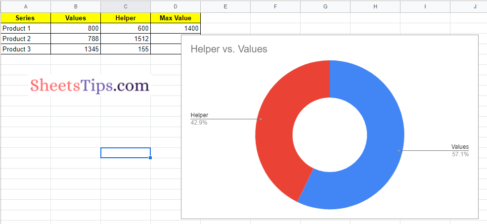
- Under the Chart Editor Pane, move to the Setup section.
- Click on the Chart Type drop-down menu and choose “Doughnut Chart“.
- Under Customize, make the following settings to the Doughnut Chart you have created.
- Color of the background: none
- Color of chart border: none
- 67 percent of doughnut holes size.
- Set the color of Slice 2 to none.
- Remove the chart title and set none to the legend.
- Now the inner radial bar chart will look like the following image. That’s it the inner circle has been created in Google Sheets Radial Chart.
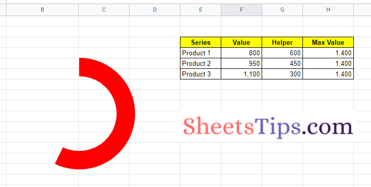
Step 2: Creating Middle Circle
For the inner circle, repeat the steps above, but use the next row of data, a new color, and a 77 percent doughnut hole size. You may need to work about these percentages to get everything to line up in the end.
To produce the same, drag the second doughnut chart on top of the first and align the radial bar. So that our chart will look like the following image.
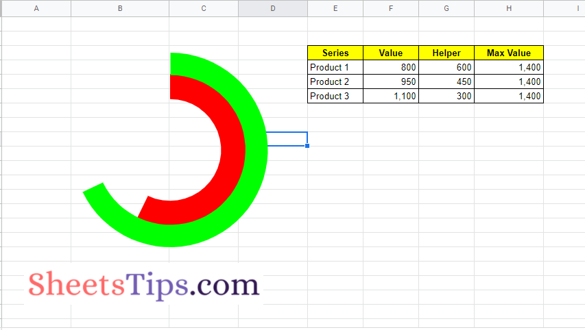
Step 3: Creating Outer Circle
To make a third doughnut chart, repeat the procedures above from the inner circle, but this time use the third row of data, a change in color, and set the doughnut hole size to 81 percent. This may need to be tweaked to match everything up.
You can make a radial bar chart in Google Sheets by dragging this third doughnut chart on top of the previous two.
Because the charts are stacked on top of one another, you will only be able to alter the top chart. To get to the chart below, you will have to move it to the side, and then move that one if you want to go to the inner chart.
Add the Data Labels in Google Sheets
Because using the chart editor to add data labels to each chart gets messy, I decided to use formulas to add my data labels to the cells adjacent to each bar of the radial bar chart.
Click on a cell outside of the chart area to view cells under the charts, then use the arrow keys on your keyboard to go to the required cell.
Add the following formula after that:
=E6&”: “&TEXT(F6,”#,0”)
In Google Sheets, the TEXT function is used to merge text and numbers.
Alongside each bar, the name of the series and its value are displayed.
To finish, remove the gridlines from your Sheet to give the chart a more professional appearance.
