A sparkline chart is a short line chart that helps you visualize your data easily. It’s useful if, for example, you want to rapidly examine if share price data in a spreadsheet is increasing or decreasing.
You may insert these types of charts into a single cell on your spreadsheet using Google Sheets’ SPARKLINE function. While a sparkline is normally a line chart, you may use the SPARKLINE function to produce other types of charts, such as single-cell bar and column charts. In this article, let us understand how to create a Sparkline chart with the help of Google Sheet tips provided on this page.

Sparkline Syntax in Google Sheets
The syntax of Sparkline Charts in Google Sheets are given below:
SPARKLINE(data, [options])
- data – The data to plot is contained in a range or array.
- options – [ OPTIONAL ] – A set of optional settings and values that can be used to modify the chart.
Options should be two cells wide when referring to a range, with the first cell representing the option and the second cell representing the value the option is set to.
- How to Make a Line Chart in Google Sheets: Setup/Edit/Customize Line Graph
- How to Make an Organization Chart in Google Sheets? – Create an Org Chart in Google Sheets
- How to Make a Scatter Plot in Google Sheets (Step-by-Step)
The “charttype” parameter specifies the type of chart to be plotted, which can be any of the following:
- “line” – A line graph is denoted by the term “line” (the default)
- “bar” is the term for a stacked bar chart.
- “column” is the term for a column chart.
- “winloss” refers to a form of column chart that shows both positive and negative outcomes (like a coin toss, heads, or tails).
Creating Line Sparkline in Google Sheets
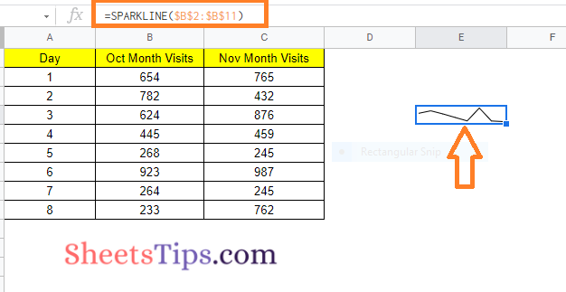
Let us consider the following dataset to create the Line Sparkline in Google Sheets. Now the steps tp create a Line Sparkline are given below:
- Step 1: Visit the cell where you would like to create a Sparkline
- Step 2: Now enter the following formula =SPARKLINE($B$2:$B$11). We simply had to define the range because the Line chart is the default chart type.
- Step 3: Press the “Return” key and you will see the results as shown below.
Customizing Line Sparkline in Google Sheets
1. “xmin” specifies the horizontal axis’s minimal value.
2. The variable “xmax” specifies the highest value along the horizontal axis.
3. “ymin” specifies the vertical axis’s minimum value.
4. The variable “ymax” specifies the highest value along the vertical axis.
5. “color” determines the line’s color.
=SPARKLINE($B$2:$B$11,{"charttype","line";"color","red"})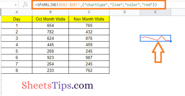
6. “empty” specifies how empty cells should be handled. “zero” or “ignore” are examples of possible values.
7. “nan” specifies how non-numeric data should be handled in cells. “Convert” and “ignore” are the two options.
8. The value “rtl” defines whether the chart is shown right to left or not. True or false are the options.
=SPARKLINE($B$2:$B$11,{"charttype","line";"rtl",TRUE})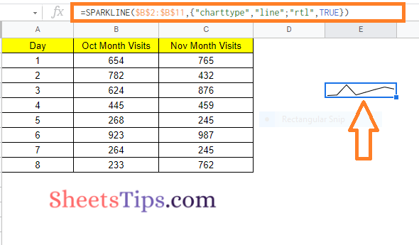
9. The chart’s “linewidth” controls how thick the line will be. A thicker line is indicated by a greater number.
=SPARKLINE($B$2:$B$11,{"charttype","line";"linewidth",2})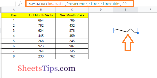
Creating Column Sparkline in Google Sheets
Let us consider the same dataset to create the column sparkline in Google Sheets. The steps to create a column sparkline are given below:
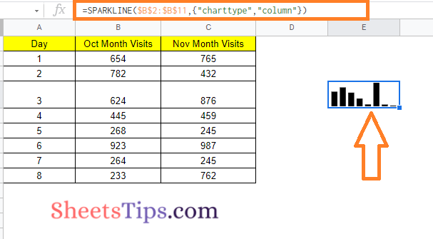
- Step 1: Go to the cell where you would like to create the Column Sparkline.
- Step 2: Now enter the following formula “=SPARKLINE($B$2:$B$11,{“charttype”,“column”})“.
- Step 3: Press the “Enter” button and you will see the results as shown below:
Customizing Column Sparkline in Google Sheets
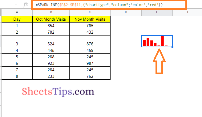
- The color of the chart columns is controlled by “color.”
=SPARKLINE($B$2:$B$11,{"charttype","column";"color","red"})
- “lowcolor” changes the color of the chart’s lowest value.
- “highcolor” changes the color of the chart’s highest value.
=SPARKLINE($B$2:$B$11,{"charttype","column";"lowcolor","red";"highcolor","green"})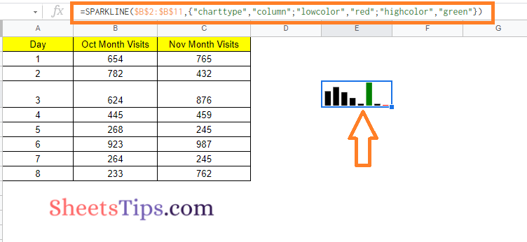
- The color of the first column is set by “firstcolor.”
- The color of the last column is set by “lastcolor.”
=SPARKLINE($B$2:$B$11,{"charttype","column";"firstcolor","green"})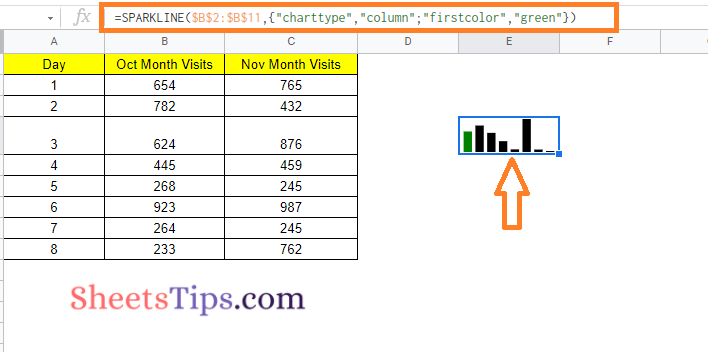
- The color of all negative columns is set by “negcolor.”
=SPARKLINE($C$2:$C$11,{"charttype","column";"negcolor","red"})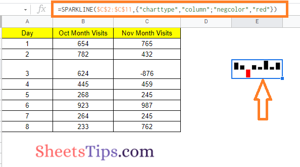
- “empty” specifies how empty cells should be handled. “zero” or “ignore” are examples of possible values.
- “nan” specifies how non-numeric data should be handled in cells. “Convert” and “ignore” are the two options.
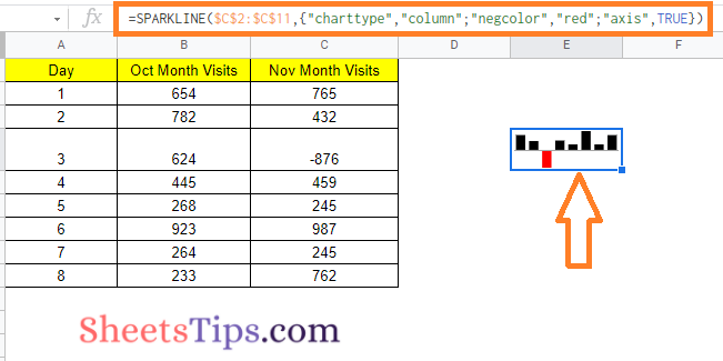
- “axis” determines whether or not an axis must be drawn (true/false).
- The color of the axis is set by “axiscolor” (if applicable)
=SPARKLINE($C$2:$C$11,{"charttype","column";"negcolor","red";"axis",TRUE})
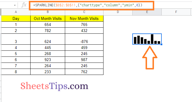
- “ymin” specifies a specific minimum data value to be used when scaling column heights (not relevant for win/loss).
=SPARKLINE($B$2:$B$11,{"charttype","column";"ymin",0})
- “ymax” specifies a specific maximum data value to be utilised when scaling column heights (not relevant for win/loss).
- The value “rtl” defines whether the chart is shown right to left or not. True or false are the options.
Creating Bar Sparkline in Google Sheets
The steps to create a bar sparkline in Google Sheets are given below:
- Step 1: Move to the cell where you would like to create the Bar Sparkline.
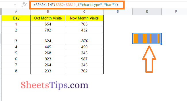
- Step 2: Now enter the formula =SPARKLINE($B$2:$B$11,{“charttype”,“bar”})
- Step 3: Press the “Enter” button and you will see the results.
Customizing Bar Sparkline in Google Sheets
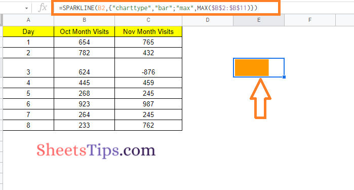
- “max” specifies the highest value along the horizontal axis.
=SPARKLINE(B2,{“charttype”,“bar”;“max”,MAX($B$2:$B$11)})
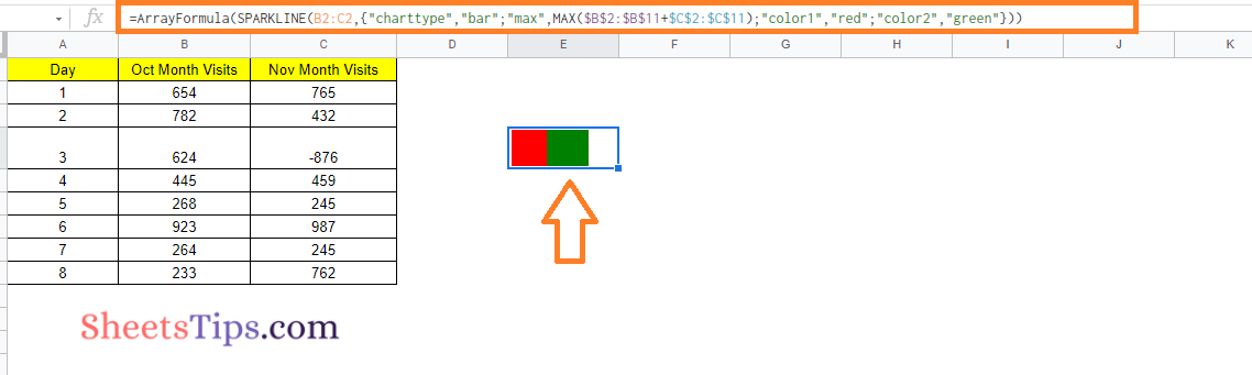
- “color1” specifies the first color used for the chart’s bars.
- “color2” specifies the second color for the chart’s bars.
=ArrayFormula(SPARKLINE(B2:C2,{"charttype","bar";"max",MAX($B$2:$B$11+$C$2:$C$11);"color1","red";"color2","green"}))
- “empty” specifies how empty cells should be handled. Among the possible values are “zero” and “ignore.”
- “nan” specifies how cells with non-numeric data should be treated. There are two options: “convert” and “ignore.”
=SPARKLINE($B$2:$B$11,{"charttype","column";"nan","convert"})

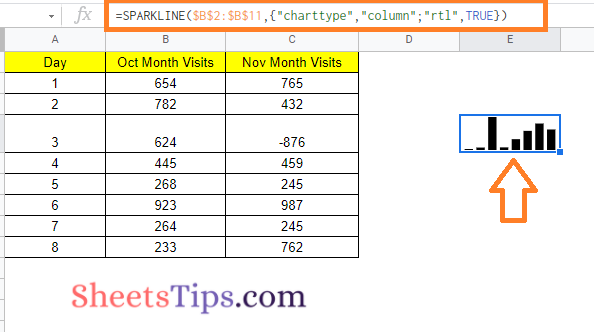
- “rtl” specifies whether the chart is rendered right to left. True or false is the only option.
=SPARKLINE($B$2:$B$11,{“charttype”,“column”;“rtl”,TRUE})
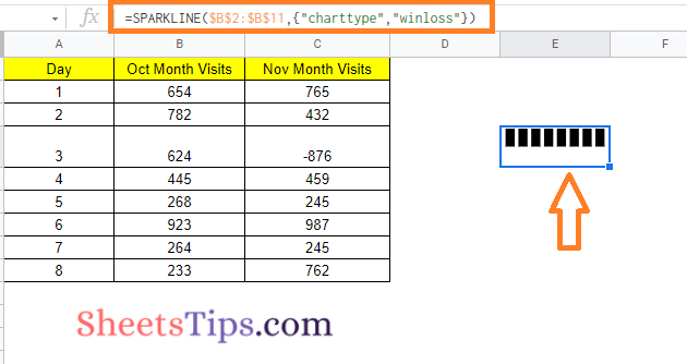
Creating Win-Loss Sparkline Charts in Google Sheets
- Step 1: Navigate to the cell where you want to create the Win Lose Sparkline.
- Step 2: Type in the formula =SPARKLINE($B$2:$B$11,{“charttype”,“winloss”}).
- Step 3: Click the “Enter” button to see the results.
Customizing Win Loss Sparkline in Google Sheets
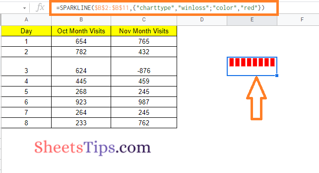
Color Option: This allows you to change the color of the column bars.
=SPARKLINE($B$2:$B$11,{“charttype”,“winloss”;“color”,“red”})
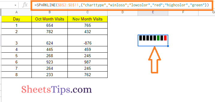
LowColor and HighColor Options: While the Win-Loss sparkline charts do not display the magnitude of the value, you can still highlight the maximum and minimum values in a different color.
SPARKLINE($B$2:$B$11,{“charttype”,“winloss”;“lowcolor”,“red”;“highcolor”,“green”})
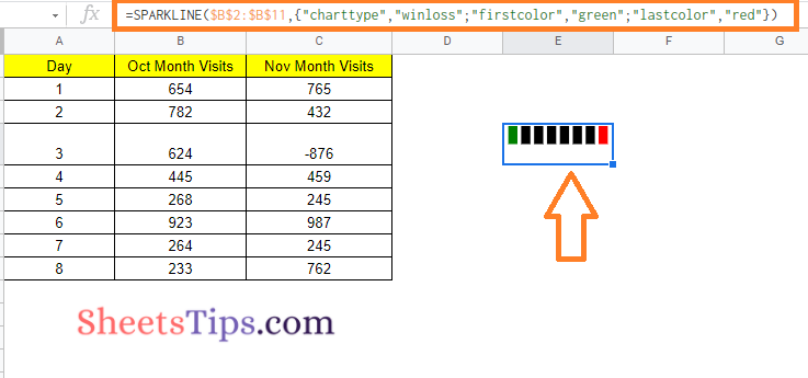
FirstColor and LastColor Options: With these options, you can use a different color to highlight the first and/or last point in the win-loss chart.
=SPARKLINE($B$2:$B$11,{“charttype”,“winloss”;“firstcolor”,“green”;“lastcolor”,“red”})