Google Sheets Line Graph is one of the useful features which helps us to understand any dataset’s analysis within a fraction of seconds. Most people rely on line charts when it comes to store and review the informational changes from time to time. Any individual can easily create a Google Sheets Line chart within few clicks. However, if you have no idea about how to make a line chart in Google Sheets, then this article is for you. On this page, we have provided step by step procedure for making a line graph with Google Sheet tips. Read on to find more.
Also Read: Java Program to Find the Sum of Series x – x^3 + x^5 – x^7 + …… + N
Table of Contents |
Google Line Chart Parameters
The important parameters of the line graph in Google Sheets are explained below:
- The Y-Axis (vertical axis)
- The X-Axis (horizontal axis)
- Chart Title
- Markers
- Grid
- Y-Axis Label
- X-Axis Label
- Legend
Types of Line Chart in Google Sheet
Before creating a line chart, let’s understand the types of line charts available in Google Sheets.
- Regular Line chart
- Smooth line chart
- Combo line chart
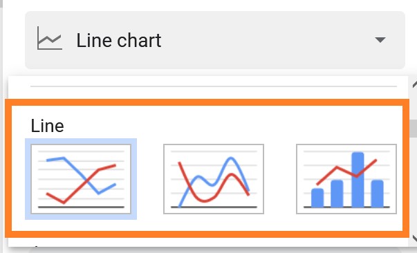
A regular line graph will appear spiky, whereas a smooth line graph will appear to have flowing lines. A combo line graph combines the features of a line graph and a bar graph.
- How to Make a Scatter Plot in Google Sheets (Step-by-Step)
- How to Make a Pie Chart in Google Sheets: Customize Pie Chart
- How to Make an Organization Chart in Google Sheets? – Create an Org Chart in Google Sheets
While you have complete control over how your graph appears, the most popular option is a normal line graph, which displays data more directly and precisely. However, the combo line graph works only when you have two series of data.
How to Make a Line Graph in Google Sheets with Multiple Lines?
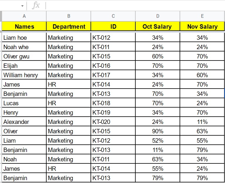
Let’s consider we have the following dataset and want to create a line chart for the same.
The steps to create a Line Chart in Google Sheet are given below:
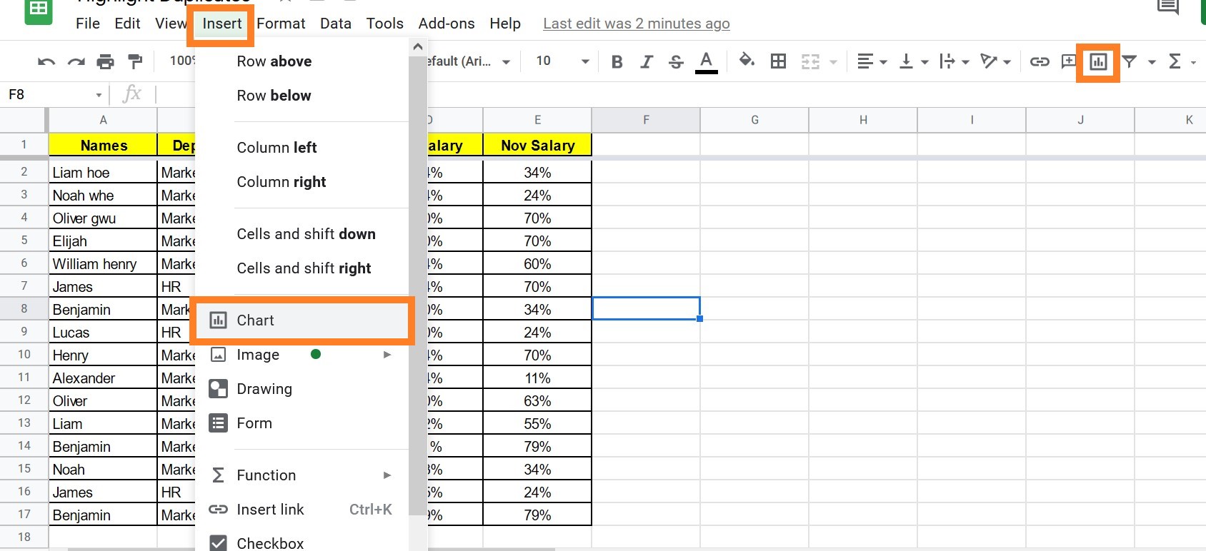
- Step 1: Select the dataset.
- Step 2: Click on the “Insert” tab and select “Chart” from the drop-down menu. You can also make use of the Chart icon in the toolbar to create a Chart.
- Step 3: Now the Chart Pane will open towards the right side of the screen.
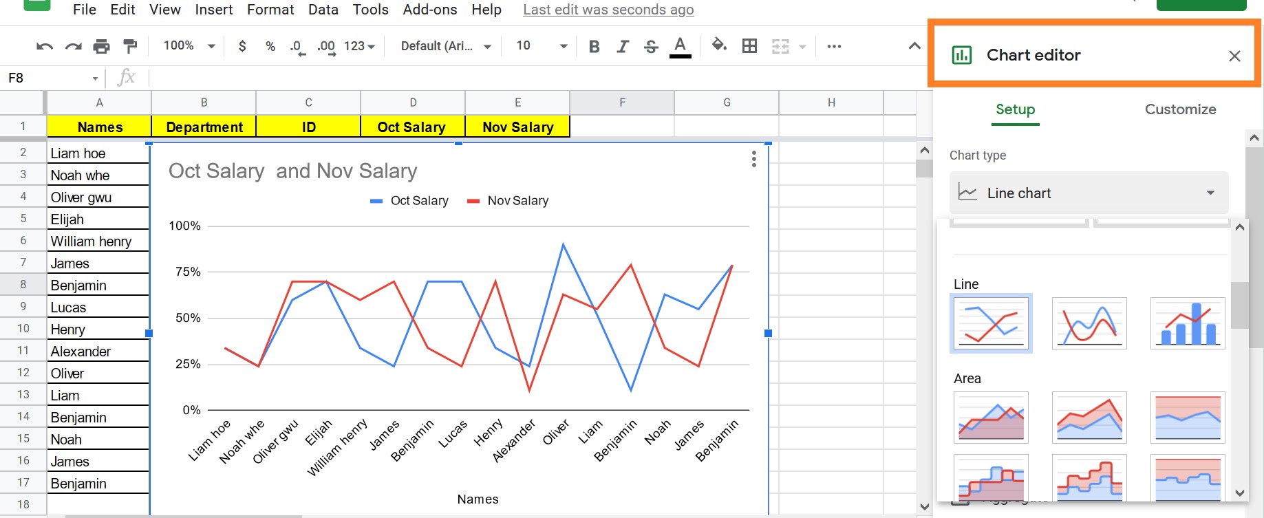
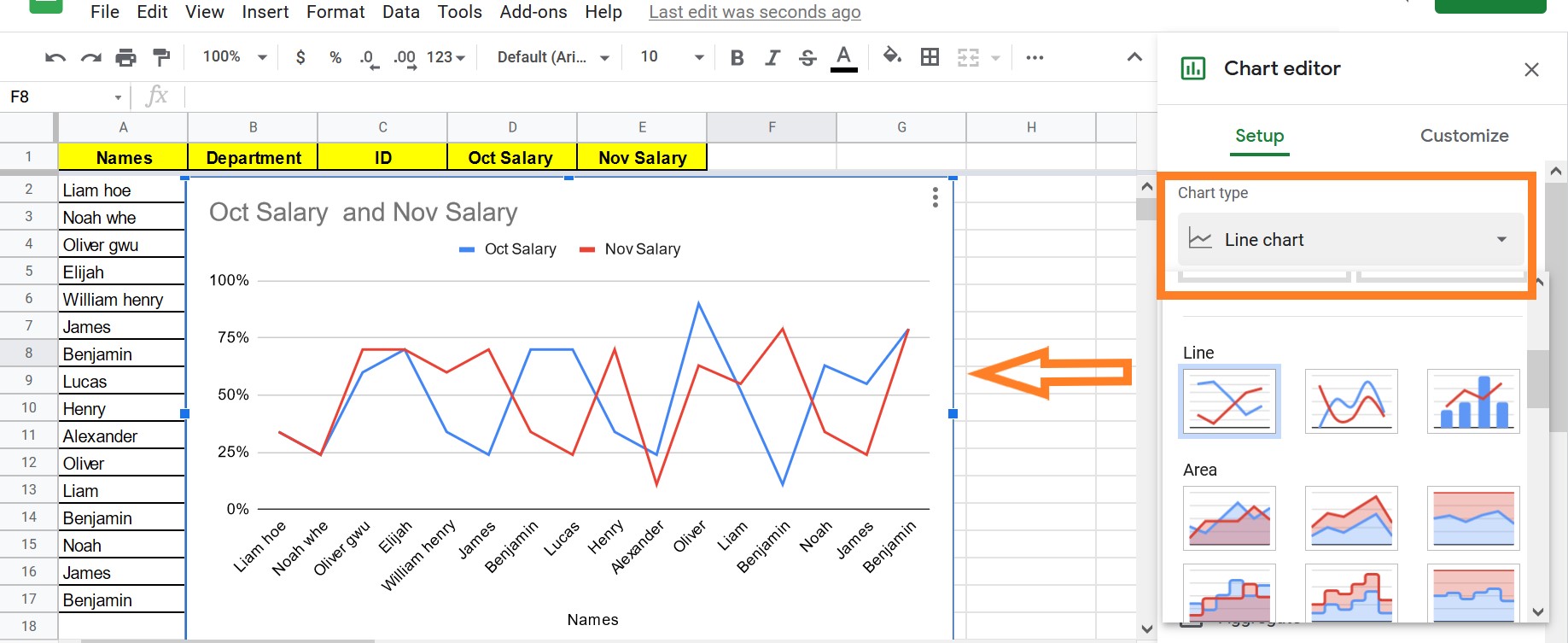
- Step 4: Under the “Chart Type” select “Line Chart” from the drop-down menu.
- Step 5: Now your Line Graph will be generated as shown below.
Setting Up Line Chart in Google Sheets
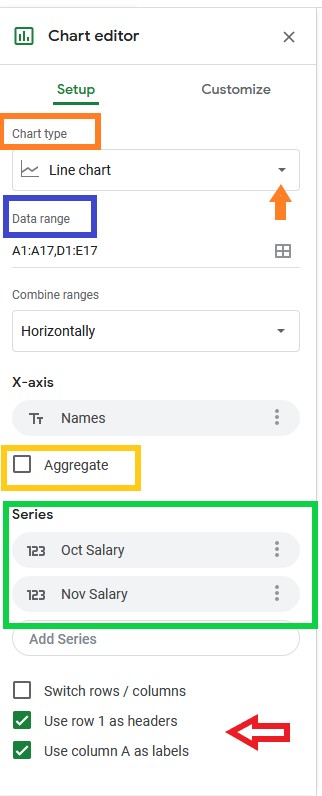
- Data Range: This defines the range of selected cells. You can also change the cell range by entering the cell ranges manually.
- X-Axis: This is the range of cells in your spreadsheet that make up the X-Axis of your chart. Under the X-Axis, you will have the option to check or uncheck the Aggregate box. By checking the Aggregate box, You can combine all values that have the same X-Axis key. The aggregate dropdown box for your series or lines will give you the choice of showing the data such as average, count, max, median, min, sum and so on.
- Series: A “series” is a term that refers to each line in your graph. You can edit the series bar by clicking the 3 dots to add or delete the labels.
- Switch Rows/Columns Box: When you check this box, you can switch the rows into columns and columns into rows.
- Use Row 1 as Headers: When you select this section, the data entered in row 1 will act as headers. Unchecking this section will consider all the data as non-headers.
Customizing the Line Graph in Google Sheets
Once the line graph is inserted in Google Sheets, you can customize the chart by moving to the Customize pane as shown below.
- Chart Style: Here you can set up the chart background color and border color. Also, you can reset the layout from the list of options.
- Chart and Axis Title: Under chart and axis title, you have the option to change the chart title, chart subtitle, X-axis title, Y-axis style. Apart from this, you can customize your chart title by changing the font type, color, size and text format.
- Series: You can change the style of your lines here. You may construct the chart that most clearly depicts the information you want to convey by altering the thickness of each line, the marker point size, and the marker point shape. The aggregate dropdown menu in this area allows you to choose the type of aggregate you want your chart to display. Under “format data point” you can click on “add,” where you may even specify a specific marker on your chart. You can also choose whether or not to show elements like error bars, data labels, and trendlines.
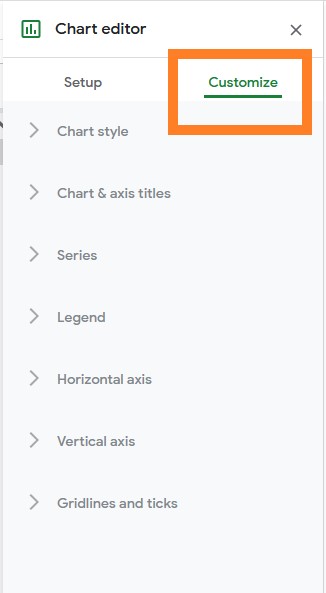
- Legend: This menu allows you to move your legend to the desired location, as well as adjust the font, size, format, and text colour of the legend.
- Horizontal Axis & Vertical Axis: This section comes with plenty of choices, where you resize the font, change the font types, color, format and much more.
- Gridlines: When showing data, gridlines might be useful. They give viewers a new viewpoint that allows them to better understand the information presented.
Editing Line Graph in Google Sheets
To edit the line chart in Google Sheets, just click on the chart. The “Chart Editor” opens towards the right side of the screen, where you can edit your chart.