Bell Curve is a type of Graph that can be generated on Google Sheets within few clicks. With the help of the Bell Curve, we can examine the differences between data points and the remaining data. Usually, organizations provide appraisals to employees based on the Bell Curve graph. The graph, Bell Curve also shows where the majority of data points in a graph are located, how near they are to one another, and which data points are considered as exceptions.
In this article, let’s learn everything about how to generate the Bell Curve graph with important Google Sheets tips. Read on to find out more.
Table of Contents |
How to Create a Bell Curve Graph in Google Sheets?
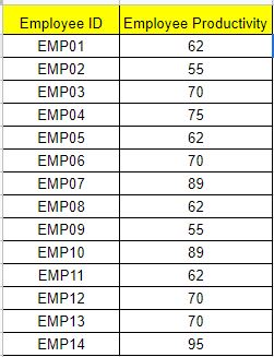
While Sheets includes a number of in-built graphing tools, we will need to perform some math to create a bell curve. Let’s understand how to do this with the help of the following example. Let’s consider an employee dataset whose productivity rates will be generated with the help of the Bell curve graph.
Before we build our Bell Curve graph we will have to perform some mathematical operations as shown below:
- The mean (average) value.
- The value of the standard deviation (either as the population or as a sample).
- The average’s +/- 3 standard deviation values.
- A series of numbers in a range.
- For all data points, the normal distribution calculation.
Now let’s create a series of assistance columns to hold the calculations we need to produce the bell curve graph before we begin.
- How to Make a Line Chart in Google Sheets: Setup/Edit/Customize Line Graph
- How to Make a Scatter Plot in Google Sheets (Step-by-Step)
- How to Make a Pie Chart in Google Sheets: Customize Pie Chart
Here we have added the following columns to the example:
- Cell C: Sequence
- Cell D: Distribution
- Cell E: Average
- Cell F: Standard Deviation
- Cell G: Low
- Cell H: High
Now follow the steps as listed below to perform Mathematical opeartions.
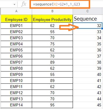
1. Cell C: Sequence: Use the formula =sequence(High-Low+1,1,Low) to generate a number sequence in the Sequence column. In cell C2, I used the formula =sequence(H2-G2+1,1,G2) as an example. This will provide a series of whole numbers in the range of the chart.
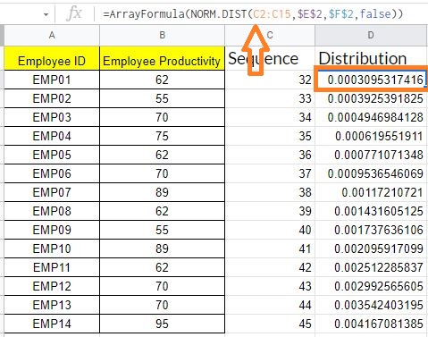
2. Cell D: Distribution: Then, using the NORM.DIST formula, calculate the normal distribution of all the data values using this pattern: =ArrayFormula(NORM.DIST(Data Cell Range,Average,Standard Deviation,false)). In cell D2, I used the formula: =ArrayFormula(NORM.DIST(C2:C57,$E$2,$F$2,false)). All scores’ distribution values will be returned.
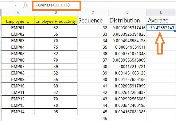
3. Cell E: Average – Using the AVERAGE function, find the average value of the data for which you’re creating a bell curve. In cell E2, I’ve used the formula =Average(B2:B15) as an example.
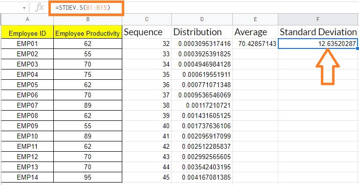
4. Cell F: Standard Deviation: If you’re working with all numbers in the population, use the formula =STV.P(); if you’re working with a sample of data, use the formula =STV.S(). In cell F2, the formula =STDEV.S(B1:B51) is used.
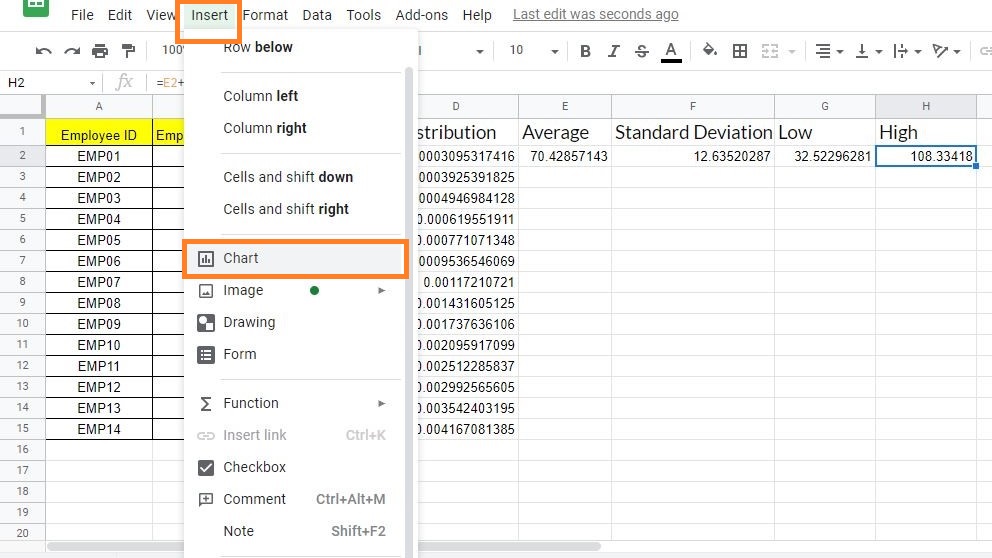
5.Cell G: Low – Calculate the average’s low standard deviation using the formula: =average-3*standard deviation, referencing the appropriate cells. In cell G2, I’ve used the formula =E2-3*F2 as an example.
6. Cell F: High – Calculate the average’s low standard deviation using the formula: =average-3*standard deviation, referencing the appropriate cells. In cell G2, I’ve used the formula =E2-3*F2 as an example.
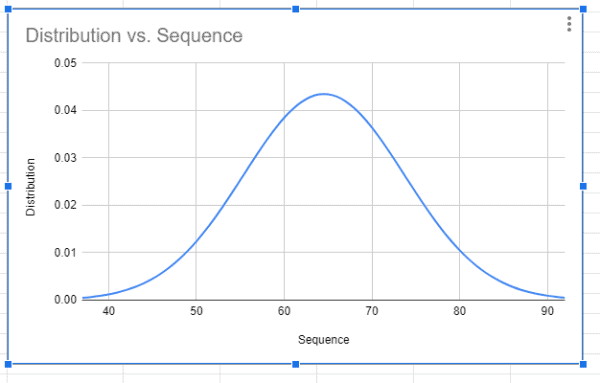
Generating Bell Curve Graph with Dataset
Now with the help of the above data, let’s generate the Bell Curve graph by following the steps as listed below:
- Step 1: Select columns C and D which means the Sequence and Distribution column in the provided example dataset.
- Step 2: Now click on the “Insert” button and select “Chart” from the drop-down menu.
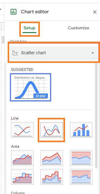
- Step 3: Now chart editing window opens towards the right side of the screen. Now under Chart type select “Scatter Chart“.
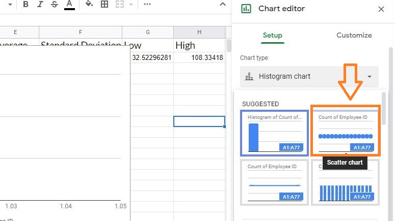
- Step 4: The Google Spreadsheets suggest the various chart styles. To create a bell curve graph choose “Smooth Line Graph” from the drop-down menu.
The bell curve graph will be generated as shown in the image given below.